Valerie Metcalfe: A Capsule


Left: Valerie Metcalfe. 1974. Her Thesis Exhibition at the University of Manitoba. Right: Valerie Metcalfe at 1000 Miles Apart conference, University of Manitoba. October, 2015.
- Dates: 1951 – present
- Production Dates: 1974 – present
- Location: Winnipeg, Manitoba
- Types of Work: functional, decorative-functional and decorative
- Preferred Kiln Type and Firing Process: home studio electric kiln, 22-23 inches mostly for bisque firing; 100 ft3 gas kiln at Stoneware studio; cone 11-12
- Preferred Clay: porcelain from Tuckers Clay and some Plainsman Clay; very early, some stoneware.
- Website: https://valeriemetcalfepottery.com/
- Signature/Mark/Chop:

usually inscribed in the base, underglaze.
Biography:
Meet Valerie Metcalfe: ceramic artist, co-op gallery owner/partner, pottery school instructor, and so much more. These two teapots below say so much about her art and her life. Add a love of nature and the environment and you are coming close to appreciating her as an artist and person.


Valerie Metcalfe. Two teapots.
Valerie readily admits there was no prior history of, or interest in, pottery in her family or educational background. But she loved to draw and enrolled in the Fine Arts programme at the University of Manitoba, Winnipeg. Pottery was not even a consideration at first:
“I didn’t even think of doing pottery in fine arts. I liked drawing. … I wasn’t even that fond of it from what I had seen and hadn’t been exposed to it very much. … The first time I saw it, my professor was Robert Archambeau, and the first time I saw him throw I thought I simply HAD had to learn how to do that. It’s a kind of a process I fell in love with. And then I was exposed to a lot more and different pieces of pottery and grew to love it.” 1
A second influence, by a fortunate coincidence was a student who had a locker right next to hers, John Waddell, founder of the Mostly Stoneware Studio, and eventually the root of the Stoneware Gallery.
”[Waddell] told me what a great life he had. I visited his studio, and that’s what made me try it out at university. I started in my second year. I wanted to be able to do something I could make a living at.” 1
Her very first show was her thesis show in 1974:
”It was at the Janet Ian Cameron Gallery at the University [UMSU], a little space they had on the second floor. … Enid Legros had given a workshop at our studio and I adopted her method of slip trailing and bleeding oxides through etched lines. I chose to leave the pieces unglazed however, and this is how the jars were decorated.” 2
After graduating with an Honours BFA in 1974 Valerie worked briefly at Waddell’s Mostly Stoneware studio/gallery. Among other young artists working there at the time was Kirk Creed working as an apprentice.
The time period determined the type of production. Among other things:
“We would get weird orders for a hundred musk ox for the Winnipeg Art Gallery [shop].“ 1
This experience was followed by an interval of about a year and a half in Toronto where she set up a studio on the artistically bustling Queen Street, West.
“I was interested in studying Sufism along with my brother and some other close friends. I also looked in to getting my Masters in Art History”.1
However, with a full-time job at the at the John Robarts Graduate Library her only pottery-time was in the evenings, a frustrating experience:
“I made pottery in the evenings but did not sell anything at that time. It was mostly to continue making pottery.” 1
John Waddell meanwhile visited to talk about an idea for a co-operative gallery back in Winnipeg. She returned to Winnipeg around 1976 and started working again with Waddell at Mostly Stoneware. The studio/gallery changed locations but there were money problems of scale, and also with Waddell’s loss of the Plainsman Clay dealership, a major income source:
“Waddell had moved his studio to two spots on Corydon [Avenue]. The second area was huge. He found he and his partner, [Liz Krohn}, could not cover all the costs. There were students and things but the gallery area was huge. He had been teaching for years. He had a group of students he had developed and asked if they wanted to start up this cooperative. We did.” 1
The group took the risk and bought out Waddell “at a bargain price”. The Stoneware Gallery has been in operation since. 1978.1
Currently Valerie is a key figure in the Stoneware Gallery, still on Corydon Avenue in Winnipeg: in fact, the only remaining original member of the gallery/studio cooperative. Over the years the membership has changed but the number has remained essentially constant. Metcalfe has been an anchor for the cooperative and the cooperative has been her “home port” since.
Today the Stoneware Gallery still operates as two separate businesses: the co-operative gallery that just deals with retail sales and the Stoneware studio that has always been a teaching studio.
Success for the owners, however, created an unexpected crowding problem. Adjustments had to be made:
“ We all wound up having to move into our own studios in our residences since there was no room, because as we developed we were able to produce a lot more.” 1
Metcalfe’s learning was continuous. The sales process was quite different in those earlier days:
“ [Waddell] taught me a lot about wholesaling. In those days everyone bought outright. … Everything was sold before you could even make it.” 1
In the very early days Metcalfe was selling in the Winnipeg Art Gallery shop, at Euphoria—a Winnipeg studio/store/workshop enterprise started up by Duane Perkins in 1971—and Desart in Osborne Village, Winnipeg. Later sales became more far-reaching as she wholesaled across the country including the Guild shop in Toronto, the Quest in Victoria and Banff, the Mendel Gallery in Saskatoon, and selling in galleries in Montreal and Halifax. 1
Inevitably circumstances changed. The downturn in the economic climate of the 1980s and 1990s was hard on the creative community. Many left the business. Metcalfe did not. Today, the Stoneware Gallery is Metcalfe’s principal sales outlet although she also sells in Portage-la-Prairie and Brandon, Manitoba. Moving with the times she has also branched out with an online store on her website. As with so many artists the story is as much about her survival as of her art.
Recognition for Valerie Mecalfe has come in several forms: in 1994 she was Elected to the Royal Canadian Academy of Art; apart from her work being collected internationally and as awards presentations to international dignitaries she has been a much sought after jury member, and a source for ceramics book images. (See sections on Collections and Publications below.)
Today Valerie Metcalfe’s interests are wide: there is her own pottery and the Stoneware gallery/studio and students; but she has also been actively involved in environmental issues, recently protesting the development of the local Parker Forest and Wetlands; and there is her love of animals, especially her recently departed horse, Sprout.
Metcalfe is also sensitive to broader pottery issue that she phrased as “Where have all the potters gone?” reflecting her concern on developments in pottery, especially during the 1990s and the early 2000s: schools were ending or reducing their ceramics programmes; and galleries and shops were closing or not buying, nor selling as much ceramic work as before. It seemed there was a general decline in the outputs and the visibility of ceramists and ceramics across the country. Recently, however, there has been an uptick in the number of students and emerging artists, and studios. Not a renaissance, yet. Ceramic activity is more evident now with new forms, new styles, and especially new names. Metcalfe’s original concerns were taken up by her university colleague, Mary Ann Steggles, who sent out 300 questionnaires internationally. Steggles wrote an article and made a presentation on the results. Although the results are beyond the scope of this page they do make for interesting reading. 3
Valerie Metcalfe is a Winnipegger and has remained in Winnipeg and the Stoneware Gallery as a key player and supporter of ceramics in Manitoba. The Stoneware Gallery plays not only a major role in Manitoba ceramics. It is also important to Metcalfe, for her own pottery, and for the community of potters in the Stoneware co-op and its classes. Her relationship with these “students” is much different from that of teacher to student, or lone-potter—working in isolation—to customer. She has remained with the cooperative for over 40 years. Manitoba pottery is the better for it.
Valerie observes the effect of making pottery on those around her:
“Throwing pots is both mentally relaxing and physically tiring and my observation is that people begin to open up about themselves while they work. It’s a different kind of knowledge that’s exercised, so while there are times when the focus is so strong you can’t speak, there are other times when communication flows. … It struck me that it was a completely unintentional benefit our peaceful studio was affording. I felt very humbled and grateful for it.” 2
A few more words from Valerie Metcalfe on her inspirations, and why she works in clay:
” There continues to be a sense of the miraculous for me in working with clay. The process is a form of alchemy where the four elements combine to transform humble matter into something precious. My work has many influences; from teachers and fellow artists to the wide open skies, deep woods and landscape of the prairies. Pottery is such an intimate art. It moves into people’s lives and becomes part of their homes and all the small daily rituals. This sense of human connection is important to me and I hope to give a gift of beauty and harmony through whatever form I undertake.” 7
A Gallery of Valerie Metcalfe Works
Some Initial Valerie Metcalfe Facts:
- Valerie’s preferred clay is porcelain for several reasons:
”I prefer using porcelain clay as its whiteness and transparency appeal to my decorative expression. I love that it allows light itself to shine through.” 6
“I moved into porcelain because the colour, texture, translucency, and glazing possibilities appealed to me. I found it to be more of a challenge, especially in those days when the clays available had almost no plasticity. Porcelain does not change the colour of the oxides or glazes used, so a far greater range of colour and depth is possible”.1
- She also exploits the malleability of porcelain:
“I like to push the clay to extremes … With porcelain you can throw in a couple of phases and will take water back on, whereas stoneware won’t. So with plates and bowls I can initially throw the but I throw thinly so as they dry their shape changes, the edges curl up so they become a completely different expression from what I originally intended . So I’ll let them set up enough so I can put them back on the wheel and re-centre them, and wet them and completely re-shape them and finish them up a lot more finely.” 1
- Metcalfe starts the creation and decoration of her larger works, principally, in her-basement studio in her home. There she has a wheel and an electric top-loading kiln, about 22-23 inches diameter, for bisque firing and low-fire lustre firings. This kiln can hold four of her big plates at a time. She then carefully transports those bisqued works to the Stoneware studio kiln for further work and firings.1

- The Stoneware studio kiln is a 100 ft3 gas kiln that is grandfathered in by the Fire Department.
- Valerie chooses a gas kiln for her porcelain since it is clean without the ash and other circulating elements of a wood fired kiln.
- In the studio she must compete with her students’ firing needs. This can be problematic when she is creating her “artistic” works, partly because of their size, and partly because her creations cannot always be fitted into a tidy production schedule.
- She describes the last-minute gas kiln pre-firing and firing rush familiar to potters, production or decorative:
” No matter how hard I try it always turns into a marathon effort of glazing with intense concentration well into the evening for days before it’s finally loaded and ready to brick up and fire. It’ll feel like a holiday for the next two days until we unload. I wonder sometimes if all this adrenaline and engagement is a kind of addiction.” 6
- The Stoneware kiln is busy with frequent firings per year. Of these Valerie uses about four for her own schedule of firings. The kiln is rented out to other people occasionally.
- Her glazes are her own formulations, developed in glaze tests over the years, plus about 30 pre-tested at the Stoneware studio.
“The glazes I have found and tested are mostly mixed in with the thirty odd glazes available for the students. There’s just a few I keep separate”.1
- Glazes and tests are shared with the students.
- Stoneware studio glazes are mixed up in 30,000 gram batches in big vats accommodating the glazing of bigger pieces.1
- Metcalfe usually paints three to five layers of glazes, oxides and slips to create a sense of depth.1
- Her specialty is throwing in porcelain developed as she says through the school of experience:
“I just figured out what I wanted and how to get around it … the school of “Hard Knocks”.” 1
- Metcalfe therefore developed techniques that would work for her, such as using a propane blowtorch while throwing some of her vases and teapots to create the delicate structures she wanted:
- She has noticed that her best sales were more of the “artistic” type. She moved into that realm very quickly, but “mugs and goblets remain the bread and butter”.1
”I can’t keep anything that simple. I aspire to make the form as elegant as I can” 1
And
“I am a production potter and to me beauty is integral to function.” 6
Very Early Works: Stoneware
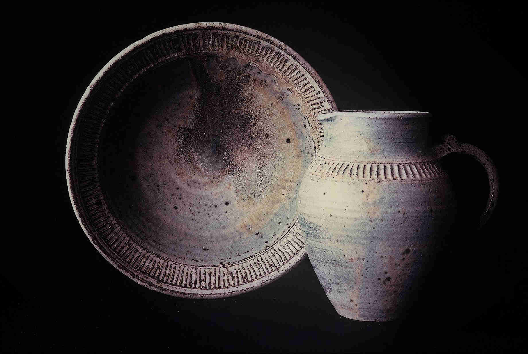
Pitcher and bowl set, 1978. These two works from Metcalfe’s “very” early years have an almost archaic, archaeological even, look and feel about them. They are sturdy, solid forms with pitted surfaces and simple, bands of carved decoration. The poured glaze1 is almost minimal, more like a wash. Yet the carving is precise. Form and decoration give just a hint at her future directions in “painting” and carving her surfaces.

Dinnerware Set, 1978. The speckled white surfaces gives these works away as stoneware. Yet there are features that are already pure Metcalfe: white clay, glaze poured into the well, and a fine, precise banding framing the central “landscape” design.

Carved Platter, 1978. A final very early work shows Metcalfe’s early exploration with surface carving. The circled centre is scarified with slashes of parallel grooves. The outer rim is a series of more discrete “rectangular” segments. The whole is nested, organized, contained. Metcalfe will burst out of this tight control into more expressive, painterly surface designs when she discovered and adapted to porcelain.
The Shift To Porcelain
Like many artists of the 1970s, and in the early part of her career, Metcalfe worked In stoneware. Although she admired the Bernard Leach tradition she gradually grew away from it, moving into porcelain work, attracted by it’s colour and potential:
” I like how white it is. Just much more pleasant than that brown stuff. And you don’t have to keep cleaning up your studio when switching clay.” 1
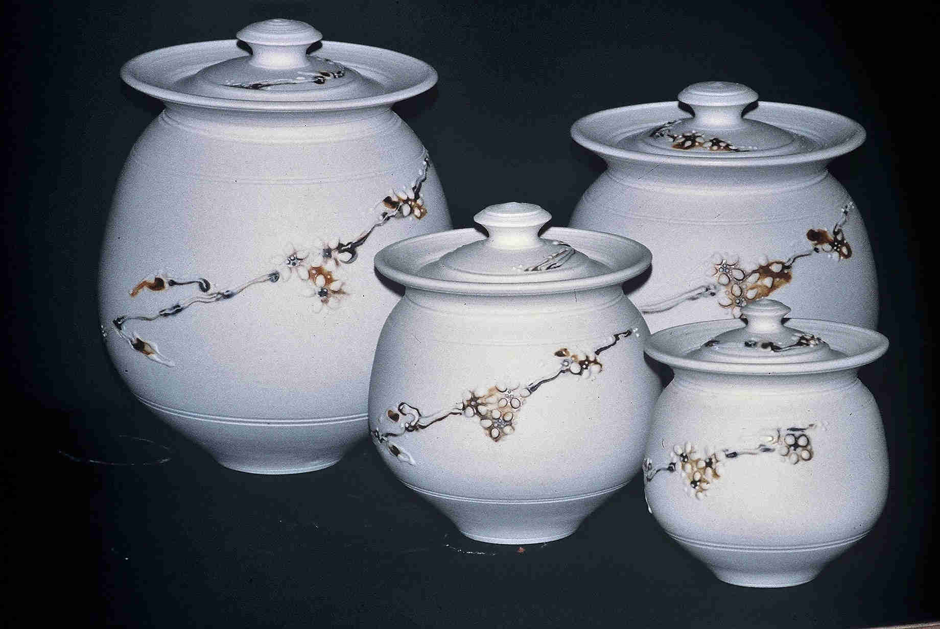
Cannister set, 1980. This grouping was in an invitational show at the university’s Janet Ian Cameron Gallery. By the time of her graduation she had worked a bit with porcelain in school.1 The white clay is thrown thinner, with more confidence. The decoration is of a simple vine with leaves and flowers on all four works of the set. Three characteristics of her functional work are already apparent: the white, the naturalistic motif, and the set, here four-part.
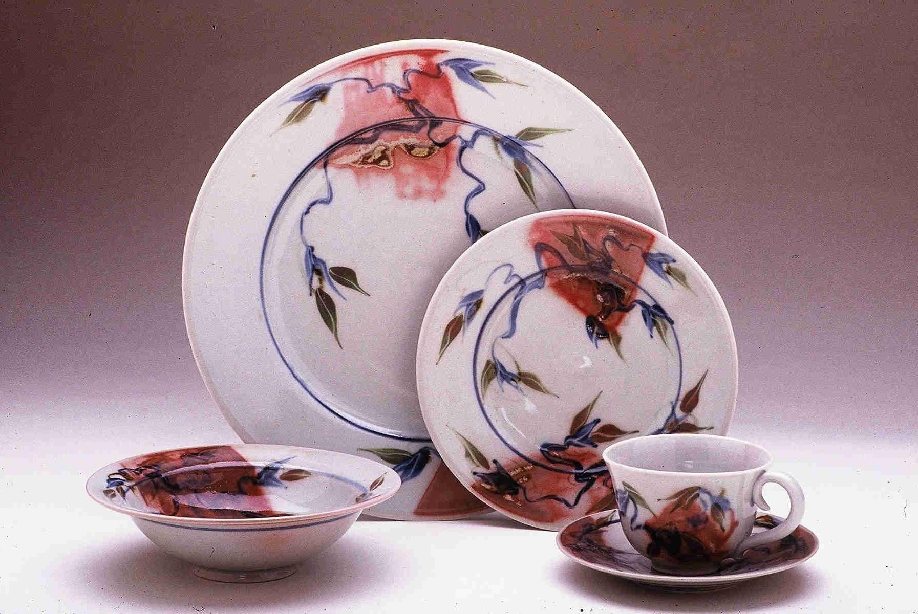
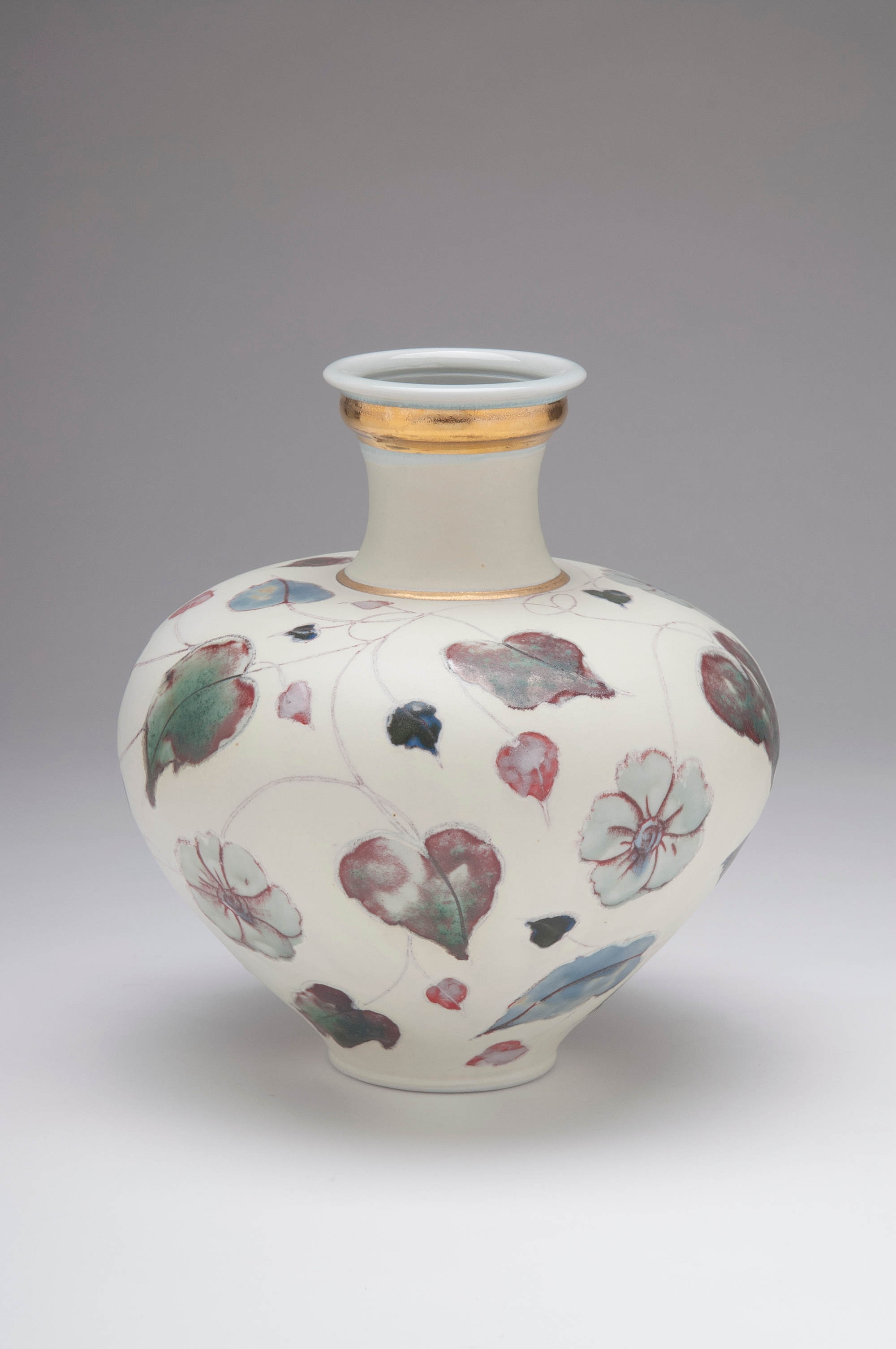
Porcelain Dinner set c.1983. Metcalfe’s first dinnerware porcelain set exhibits further characteristics she would continue in her work. Firstly, it is a dinner set, this one commissioned.1 There is still a central ring, a circle, separating the rim and the well but there is a loosening of the design. The tightness of her overall early designs would shift to a precision of detail. Here red, transparent, oxide washes flow from the rim into the well. Nature enters the design vocabulary with blue and green flower buds reaching out from the splashes of red. The effect is now more painterly, less “sculptural” as she exploits the white surface of the porcelain.
Large plates and vases
Landscape plate, 1983. Metcalfe lays colours that represent scenes and seasons, here Winter, in her “Landscape Plates”. She refers to her porcelain surfaces as “canvas”. She will throw the work as thinly as possible, cut and bend the surfaces and edges, and then augment them with other media such as solder and beads. These are large, one-off pieces that would become central to her non-functional creations. In this earlier work she describes how this “series” developed:
” I was in a relationship with a stained glass worker. When one of my plates cracked, we decided to fill it with solder. After that I began to purposefully carve holes for the metal and then thought to incorporate a glass bead on the rim. I was fascinated by the clay taken to such an extreme width and thinning out so that it almost disappears. I emphasized that movement by altering and carving out spaces in the rims. The interior canvas became an opportunity to pour glazes and wax resist in multiple layers that hopefully create a sense of infinite space.” 2


Left: Valerie Metcalfe: Skyscape/Landscape plate, 2017. Porcelain, solder, glass. 40.6 cm w.; Right: detail. A more recent landscape plate shows how she expanded on the theme. Here the colour effect is more of spring or summer, of sky, earth and fields. The play with her “ceramic canvas” is now more extensive with deliberate, confident cuts through and around the rim; the added bead and solder glisten against the washes of pigment. The whole is an effect of a small tondo. Metcalfe further describes her technique:
” I mask off the holes to melt in the metal and glass bead. Then I reverse it to do the same. The metal swells slightly above the openings and keys itself in. Then I have one more go round on the front to make sure everything is smooth.” 6

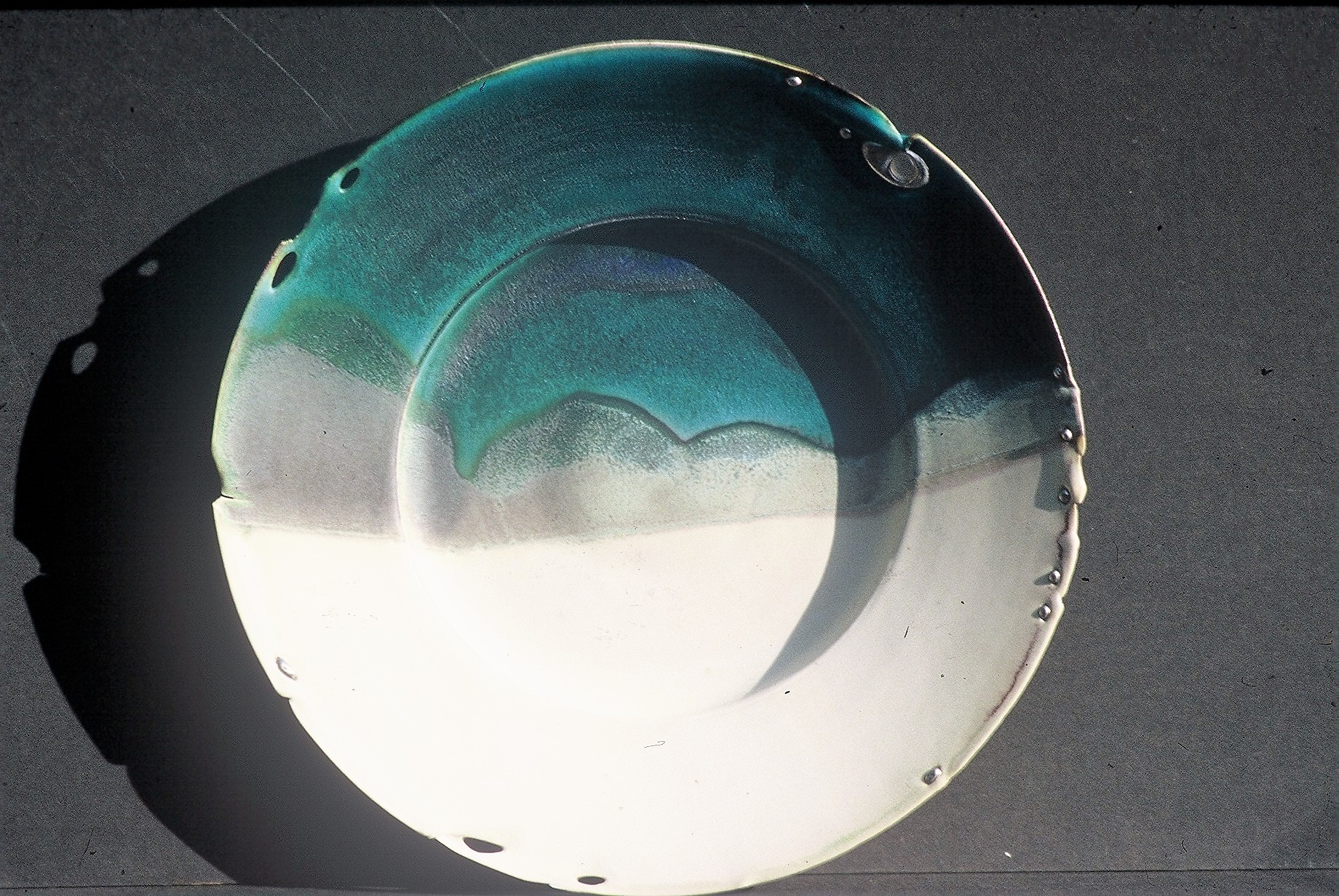
Cathedral Bowl 2000. Metcalfe would experiment and expand on opening up the rims. Here, surrounding a poured glaze interior she has deliberately cut lunettes and carved precise, symmetrical grooves around the entire rim. The effect is one of gazing up into the rib-vault of a gothic cathedral, and looking through the vault into an unsettled sky. The effect can be “Abstract Expressionist” in its drama. Although she can be meticulous, precise in some elements of her glaze design she like to “let loose”, to release the tension of creating the fine detail.1 This tight-loose tension is typical of much of her work. The bowl was juried into Porcelain 2000 at Esmay Fine Art in Rochester New York.2

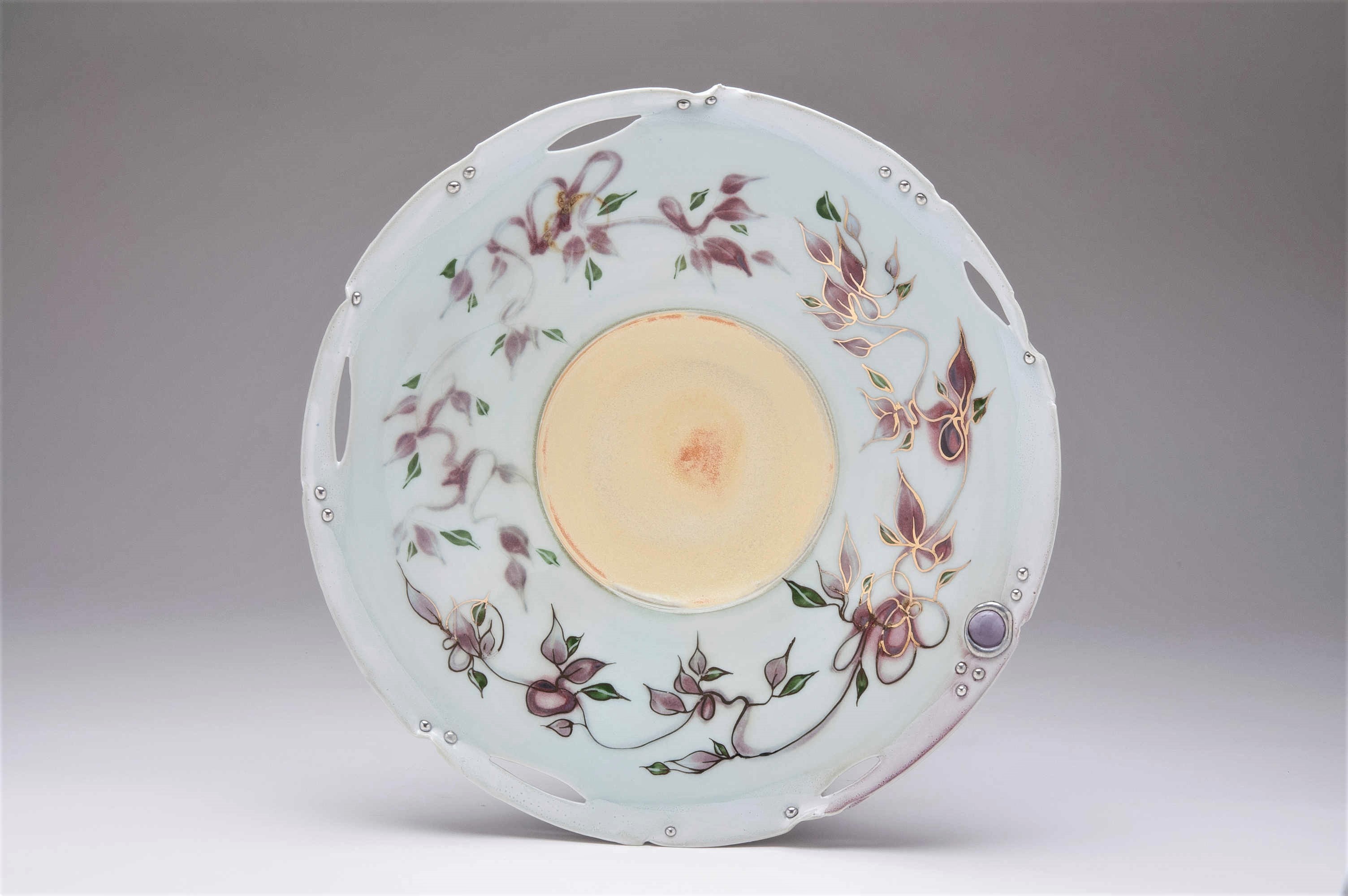
Bowl, 2005. Along with experiments in the shape and surface of the clay, Metcalfe would also explore colour combinations as in this plate where she has used matte black and white as contrasts with the colour and gold. Her signature features are all there: the size; in the rim, the silver solder “studs “ and mounted bead; the elliptical through-cuts; and the occasional “nicks” in the rim contour; within the body are the ring of gold, the loose, leaf-vine pattern, in part painted with a watercolour transparency, in part rimmed with gold, like cloisonné enamel; and finally, the colour washes in red and grey-green.
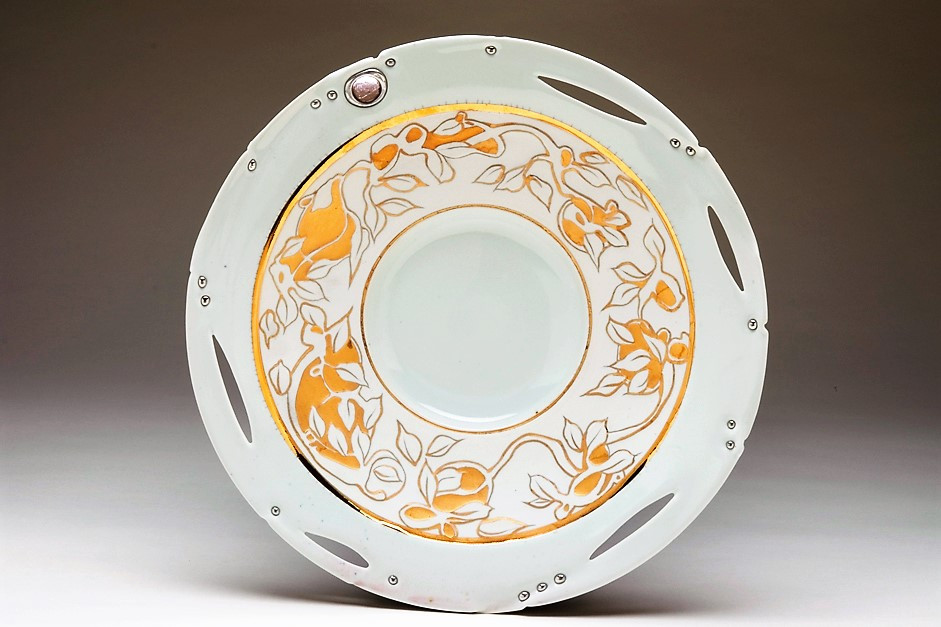
White and gold platter, 2007. In this work gold lustre is applied to bare porcelain. The effect clean, precise, tight.
And one final platter to show Metcalfe’s more recent use of water etching:

Large Platter 2004. In this work shown at the Ontario Craft Guild Porcelain invitational Metcalfe here has used a loose, water-etched-embossed rim surface to contrast with a tight design in the well. Both are in her trailing leaf-vine motif. As a further play of looseness she has allowed the rim glaze to slightly dribble towards the centre, confidently accepting a deliberate “accident.” The visual effect is almost hypnotic with the rhythmic dark-light-dark-light tonal contrasts flowing from the rim to the centre.
Vases and Bottles
Metcalfe’s plates are open both in form and, literally, in the penetration of their surfaces. But she is still the potter delighting in throwing more closed forms.
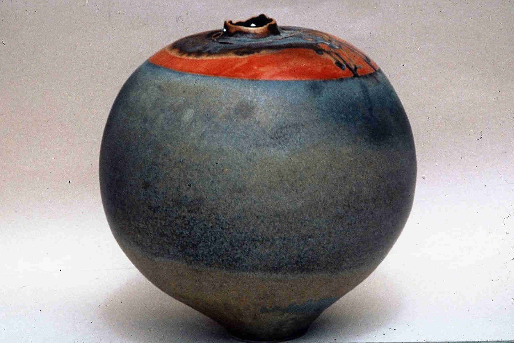
Porcelain vase1993. The vase is solid, smooth, sphere in matte black, giving it the visual weight of a cannon ball. The shoulders and lip are a dramatic contrast: a colour splash in contrasting reds, blues and blacks, while the mouth and lip are penetrated, carved, almost torn. So much contrast in so simple a form.

Two Bud vases, 2005. Each thrown in one part, these two bottles are an essay Into combining matte and gloss, glazes, with bands of painting and carving.1 The bowls are fertile, organic in form as though a bulb has not just grown but shot forth into the stretched neck-stems and the “flower” at their lips. The colours are elegantly muted on the belly and shoulders. The bowls have gilt-edged leaf designs rooted in the green and black bottom glazes. The gold lustre is applied with three different brushes: a stiff small one for edges, an angled one for banding, and a very fine one for the accent painting.1 The extended necks blossom into the spreadinto the lips like lilies, wide and flat, each with their cuts and solder beads. There is a tension between the delicately coloured and designed bowls as painterly surfaces and the lips, as plainer sculptural forms, the whole united into hybrid constructs.
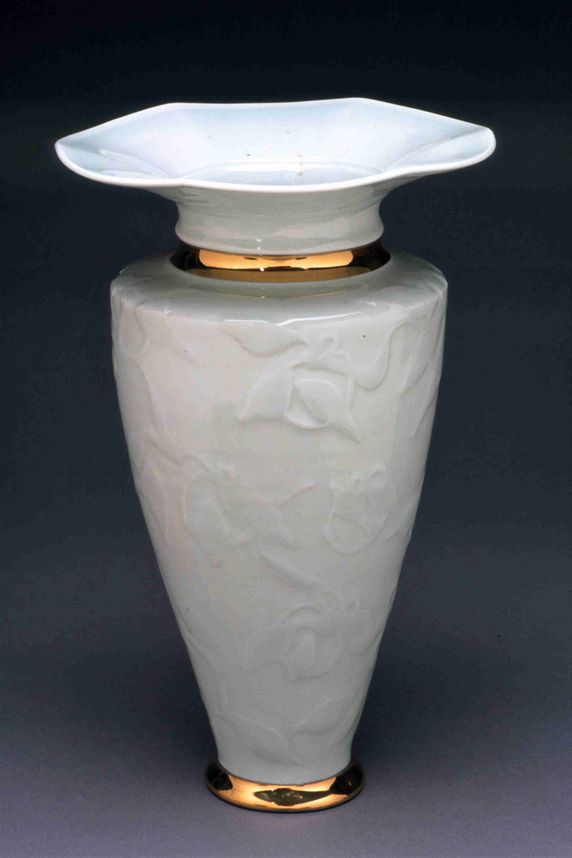
White and gold vase, 2003. Here the effect is not of colour combinations, rather of surface, texture and juncture. The body, pure white, except for plain gilt bands that ring the foot and the base of the ridged neck, is a carved, subtle, water-etched relief, of leaves and branches. The shoulder is tightly turned-in, the lip flared and lightly curled, petal-like. The whole is a combination of restraint and gilt flash. With water-etching Metcalfe has masked parts of the design on the dry-clay form with an acrylic varnish, matte or gloss, and then carefully rubbed away the un-masked sections with a damp sponge or cloth, slowly, lightly wearing it down. The masked areas now stand out as relief. Further masking and rubbing can enhance the layered effect.

“Leaves in the Mist” Vase, 2013. Size presents new challenges for Metcalfe. She describes her large vases as “wax painting on Shino with various overglazes. The bases are thrown from 20 lbs. of clay in one piece with the neck thrown on top later.” 2 The form here has elegance of the ancient Chinese Meiping, plum vase. In earlier works, such as her landscape plates, winter colours were a key feature. Here the sense is autumnal, of leaves cascading down the body of the vase. The colouring is loose with the red of the leaves bleeding into the greys of the shino glaze. The whole effect is one of a combination of wet-on-wet and scumbling painterly effects. The separately thrown neck and lip, not carved or altered, is solid in thick opaque black and red. The total effect is meditative.
Functional Ware
Regardless of the above “art” images Valerie Metcalfe refers to herself as a functional potter. This might sound contradictory. Yet think back to her early question, “Where have all the potters gone?” Her production ware has made her acutely sensitive to changes in the ceramic economy and lifestyle. Along with some slab and hand building she throws extensively on the wheel, creating individual items and sets: mugs, goblets, bowls and matched sets of dinnerware. These are meant to be used and enjoyed. And then there are those “functional-decorative” works, generally functional in form but so much more in detail. In both cases she says:
“I aspire to create elegance” 1
The years of experience have also made her a realist. Valerie is not industrial in her output but when one sees her production ready for firing or just out of the kiln one realises that she like to throw on the wheel. And throw, and throw, and throw. One-offs can seem easy compared to the precision and detail required for sets and series.
“You have to make MANY pots to make a go of it and balance your one of a kind pieces with a lot of inexpensive functional ware. … Literally thousands of mugs and goblets and bowls. They are my bread and butter. It can be very tedious at times. But I think the constant repetition can only serve to improve your skills. I try to come up with new approaches and shapes all the time.” 2
And:
“Making pots is a process and a way of life. The finished piece is a nice [hopefully] and necessary by-product, but everyone’s always moving on from their last creation. You’re only as good as your last role. Part of this movement for me has always been selling my work. The process simply does not feel complete until a piece has found a home. It’s a sense of having communicated successfully. Money paid is an exchange of energy. It also allows me to keep making pots.” 2


Valerie Metcalfe: green and bisque ware.
These images of green and bisque ware give a sense of the volume of her output and of favoured forms and decorating techniques that she also shares on her instagram site:
” I trim and assemble my goblets in two stages. I like the top to be quite set up and the base fairly wet. I smooth the base into the top and take off a bit of excess. I then let the piece set up for a while before finishing the trimming. The clay chuck makes it easy to trim in both directions and it is still just barely soft enough to get it centred and have it stay that way. The base is still quite thick at the join so it supports the top during the firing.” 6
Metcalfe also shares a sense about the fate of her creations, a sense shared by many potters. They are not widgets:
” I find a great satisfaction in knowing how intimate these items are to the lives of the individual using them. Hands and mouths need to take pleasure in their touch and feel. Pots are personal and people are drawn to them [or not] as they would be to a personality. “ 2
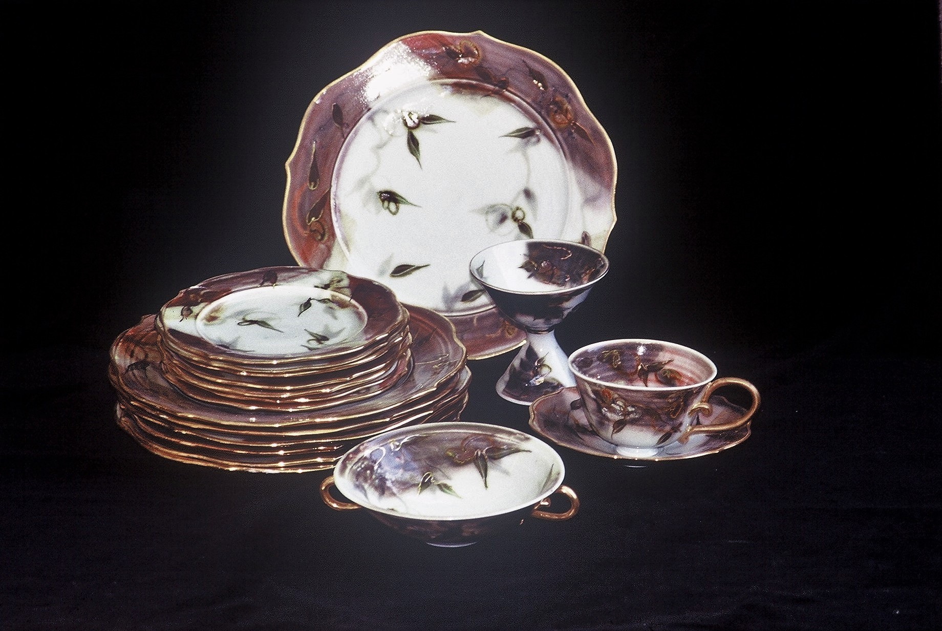
Painted Dinner Set with gold lustre, c.1987-88. One of Metcalfe’s favoured productions is the making of custom dinnerware sets Here is a full dinner setting with Metcalfe’s characteristic leaf and red-wash design. She had just started using lustre. Creating a full dinner set requires other challenges: consistency of dimensions; making sure they stack correctly, and especially, “getting the proportions right between the pieces.” 2 She also had to develop other forms of patience and to learn skills beyond ensuring consistency of design: forecasting sales, even basic business risk analysis. Metcalfe notes on the fate of this particular set:
“ Fellow went bankrupt. My dad bought it. Always get a deposit!” 2
And yet quantity cannot be ignored either:
” Always make samples plus twice the number that I need.” 2

Butter dishes 2010. The same care she has made in her larger sets is carried over into her “smaller” items of functional ware. The decorations carry that special Metcalfe signature of colour, design and motifs. Metcalfe describes how she makes these butter dishes:
“The tops are cut from a slab in one patterned piece that is then draped over a block and joined. Therefore only 4 seams. The plates are thrown and cut square. The interior square flange for the butter is thrown off the hump in a thin ribbon and then fastened to the plate.” 1
Functional-Decorative
“Functional-decorative” works are a specialty of Metcalfe’s. They are works whose overall functional form is immediately obvious but whose details move them to another plane, one of shape and design. Metcalfe has actually used the term Victorian on her work. This can imply a sense of some of extravagant shapes, surface colours and designs. Perhaps this is defensive. She does use gilt, bright colour and bold forms but they are unique artistic impulses, measured, individual, not captive to an historical, overwhelming, cultural norm.1
That said, as Metcalfe’s reputation—and experience—grew so did the opulence of some of her creations. But then:
”I remember reading a quote once saying ‘if you make beautiful pieces someone will want to buy them’, and I’ve had to learn to live with that faith. Now I would ad that someone will buy them “eventually”!“ 2
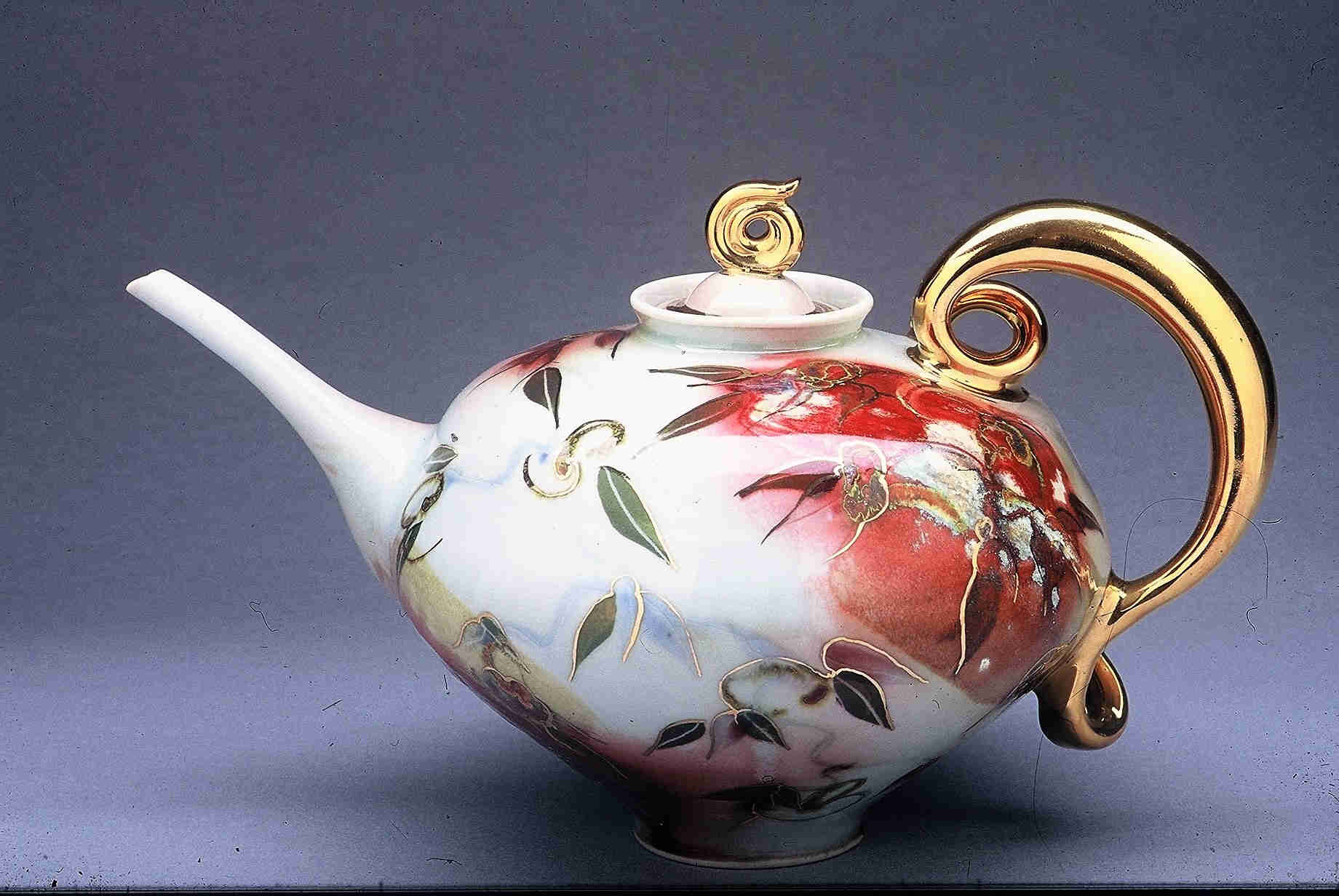
Teapot 1995. This elegant teapot was juried into the RCA “Book Of Days” date? and later published in Robin Hopper’s 2000 edition of Functional Pottery, Form and Aesthetic in Pots of Purpose. Such works are fall into the category Metcalfe calls decorative-functional where the intensity of the gold luster emphasizes the soft focus of the oxides, and of the handle and spout, making them seem too delicate to handle. The generic look is functional but one cannot imagine the surface being tea-stained or the lustre finger-marked. The surface design is a familiar red wash and green leaves. Here, however, the leaves and stems are thinly outlined in gold giving the effect of cloisonné enamel. The curves and gilt of the knob and handle have an Art Deco look in their flow and tight curls. In such works there is a constant tension between precisely applied , fine detail and loose energetic brush strokes. The final appearnace of the work belies the throwing process to create it:

“I like to push the clay to extremes so I [sometimes] use a blowtorch when I throw. … when I’m doing anything like a vase, or a teapot, when I have an extreme shape or a shoulder holding up a fine neck. Sometimes I’ll do the neck separately …but especially in big pieces porcelain tend to run back down on itself like a mudslide … So if I torch the bottom and pull it up I am able to have it stay and support the rest. … I can go higher and bigger and wider. It can take an hour or two to throw a really big plate. It’s not bisquing just drying, ‘straight flame on the clay.’” 1

Pitcher, 1998. I am including this pitcher not just for its elegance of design but as an illustration of Metcalfe’s interest in shaping space. Not only is there the solid presence of a of the pitcher’s volumes but also a play with negative space in the curled shape of the handle, a “cryptic” number nine. The work does not just occupy space but defines it. Further, this work typifies Metcalfe’s sculpting of the edges of her works, be it of a vase, or of a dish rim, or as here, a pouring channel. These are not functional items rather deliberate artistic decisions. Playing with the edge, the final “cut” into the ambient space, shifts its forms from volume or plane into line. A dimensional shift subtly underlying the more obvious colour patterns and familiar shapes.
Pitcher and bowl set, 2015. Around 2015 Metcalfe explored further design techniques and comments and on the intensity and the satisfaction of their creation:
”I’ve begun to carve and inlay slip and underglaze. Then I varnish the carvings and wipe to create relief. I then paint the glaze on those areas and wax resist them to contrast with the background glaze. It’s very time consuming and leads me to believe I really am a masochist. However, I am pleased with the new pitchers. I’ve tried something different with the handles and they seem well balanced.” 2
More Recent Works
Consistently, throughout her work, Valerie Metcalfe has shown her love of nature, of its importance to us. Plates can be landscapes, teapots and vases as flowers. In her own way she commemorates efforts to preserve nature, even when they were not successful. A recent series was inspired by the Parker Forest and Wetlands she helped campaign to preserve, unfortunately to no avail.

Valerie Metcalfe: top left: Flowers in the Snow. 2018. 33 cm high. Porcelain. Mishima drawing with painted glaze, underglaze and wax design. Gold lustre accents; top right: Forest vase. 2018, Porcelain and Gold Lustre. Carved Mishima design with painted glazes, underglazes and wax. 38.1 cm; bottom: Garden in the Sun. 2018. 40.6 cm w. Altered and carved with metal and glass accents. Hand painted with slips and oxides. Gold lustre accents.
In these recent works Metcalfe has used the “mishima” technique creating fine, coloured lines of inlaid engobes, occasionaly bordered in lustre, to fashion patterns of soft washes of coloured leaves. The effect is subtle, gentle but distinctly Metcalfe. Interestingly, the series also prompted her to give titles to the works.
Some final words:
Despite the sumptuous colours and occasional large scale of the above works, Valerie Metcalfe nonetheless describes herself as a “production potter” as in her artist statement below. Yet this is typical of her reserve in talking about herself. But she will talk about her passion for pottery. Function underlies all her forms, all her designs, be they one-offs or multi-piece sets. Her lucid artist statement provides a summary not only of her art but also her life:
”I fell in love with making pots 43 years ago in Art School and there continues to be a sense of the miraculous for me in working with clay. The process is a form of alchemy wherein you work with the four elements to transform humble matter into something precious. My work has many influences; from teachers and fellow artists to the wide open skies, deep woods and landscape of the Prairies. My inspiration also comes from working. It’s a mysterious process, but the more I work, the more ideas come. They manifest as images that suddenly come to mind or sometimes even in dreams. I am a production potter and to me beauty is integral to function. Pottery is such an intimate art. It moves into people’s lives and becomes part of their homes and all their small daily rituals. This sense of human connection is important to me and I hope to give a gift of beauty and harmony through whatever form I undertake. I prefer using porcelain clay as its whiteness and transparency appeal to my decorative expression. I love that it allows light itself to shine through.“ 4
Links to Sites for More Information on Valerie Metcalfe and Her Works
Videos By and On Valerie Metcalfe
NB: The Instagram and Picdeer videos below are “sped-up” when viewed online but still show the subject and techniques well.
- Valerie Metcalfe’s Instagram general page: https://www.instagram.com/valeriemetcalfepottery/?hl=en
- Valerie Metcalfe on how to get an even line of lustre. 49 seconds video. http://picdeer.com/media/1867621866552598363_1780634853
- Valerie Metcalfe on how she uses a clay chuck to trim small vases. 1:00 min. video http://picdeer.com/media/1742250872080996468_1780634853
- Valerie Metcalfe video on water etching. 55 seconds video. http://picdeer.com/media/1726969118470633303_1780634853 . Enjoy the background music.
- Valerie Metcalfe on how she “gets the glass and metal in her pieces. 58 seconds video. http://picdeer.com/media/1599481273141750299_1780634853 .
- Valerie Metcalfe on throwing a neck on a vase. 43Seconds video. http://picdeer.com/media/1517645808315575796_1780634853 .
- Valerie Metcalfe on throwing fat teapots and using a propane torch. 59 seconds video. http://picdeer.com/media/1491660626559470196_1780634853 .
- Valerie Metcalfe throwing a large plate. 1:00 min video. Originally from artquest.ca. http://picdeer.com/media/1329068590762175341_1780634853
- UMFM 101.5 University of Manitoba “Art World Innovators.” Metcalfe’s section of the interview starts at 14:22 minutes. First aired November 21, 2018; re-played January 16, 2019. https://umfm.com/programming/broadcast/art-world-innovators-january-9-2019 About 14:24 min in length.
- Pottery By Valerie Metcalfe. By ArtsQuest.ca. 4:24 min. https://vimeo.com/189244585
Selected Publications
- 2013 500 teapots, Volume Two, Lark Books
- 2008 500 Plates and Chargers, Lark Books
- 2006 500 Pitchers, Lark Books
- 2002 Art and Perception: Issue 48; Article by Shirley Clifford: A Matter of Clay, Canadian Ceramics on Show
- 2001 Robin Hopper, The Ceramic Spectrum, 2nd edition
- 2001 Kevin A Hluch, The Art of Contemporary American Pottery
- 2000 Robin Hopper, Functional Pottery, Form and Aesthetic in Pots of Purpose, 2nd edition
- 2000 Daniel Rhodes, Clay and Glazes For the Potter, yd edition, revised and expanded by Robin Hopper
- 2000 Clay Times, Esmay Fine Art, Rochester, N.Y., Porcelain 2000 Exhibit 1997
- Contemporary Studio Ceramics, Collection of the Winnipeg Art Gallery
- 1997 Royal Canadian Academy of Arts. Book of Days
- 1993 Ceramics Monthly, 8th Annual San Angelo National
Major Collections
- The Honourable Michaelle Jean, Governor General of Canada.
- The Honourable Adrienne Clarkson, Governor General of Canada
- Manitoba Department of Culture and Heritage, Government of Manitoba
- Collection of the Winnipeg Art Gallery in Winnipeg, Manitoba
- Private collection of Senator Harding, Attorney General of Kingston, Jamaica
- Lipton’s Tea Company
- The President of Iceland
- The King and Queen of Sweden
- The Massey Foundation
- The Federal Government of Canada
- Private collections across Canada, in the United States, England, Australia France, Korea, Japan , the Netherlands and Germany
Endnotes & Bibliography:
- Valerie Metcalfe, Interview and correspondence with Barry Morrison, June 15, 2017ff.
- Valerie Metcalfe. Presentation for 1000 Miles Apart Ceramics Conference, University of Manitoba . October 1 to 3, 2015.
- Mary Ann Steggles. Where have All The Potters Gone?: Mary Ann Steggles observes the outside effects on studio pottery practice. CeramicsTECHNICAL. No 37, 2013. Pp.14-18.
- The Stoneware Gallery page on Valerie Metcalfe. http://stonewaregallery.com/galleryartists/valeriemetcalfe/
- Valerie Metcalfe Instagram pages: https://www.instagram.com/valeriemetcalfepottery/
- Valerie Metcalfe. Picdeer.com: http://picdeer.com/valeriemetcalfepottery
- Valerie Metcalfe website. https://valeriemetcalfepottery.com/
Addendum
Thank you for reading this far. The personal lives of artists make for compelling reading. The picture and text below give a further insight to the breadth of Valerie Metcalfe’s heart. Her beloved horse, Sprout, passed recently. Those who know Valerie know of her love for Sprout.

”RIP Beloved Sprout February 8th, 1994 – November 17th, 2018 Racing name: Return in May Inbreeding: Bold Ruler 3S x 4D Nasrullah 4S x 5D Miss Disco 4S x 5D AKA: Sprouters, Sproutie, Sproutertariat, Spookertariat, The Big One, but always and forever -Beloved Sprout. Every horse story is a love story. Sprout’s and mine began 14 years ago when I took up riding at the age of 53. As destiny would have it he became my horse 10 years ago. And what a horse! Way too much horse for me really, for I was a fairly green rider, a “golden spur” as our barn referred to riders over 50. However Sprout was far too much of a prince and gentleman to let on that he knew that. He was a true blue-blood in both his pedigree and his nature; aristocratic and noble, yet kind and gentle. He was beautiful inside and out and never failed to take my breath away. Sprout was also the funniest horse I’ve ever met. He loved his many friends, especially his best friend,Touchdown. He loved to play. Sprout was a school horse when our paths first crossed. Some say that I rescued him, but the truth is he rescued me. He raised me up. He took me to a better place. He let me find myself in him. Oh Sprout, what a time we had! What adventures! What friends we made! You were so patient with me as I learned how to ride you. As the Arab proverb says: “ The wind of heaven is that which blows between a horse’s ears”. I am so blessed that you revealed that to me. Sprout passed away a few weeks ago. He took my heart and soul with him. I am grateful to have been with him to tell him how much he was loved.” 6
–
© 2019 studioceramicscanada.com
–
–
–
–
–
–
