Dates: Tim Worthington, August 15, 1950; Pamela Birdsall, January 21, 1951
Production Dates: 1977- present
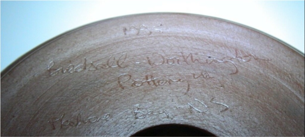
Location: Mahone Bay, Nova Scotia
Types of Work: Functional; Jewelry; Commemorative Plates; Anniversary Plates; Custom Decorated Tiles; Funerary Urns.
Preferred Kiln Type and Firing Process: electric kiln; cone 03
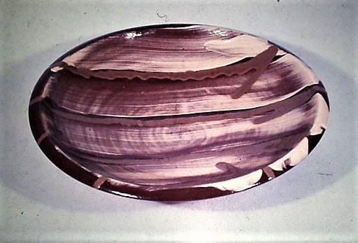
Preferred Clay: Lantz clay, earthenware; from Shaw Group (formerly L.E. Shaw Limited); slip trailing; marbling; underglaze painting.
Website: https://www.pottery.ns.ca/
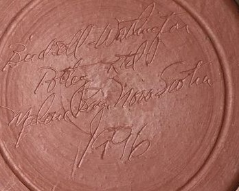
Signature/Mark/Chop:
Biography
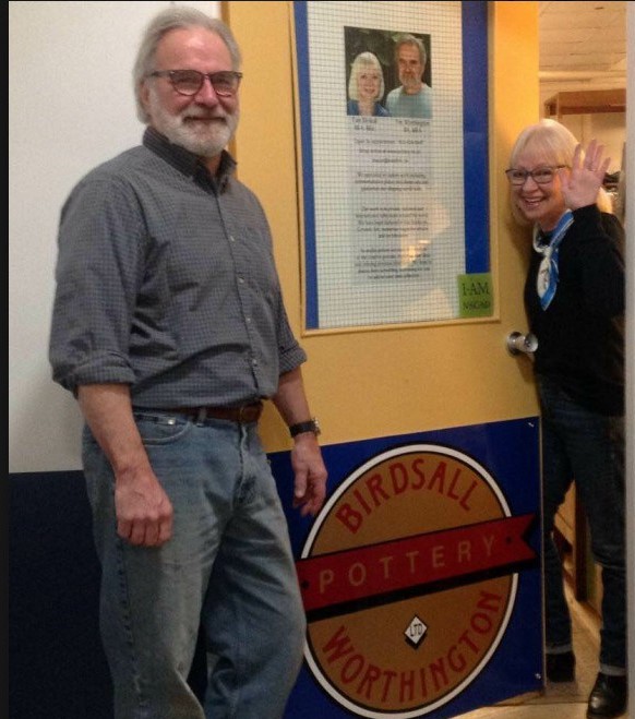
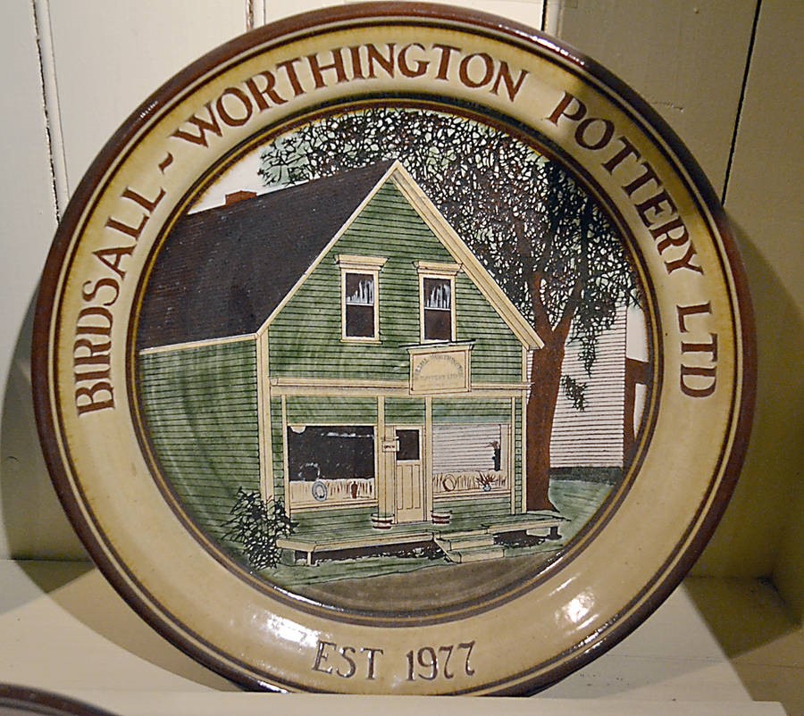
Mahone Bay, Nova Scotia, (population 1036 in 2016)) is a picturesque seaside town south of Halifax on the tourist highway to Lunenburg. The town has had several pottery studios, most now gone. Except for one, established in 1977 and still going strong, Birdsall-Worthington Pottery.
Although today with a recent, slightly different focus on creation and location, the Birdsall-Worthington pottery continues its long tradition. But more on these changes later.
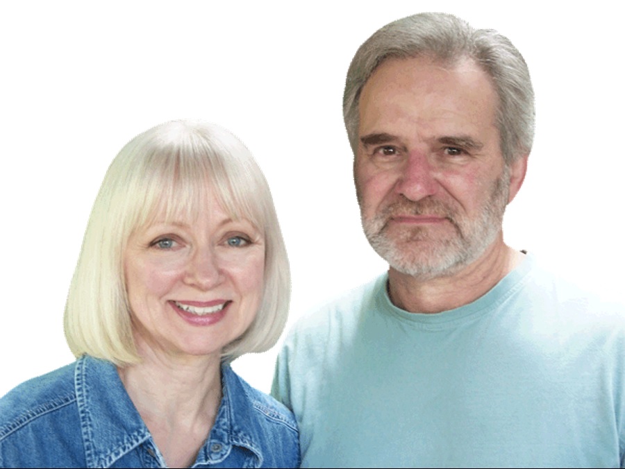
The name, Birdsall-Worthington, indicates a partnership. Partnerships, be they married or business teams, are a quite common and long lasting phenomenon in pottery. Sometimes they have jointly produced work, sometimes have created individual, unique outputs. Frequently there is a cross-pollination of product, style and technique. Several such teams in Canada come to mind: the Deichmanns, the Lorenzens, Hansen-Ross, the Groves, the Harlanders, the Schwenks, the Hermans, and the subject of this page, Pam Birdsall and Tim Worthington.
Pam and Tim are an institution in Nova Scotia pottery. Their production, their studio, their consistency of style and media have been a mainstay for Nova Scotia pottery, and for collectors across Canada.
Like many partnerships it’s a wonder, sometimes, how the two of them even came together in the first place. Tim, after all, is an American from Coshocton, Ohio, who had graduated from Ohio Northern University, while Pam is a Halifax/Dartmouth native. The link here is NSCAD, the Nova Scotia College of Art and Design, in Halifax, the premier art college in Atlantic Canada.
Birdsall-Worthington, The Early Years
Bear with me as first we first explore their individual, early, pre-NSCAD paths: widely separated starting points in subject and geography. We shall then look at their partnership path later.
Tim Worthington: Early Years

Tim’s introduction to pottery was more meandering than Pam’s. He chuckled as he related his early academic career:
“I’m from Ohio and initially started in school in pharmacy, in a real, small, private school. They had an engineering college and a pharmacy college, and it was very much isolated from anything. It was kind of like, you know, a camp. Parents were sending kids there so you wouldn’t get into any kind of trouble. I made it about half-way through the course and it just wasn’t working out, so I changed into the art program”.2
The art department was the lowest priority of the school. At first, he wanted to be a sculptor or painter but in the last year, after witnessing a pottery demonstration, he became interested in ceramics. 2
Graduation, and reality, would kick in. He realised that :
“I couldn’t be a production potter or teach because I didn’t know enough yet.” 2
Fortunately, the career track, of “somebody-who knows somebody-who knows somebody” helped set his direction, and ultimate success.
“Well, a girl who was from the Art College [NSCAD] met Bruce Chesser [his instructor] … in Ohio. … Bruce went to graduate school with Walter Ostrom and that was the connection, really. … So she came down to Ohio to do, like, a short stint with Bruce. So I got to know her and she was telling me about Nova Scotia, and this sounded so exotic! Wow, where is this place? And she was talking about the Art College and that they had a pretty good ceramics department. … I got a good letter of recommendation from Bruce to Walter, and that kind of eased things along, I’m sure. So I came up, and it was really a good situation.“ 2
Tim At NSCAD
He enrolled in NSCAD in 1973. Since he already had his B.A. he was able to work for a year as a special student, seven days a week:
“the progress [was] amazing! The things that can happen! And I got a lot of help from the instructors there. Walter Ostrom and Homer Lord were the two instructors, and Franklyn Heisler, too. So there was a nice blend of different ways of approaching clay, and that was really good for me, too. … So then I applied to Graduate School and was accepted, and [in 1974-76] finished the two year course.” 2
He was the first MFA to graduate from NSCAD.1
But Tim still felt unprepared and was able to continue studying for another year, with a teaching assistantship at the same time. He would use this time to also study the ceramic slides in the department, and to read classic works such as the Unknown Craftsman. Ostrom’s teachings had highlighted Asian ceramics. Their forms and philosophy resonated with Tim. The Asian influence would be profound, especially in some of his vase and urn forms.
“… because Walter was an art history buff we got a heavy dose of Chinese, Korean and Japanese pottery, so we had a predilection to that direction.” 1
Also:
”There were two books, that when I was in grad school I was trying to sort out what it exactly was that I was going to do. I was trying a whole bunch of things. I was casting things, I was fooling around with drawing out pots. And then I’d make them, but the drawings had more life than the pots did. So I was floundering around. And I hit upon The UnknownCraftsman … and the other book that really knocked me out was How to Wrap Five Eggs and it just turned my whole way of looking at things around.” 1
Of this latter book Tim acknowledges the long-lasting effect of its message:
“This book was such an influence when I was trying to find my way with clay in grad school. Form and function personified.” 8
He was now juggling several priorities at this time: he had to prepare a graduate exhibition; he had been introduced to earthenware pottery; the Mahone Bay studio/shop had entered the picture. And he had met Pam.
Pam Birdsall: Early Years
Pam had an earlier introduction to pottery than Tim. She also had the art-inspiration of her mother whose own handiwork would influence Pam’s own work.
“When I was about 3 years old, on a family visit to the Deichmann pottery I saw Erica throwing and thought it was magic.” 1
But for many years it was her mother’s needlework creations that inspired her. This had a couple of long-lasting effects: an interest in precision and detail; and later in her career a love for creating works on a smaller scale.
The first technical step in her art career was a bit of misdirection:
“… a misstep in some ways although there are never any mistakes, I don’t think, but I was at Acadia doing Bachelor of Science. But it was a Home Economics degree because I thought that what I wanted to do was to design clothes. My mom was the one who sort of instilled this, a renaissance woman kind of thing. She could do just about anything. She was a concert pianist and an amazing seamstress. She did ecclesiastical embroidery, which is the most intricate fine gold thread embroidery, on church linens and things… This is the kind of thing I grew up watching. … So I just thought that’s what you’re supposed to do so she taught me how to sew when I was very young and taught me how to be a really good seamstress. I loved fashion so my high school guidance teacher said go to Acadia. “ 1
But it was a mismatch. Ironically the right answer lay closer to her home in Dartmouth, at NSCAD in Halifax. 1
Pam At NSCAD
“I switched to NSCAD and … the foundation year with the full intention of doing apparel design. I did do some courses in apparel design but in the foundation year where you do a bit of everything … I got involved in clay.” 1
(By the way She still sews. Her mother would critique her childhood sewing of dolls clothes and through that experience she learned to love the Wednesday morning critiques at NSCAD that most students dreaded.) 1
Pam now laughs at the contrast between aspiration and reality:
“ it was the height of irony: there was someone who loves clothes and loves fashion, Mostly I [wore] a black T-shirt and jeans covered with clay; but I clean up good when I when I have to.” 1
And, of course, she met Tim. Or he met Pam. I’m not quite sure as to the exact sequence, but anyway, the relationship has been long lasting.
“I was finishing up my final year in Art Education and Ceramics degree and he was doing his Master’s degree, and I really liked his pottery.” 1
Pam describes energy of the NSCAD environment:
“It was exciting. It was a real transition from a Royal Academy kind of school to a ‘blow my mind kind of thing’. There were amazing visiting artists. We were exposed to lots of interesting ways to think and people were experimenting with their own work in new ways, tramping on untrodden ground. There were quite a few people that ran through there: Robin Hopper, Walter Drohan, Jack Sures, Enid Legros, (she was wonderful), Robert Turner, Harry Davis, John Reeves. There were a lot of people with very diverse backgrounds. It just seemed to be a very happening place. And for someone in their mid twenties it was pretty darn exciting.” 1
Who were Pam’s other inspirations?
“Clive Bowen of England, he does slip decorating. A real Leach kind of person, who does simple elegant table ware work. Walter Ostrom was the oriental art history teacher and as advanced students [we] had to take oriental art history, I loved it. Walter had an infectious enthusiasm for things.” 1
For both her and Tim the effects were long lasting.
“One of the reasons Birdsall-Worthington has been so consistent in what we do is because we both admire similar people, Leach and Hamada and that whole studio craft movement. We are studio potters and that’s what we do and who we are, and we are known for that.” 1
Pam and Tim: Graduation and After
Pam graduated in 1974, Tim in 1976. The overlap gave them time as a couple to explore post-graduation paths. In their final school years theyrealized that as soon as they graduated they were not going to be able to go out and just make pots.” 2 Pam therefore, completed a BFA Degree in Ceramics and Art Education, and also, had set up a studio in her mother’s basement in Dartmouth. As a student-teacher she taught adult night ceramic courses for the city for three years. 2
“… after I graduated from NSCAD Tim was doing his final year at his master’s degree and he was the first one to graduate with a Masters in ceramics at NSCAD so when he was doing that I was teaching at what was known as the Central Ceramic Lab and that was in a school in Halifax for the Halifax City School Board. So I have a BFA and I also have a Bachelor in Art Education. 1
These early years were incredibly busy, Tim, while working on his graduate exhibition, had finished his assistantship but was now teaching for a year, replacing Franklyn Heisler. Tim developed his interest in platters at this time.1
Pam, who had graduated earlier, had set up a studio in her mother’s basement in Dartmouth. This was a time of successes, failures and working to stay alive.
There were a few early problems. Though teaching nighttime adult courses at St. Patrick school in Halifax was a success, their artistic production faced technical problems. Pam had started working on a mid-range, white clay body.
“I mixed it all up, and I was going to do a lot of brush work … Well, the whole thing was a disaster. I mixed it up wrong from the beginning, and the proportions were wrong, and the clay just shattered in tiny pieces all over the place.” 1
Lantz clay, a red earthenware clay favoured in Nova Scotia, now entered the picture. Pam remembers it as almost heretical:
“Other schools across the country were still very much high fire stoneware and porcelain, so working and earthenware at that point was almost blasphemous. Yeah things have changed an awful lot” 1
“… at the time I was teaching with earthenware, so I thought, ‘Okay, that makes sense here to do this’.” 1
Earlier, Pam had also learned about slip trailing. Ostrom and Lord were generous in inviting graduates to attend visiting artist workshops at NSCAD:
“Walter and Homer would say ‘Come on in’, if somebody was coming to do something.” 1
“… the first slip trailing I had seen was when Robin Hopper came. He did a week or two one summer [at NSCAD]. I was doing boxes and doing neat little things on the lids. I just kept going and going and going. There were a lot of [barriers], and one of the problems was that there wasn’t anybody else doing slip trailing at the time, at all.” 1
A further professional success was the development of a transparent glaze that would be the foundation for their future work, sometimes modified with colourants. 1
This was also a period when they were participating in fairs and markets. 1 It would not last. Mahone Bay changed their focus
Mahone Bay and Making It
As student and recent grad, they made a big leap of faith:
“When we were in Halifax we were both still in school, and in ’76 we bought the building down in Mahone Bay and moved down there” 1
They set up a retail operation purchasing an old store in downtown Mahone Bay. The business formally started in 1977. Those who themselves have acquired an old facility, set up a studio/store, and created and marketed their work, will recognize the time and energy demands. It is a wonder they even had time to produce work.
From the beginning they had confidence in themselves: perhaps youthful enthusiasm, perhaps a certain innocence. But they were right and made sound choices. Tim explains:
“We were both fresh out of the art college and it was our own place so there was excitement in that. We knew how to make pots. We never considered it wouldn’t work. We knew we had the ability and we really loved making pots. We knew it was going to work.” 1
Why Mahone Bay? Pam explains:
“Franklyn Heisler was from there, and he knew we were looking for a nice town. … Yes, we wanted a place for the business but the town is magical. There’s a specific energy that draws people here. Perhaps it was subconscious, but it appealed to Tim and me on a lot of levels. We were 25, 26, just kids. We bought the building and there you go. The place has something indescribable … a real soul connection for both of us.” 1
Youthful innocence, energy and hope played well.
“ [Pam] was teaching five nights a week, … we bought this place, which was in a complete shambles, and so, on weekends, we came down here and were tearing it apart“ 1
” … one thing strong in our favour, was that we had no idea what we were getting into, at all. And everybody said that, too. You know, their hearts bled for us! ‘There they are, those two, thinking they can do it! And they’re doing it!’ “ 1
Reality also hit in an unexpected way They recall the experience and their self-analysis. Setting up the new physical studio was one challenge. The other was a surprise, production.
“We finally got everything all finished down here; the teaching was done, and we were both down for good, we had moved everything down and we were starting the pottery up the first day downstairs, making pots. [We] didn’t know what to do! … couldn’t think of what to make! Then [we] thought, well [we’ll] rely on all the safe ones that [we] remembered how to make from school. So, [we] made a bunch of these pots and … looked at them and thought, ‘Oh my God, none of them worked, they’re awful, they’re terrible’. It took a while, Then things started to go.” 1
They found success in that there were two of them. Tim adds:
“Well, it’s also nice in the sense that there’s been someone to share it with. It’s not quite the same when there’s just one person. Yes, if it were just me, myself, I’m not sure whether I’d do it.” 1
Pam agrees:
“Pam: Yes, that’s the best thing— that we’re each other’s source of inspiration” 1
They were quickly accepted by the local community and were not considered “hippies: “
“Oh yes, they really like us because we fixed up the building, and we painted the outside, and it didn’t look like we were going to open up a place that silkscreened T—shirts and be out the next weekend” 1
They are still in Mahone Bay today.
A Potter-MLA And A Business To Run
Life in Mahone continued with the usual ups and downs of creating, producing, selling and other aspects of running a ceramic business. Except for one interlude: Pam was elected to the Nova Scotia Legislature for a term (2009-13) as the Lunenburg NDP MLA, and for a time served as Ministerial Assistant for the Department of Communities, Culture and Heritage. She worked on Creative Economy of Nova Scotia, and bringing in legislation for Artists and creating the terms of reference for Arts Nova Scotia. 9
Pam describes the time as
“… four years of total madness.” 1
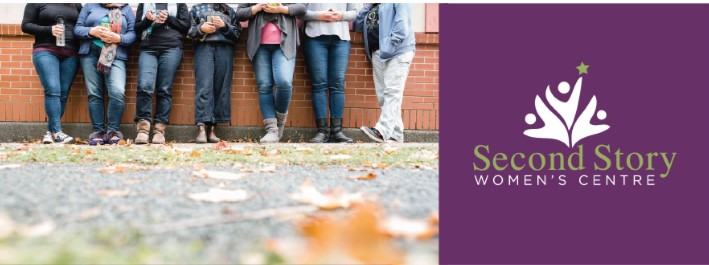
The decision to run, after much prompting, was a result of a social-activist side of her personality, including serving on the board of the womens’ support group, Second Story,(and more recently Be the Peace Institute.) 9
Tim was in full support:
“The opportunity came up and she thought it was a time to put the money where her mouth was. … She enjoyed it even though it took her way out of her comfort level.” 1
Inevitably, with multiple priorities, issues would arise in the studio. She and Tim were to face new technical challenges with a supplier changing its glaze formulations on them. Pam recalls:
“It was a change by the supplier of one of the ingredients in our white slip. No one told us this was a new talc and it didn’t shrink in the same way the old talc did. This made a tremendous difference as we decorate everything before it is fired, therefore the shrinkage rate is critical to the outcome. So it wasn’t a change in the suppliers glaze formulation as we make our own glaze from the raw materials from the supplier.” 1
”I was working all week and then in Halifax or in my office down here and then on weekends I would work on my plates. Some of the plates were special order. I was doing two and three times or more because they were just breaking and cracking it so it was not a good time anyway. We went back to the drawing board and pulled out even more glaze chemistry. Tim with his meticulous notes had pages and pages and tests that he did and was becoming more and more frustrated. Bless his heart, he got through it.” 1
They resolved the technical issues. But In the subsequent 2013 election Pam wasn’t re-elected. So, they now focused and “put their brains together” to work on technical pottery matters.
But overall life and business were good. Their reputations served them well. They were able to sustain product lines, develop new lines, and ways of reaching out to outlets and customers.
But they had been in the same place for over forty years. Although business was still important the need for personal, artistic expression was surfacing more forcefully.
A New Location: The Community Centre. Some New Directions
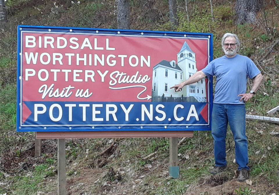
Tim and Pam have recently sold their studio-store and moved their studio into the old school building which is now the Mahone Bay Community Centre. After 40 years of having a retail space they have moved to a place where they “don’t have to open up the store at 10:00 every morning”. Their new location is in the old chemistry lab of the school down in the basement, a bit bigger than their old space since they do not have to have a retail space and show room in the front. 1
”The romance of having your own place was fabulous. We really had a great time. But it got to the point after 40 years. ‘God. We’ve never left this building!’ We just needed to put the time in, put our heads down and work like crazy.” 1
”The shop and talking with people was wonderful but it was distracting timewise. So now we can come into the studio; two or three people might come in but now we get huge amounts of work done. We are so blown away by how wonderful it is to work uninterrupted and not having to keep the store full.” 1
After forty plus years one has the right to call the shots in life and career.
With established product lines in place, and online a new gallery website and frequent Facebook presence, they now have time to create some of the “fun” things they have wanted to do: more time for one-of-a-kind and experimental pieces; for playing with designs, themes and series of special interest to them; and of course, continuing their favoured commissioned, commemorative works. 1
They can also now explore gallery shows, something they have not actively pursued for many years.
“We just haven’t had the time to do it, and now we do.” There is a different sense of lightness and lack of pressure they felt before. 1
Both reflect on their personal needs as well as the artistic:
For Tim life and business are good. He is an accomplished jazz musician, letting the music influence his pottery. He is in a jazz quartet and loves playing music He jokes:

“I wanna be a jazz guitarist when I grow up.” I really love paying tennis as well, and I find playing tennis, playing the guitar and making pots very similar … in that all these things present you with option of being honest with yourself. It is what it is, and you have to accept that. Pots are very similar. The pot has to stand on its own without a whole bunch of artspeak to make it valid. That’s what appeals to me.” 1
Pam still loves to sew, do flower arrangements, cook, and serve on the boards of a non-profit womens’ shelter, and on the board of the Be The Peace Institute working with the Barristers Society on stopping violence against women and girls, on the south shore of Nova Scotia.
Artistically there are new changes, a chance to follow lifelong personal interests. But what keeps them truly grounded is sitting at the wheel. 1
A Birdsall-Worthington Gallery
Firstly, some points to highlight some of the history and technical side of the Birdsall-Worthington business; and secondly, to give a sense of the sharing and the frequent individuality of their partnership.
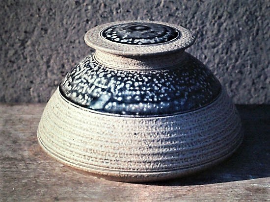
- Their production is slip-decorated earthenware.
- In their Mahone Bay studio they use only electric kilns for their cone 03 clay. It is not practical to have a wood fired kiln.
- Prior to working in earthenware Pam was working in Dartmouth in a “white talc kind of body” but was dissatisfied with the results. She then started to “mess around” with the Shaw Brick Company earthenware clay. She and Tim have used it since.1
- This Lantz clay is their favourite clay. Tim describes why:
“We are terribly spoiled because it is absolutely spectacular to work with on the wheel. They dig it right out of the pit, put it in a 50lb bag and send it to us. You have to process it but it’s very simple. You slice it up, dip in water and throw it in a garbage can over night. Then run it through the pug mill and add a bit of silica sand. It’s a very fine particle size clay because it shrinks too much if you don’t add the sand. … The clay has been aging in the ground for ever.” 1
- Around 1975 Robin Hopper delivered a workshop at NSCAD that included a module on slip-decorating that “knocked both of us out.” 1
- Their earthenware production in their early days ran counter to the teaching and practicing dogma of the day: “stoneware was king.” 1
- Again, around 1975, Pam tested for a white slip to fit that clay body and then found a “nice clear glaze that goes with It”.1
“Initially most things were kind of brown and cream. … Then we just added various oxides to get the various colours of slip. So, then we had transparent coloured glazes. But initially we had mostly a lead glaze look, mostly brown with lines of slip glazed with an amber coloured transparent glaze. It looked like lead without using lead.” 1
- Around 1978-79 Tim and Pam moved into coloured slips giving them more options.1
- Both Pam and Tim have followed the Arts and Crafts approach since they liked form and function, and purposely picked functional pottery to make:
“Just because something is functional doesn’t necessarily means it has to be ugly. In fact, to the contrary, it should be a joy to use.” 1
- Firings are always a mixture of both their works:
“Since there are special orders all the time, we just fill in the space with other things. A special order might take priority at times.” 1
- They appreciate the benefits of partnering. Pam describes the ease of their relationship:
”Tim does the firing of the kilns because he just loves to do that. … He is an extremely precise person with stop watches and beepers that go on and off; everything is done to perfection. So I just say, ‘OK kiddo, do that.’ So he’s in charge of that. Over forty years we have identified what strengths we both have.” 1
- With their electric kilns and wheels, they produced joint and individual works. But no matter who did a particular piece, or feature, or detail, the final outcome would always be signed a Birdsall-Worthington creation. 1
- Tim does all his own brushwork; Pam does all her own slip trailing. 1
- Colour came in early, around 1980, opening up more potential with the white surface decoration.
- Overall, their works are primarily individual, one-off pieces rather than ensemble sets of, for example, table settings, although they are capable of such work

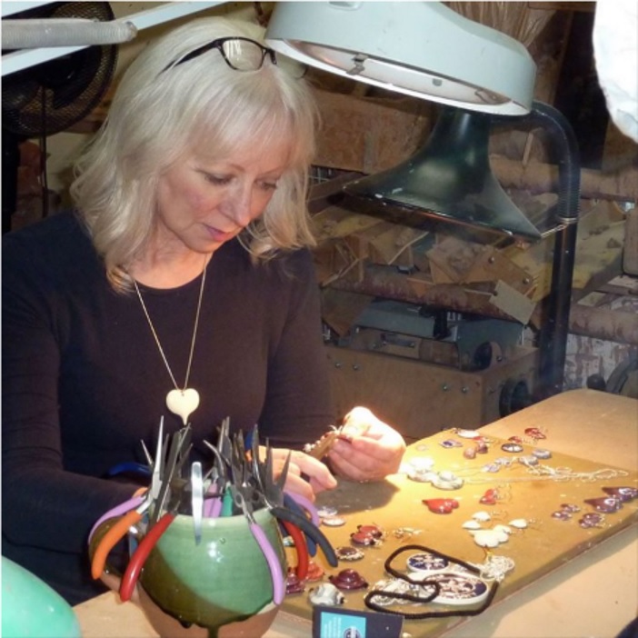
- More recently Pam has been working on items such as jewelry and ornaments that tie in with her love of working in “the small.”
- Tim has been working on forms, themes and images that interest him, be they decorative or naturalistic as in bees and crows.
Both look forward to the artistic freedom that their new studio will provide now that they do not have to work around the demands of running a retail shop. Pam is exploring new forms and clay/glaze mixtures; Tim is exploring surface elements, figurative and abstract, and pursuing his interest in Chinese ceramics.
Early Works
NSCAD and Very Early Days
Some early works suggest the range of possibilities that Tim and Pam explored before settling into their familiar Birdsall Worthington wares.
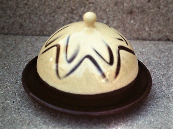
Left: Tim Worthington, 1973, Lidded Vase. Cone 10, Stoneware, Salt glazed, Stoneware. Centre: Tim Worthington, 1976, Bowl. Cone 03, Earthenware, Brushed and trailed slips and transparent glaze; Right: Tim Worthington. 1977. Butter Dish. Cone 03, Earthenware, finger combing in white slip.
Above left: Lidded Vase, 1973, is an example of Tim’s early explorations, pre-grad school. Stoneware, and therefore a higher firing temperature along with salt glazing display a potential direction not taken. In the centre: his 1976 Bowl, for his grad show Tim was already exploring earthenware and enjoying the use of colour. Here he applies red, purple and white glazes in layered brush strokes and drizzled bands in a rectangular design that play against the circular form of the bowl itself. The whole is a blend of controlled layering. On the right: His Butter Dish of 1977, the white slip covering the brown earthenware hints at the favoured slip techniques he and Pam would settle on as a ground for decoration, adistinguishing characteristic of their ware.
Pam, who had just graduated was exploring clays and glazes for functional ware.
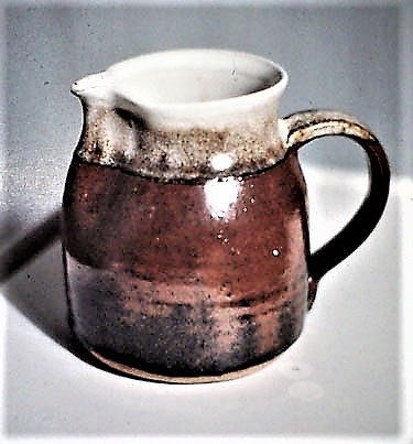

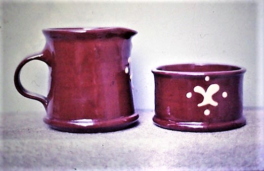
Left: Pam Birdsall. 1974. Pitcher. Cone 10, stoneware, Iron saturate glaze; Centre: Teapot with Cream and Sugar. 1974. Cone 10, Stoneware, salt glazed with ash glaze; Right: Cream and Sugar. 1977. Cone 03, Earthenware, white slip trailing and transparent yellow glaze.
Here, a Stoneware Pitcher, 1974, with bands of iron saturate glazes is a sturdy example of functional ware that would attract early career potter. Pam would continued in stoneware for a while here with Tea Set , 1974, speckled glazes, here salt and ash glazes. The colouring on these early works is brown, a colouring that she and Tim would soon move from. The Cream and Sugar, 1977, hint at the technical developments she and Tim were to follow for the rest of their careers in earthenware. Here the forms are softer, smoother in form and contour, highlighted by the evenness of of ” not-brown” colouring, and simple white slip trailing,
Mahone Bay
When they first opened their studio, their work was predominantly white slips, uncolored slips, really. They developed a turquoise and a pale blue they trailed on the brown surface. 1 But their first productions were, they felt, too, homogenous:
“People would come in the shop and say “that’s really nice but everything’s brown. And we thought maybe we need to broaden our palette more.1
“… and it was pretty darn boring. We would look around the shop and everything was brown so probably, it was it in the first year or so, we really wanted to add more colour and experiment with the white slip more. So then we started really covering the surfaces with the white clay, and then I started drawing and feathering. … That’s one of the things that I [Pam] absolutely love and I’m the only one of the two of us that does it.” 1
By 1979 they had expanded their glaze repertoire taking their transparent glaze and adding more colorants: They had their pale yellow, which was a very small degree of burnt umber, then a deeper umber colour glaze, and then pale blue and turquoise and dark and light green; applied over the white slip base. The pots became more colorful. 1
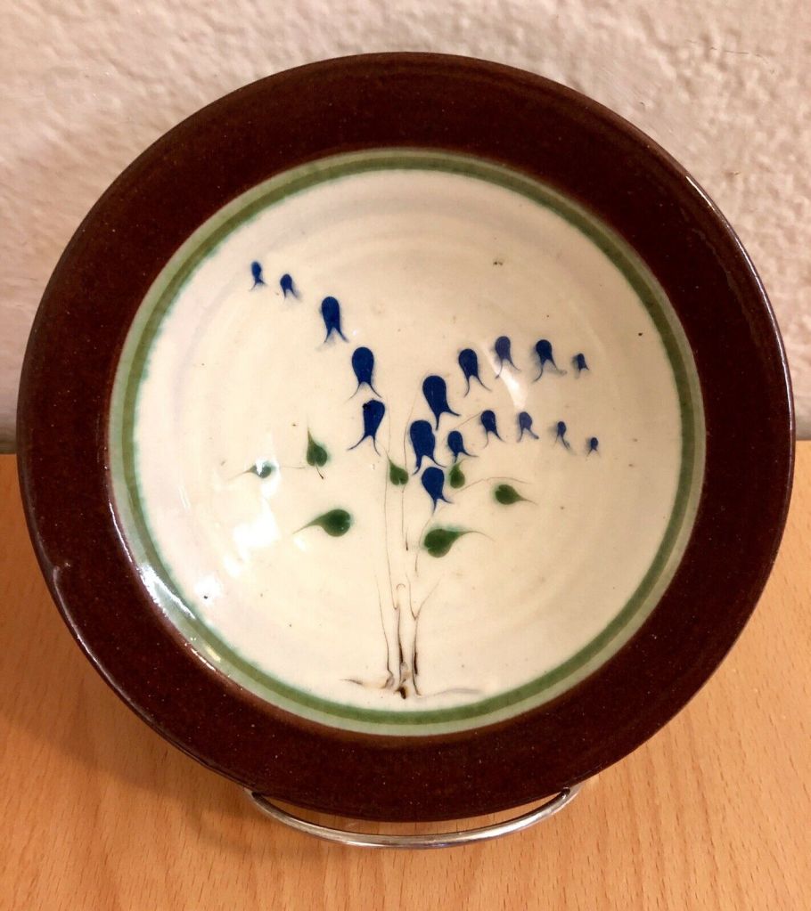
The Bowl’s white base, like a white canvas, allowed for naturalistic decoration. Here, Bluebells, in a loose dropped and feathered style, would find echoes in the decoration of Pam’s later Anniversary and Birth plates.
Jars, Vases and Bowls
Much of the bread and butter of their careers were a set number of forms. Variety came in their surface designs: sometimes linear “blank” areas, sometimes sponged patterns; other times with washes of natural forms such as irises.
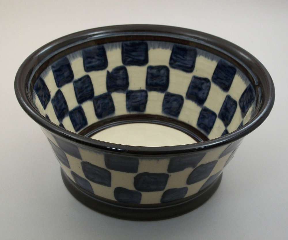
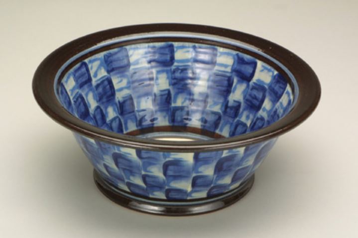
Earthenware. Dark blue clay squares sponged on 22.2 cm diameter.
In both above Bowls the brown clay was covered with a white clay slip. Dark blue slip squares were sponged over the white using three different sized cut sponges. On the left the design is tight, regimented, contained by the narrow rim. On the right the lip is more flared and flattened; the design is one of movement, angular momentum as though the centrifugal force of the wheel has drawn out and blurred the squares and rim.
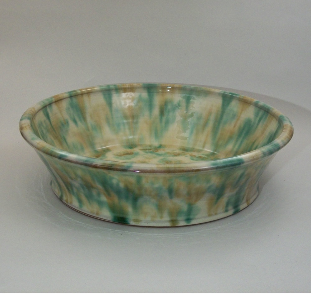
This Serving Bowl is a wider and shallower form showing their wider colour range. On the walls the glaze is sponged on, yellow over green in vertical sweeps. The colour of the bowl’s well is regularly but loosely dabbed. The design flows uniformly over all surfaces unconstrained by the linear banding of the rim well contour
Other works would display other painterly interests.

Birdsall-Worthington. 2015. Olive Bowl.
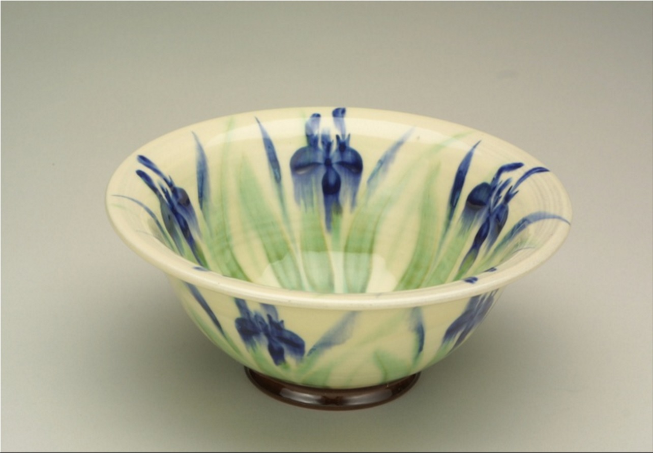
Birdsall-Worthington. 2012. Iris Bowl. 8.5 cm x 18 cm diameter.
Naturalistic motifs would become more explicit, with the same dichotomy of loose or tight control as in the Olive and Iris Bowls above, in either precise or gestural treatment. Also, there is a similar interest in replicating interior and exterior “pictorial” designs.
Brooches, Pendants, Earrings and Ornaments
The Birdsall-Worthington studio also expanded into the clay production of small and large works.
Although Pam does throw, from the beginning she has always had an interest on the “small” and in multiples: items such as jewelry and commemorative items. But typical of their joint production, while Pam will work on their concept and design details Tim will work on mould and firing techniques. 1
Around 1980 Pam started designing and creating smaller work, jewelry, pendants, earrings. Why? “Sheer economics,” initially.1 Around 1978 they attended their first government sponsored trade show. The government of the day had identified a need to help small artisan businesses. They went to the trade show with their pots and obtained orders from across the country. But it did not take long to realize that doing very detailed slip decorated pottery for half price was not a smart move.1
Talents and interests from the past came into play this time with a somewhat ”industrial” slant. Pam describes:
“Over the years because I sewed I had a collection of antique buttons,… so I made plaster moulds of some of those and turned them into earrings , and then I started modelling my own different designs. But the whole Idea was to make something small and light that I could train someone else to do at some point; that we could use for a wholesale product that would actually make us some money and allow us the time to work on pots which is what we wanted. Their making demanded precision.” 1
Pam did hire assistants that she trained to produce the works, and developed a network of agents across Canada, and New England.
“You could put three or four hundred dollars worth of earrings, which was a lot of money in the ‘80s. and put them on the train from Mahone Bay. Shipping was much less much expensive then. It was a real bread-and-butter kind of thing. But we did not have to compromise the pottery.” 1
Her techniques and style would change:
“But what I’m doing now very different from that and I’m doing it all. I’m doing a lot of marbling with the same slips that we decorate. It all plays into the fashion design and other things I am interested in anyway.” 1

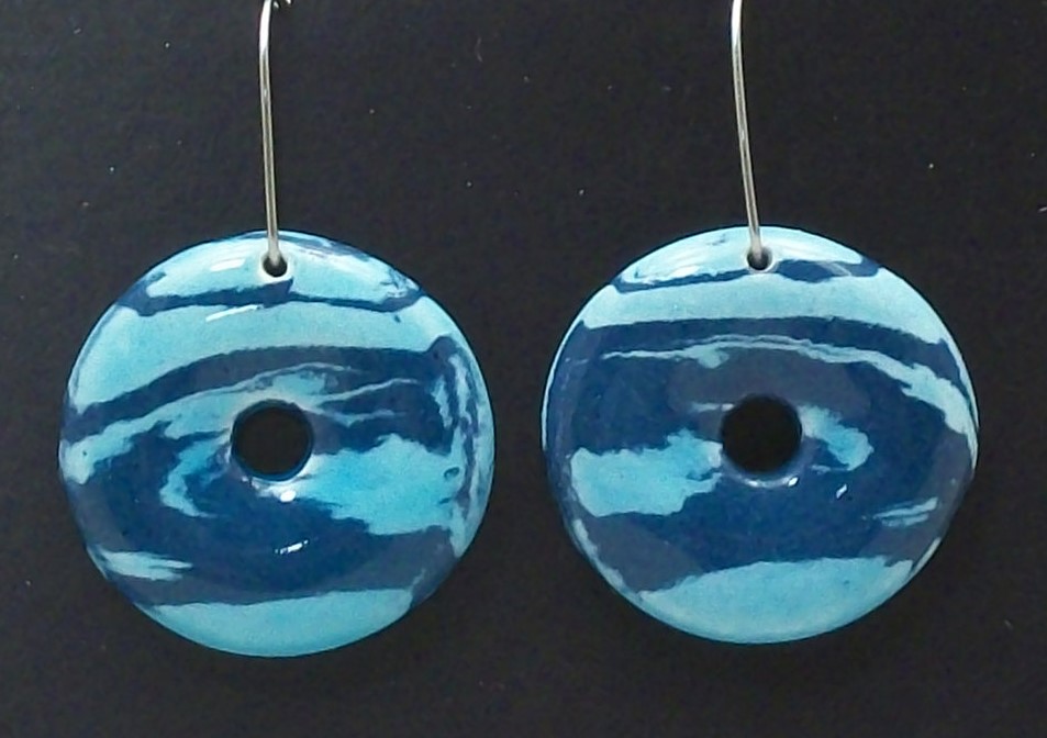
Here Pam is manipulating the clay body itself rather than treating just the surface. The clay is carefully combined and cut in a way that creates a mirror-imaged earring.
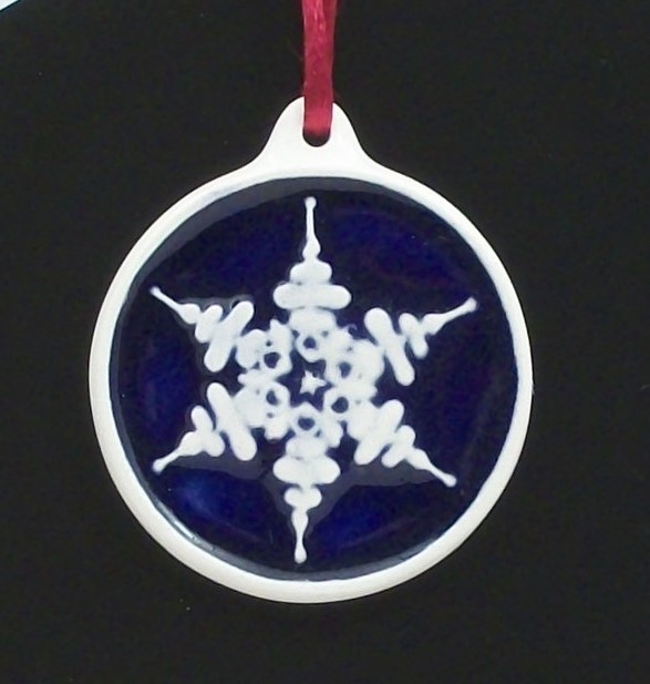
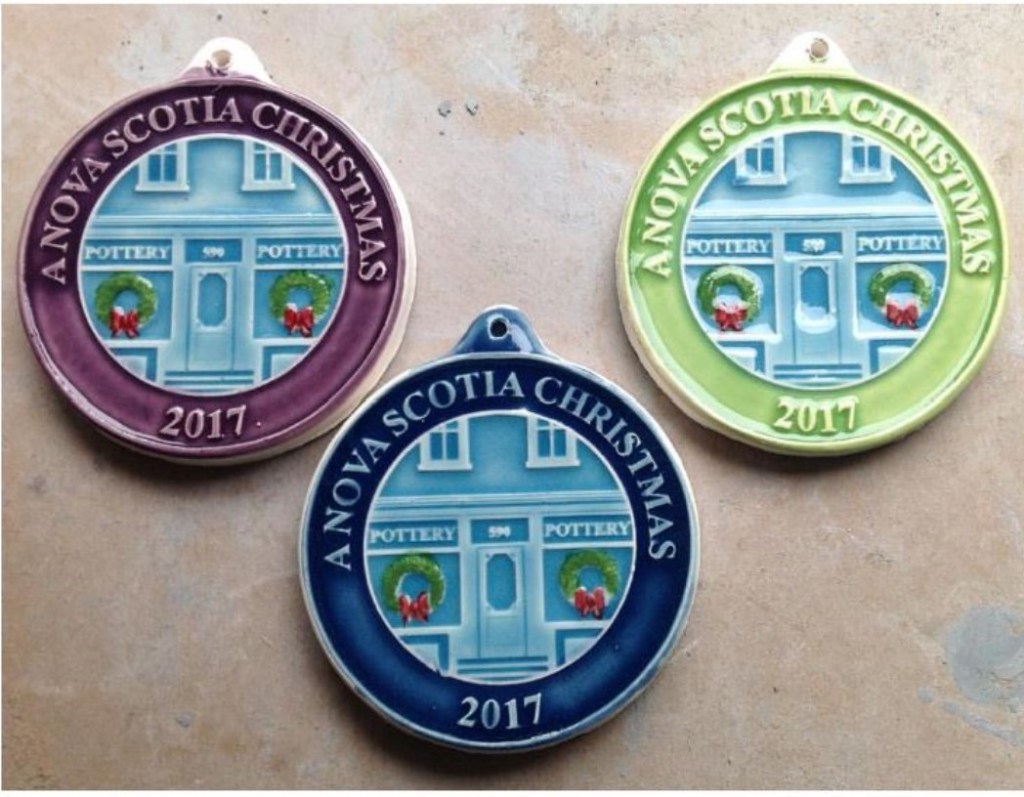
Christmas Ornaments
Spoiler alert! Christmas ornaments once annual seasonal items are now collectors’ items. Pam and Tim no longer produce them annually. Pam explains why:
“The 40th year and the sale of the studio marked [their end]. … Between three and five hundred would be the edition. There are other things I want to spend more time on now, and I was the one who did most of it. … I just decided that I would rather do something else …. It was a logical time with the shifting from the studio.” 1
Tim describes their creation:
“Every year we did a limited edition of Christmas ornaments: carved in plaster, then a master made.” 1
He had learned plaster mould making techniques from a Scottish mould maker. 1
The “Glaze Test” ornaments on the right above give a hint as to the online focus of their future online marketing endeavours. The colour variations, purple, denim and line green are in fact a customer survey as to preferences. Their is a nod to the “old” days with the old studio storefront as the subject.
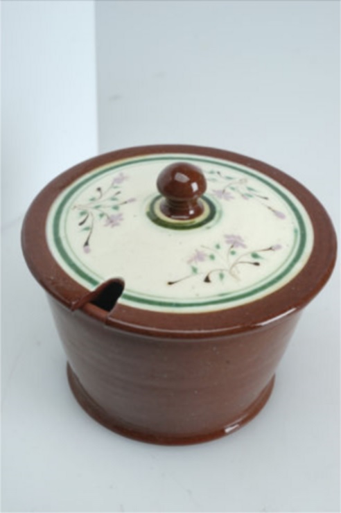
Large Plates
Pam and Tim create two main types of large plates: personalised commemorative, and “artistic.” Although both are client-personalised, the latter speak more to the artistic impulse of Pam or Tim.
Personal/Commemorative Plates
Pam and Tim make commissioned plates for several occasions: wedding/anniversary, birth, graduation, and house and pet portraits. In so doing they acknowledge they are continuing an old tradition dating back to 17th century England and the work of artists such as the Toft family.1
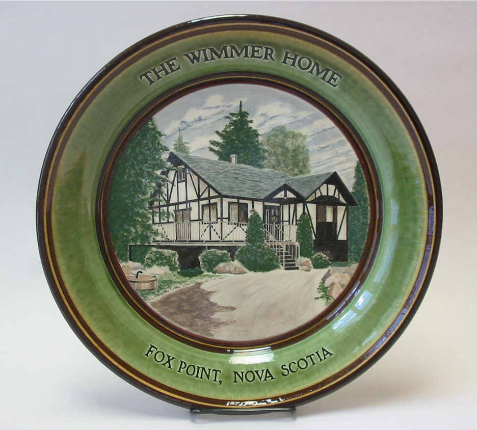
Although they each make their own items they do collaborate. Tim will make a plate with the underglaze painting of a house or boat or airplane, drawing in the slip. Since he and Pam use the same glazes and slips, joint kiln firings work well.1
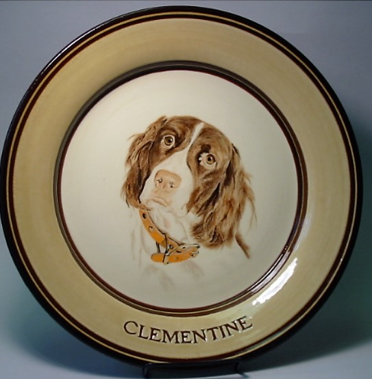
The image is handdrawn by Tim in the centre of the plate with the name carved into the plate rim.
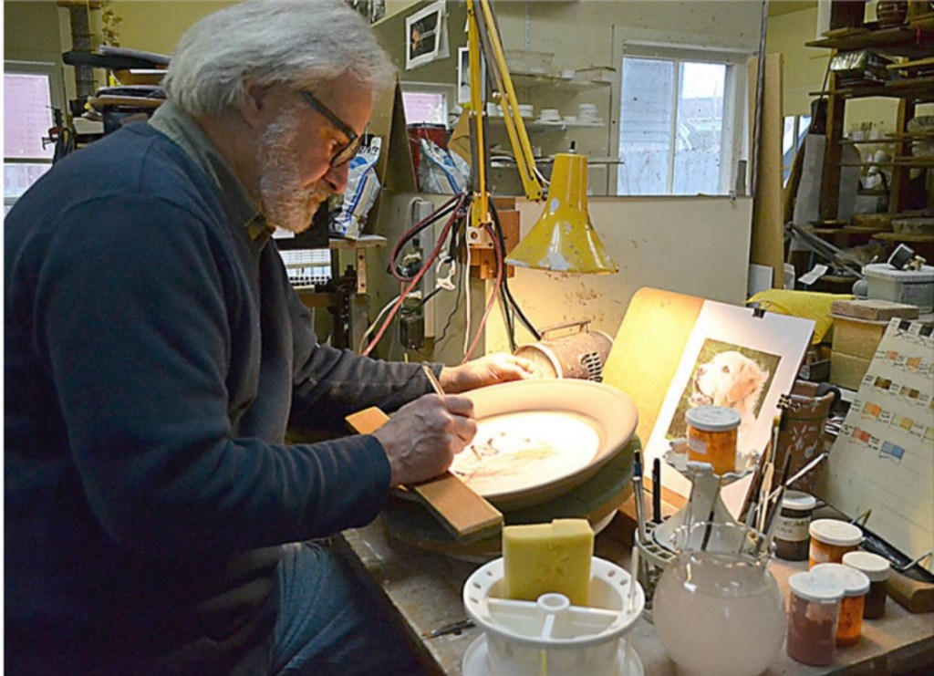
Tim will throw a plate, applying a white slip ground, “letting it dry up a bit” and carving information that goes on the rim; he then draws with a pencil, first, from a photograph, lightly etching the pencil line into the surface of the slip. He then scratches in the image using a darning needle mounted in the end of a drawing pencil but does not go all the way through the slip. It will be almost like an etching. He then fires the work. All the pencil lines burn away, and he has a drawing in the white slip surface. He then adds his colours using underglaze.1
Tim reveals a passion for his style of plate decoration:
“I’m basically a frustrated water colour painter. I really loved watercolours when I was in art school. So, I have been treating the underglaze more like a watercolour. The beauty of the ceramic material is that it’s permanent.” 1
He has done the same work on tiles for his children of local scenes, and sees this as a possible venue to explore, making “permanent art”, when he has more time. 1
Event/Family/Anniversary Plates
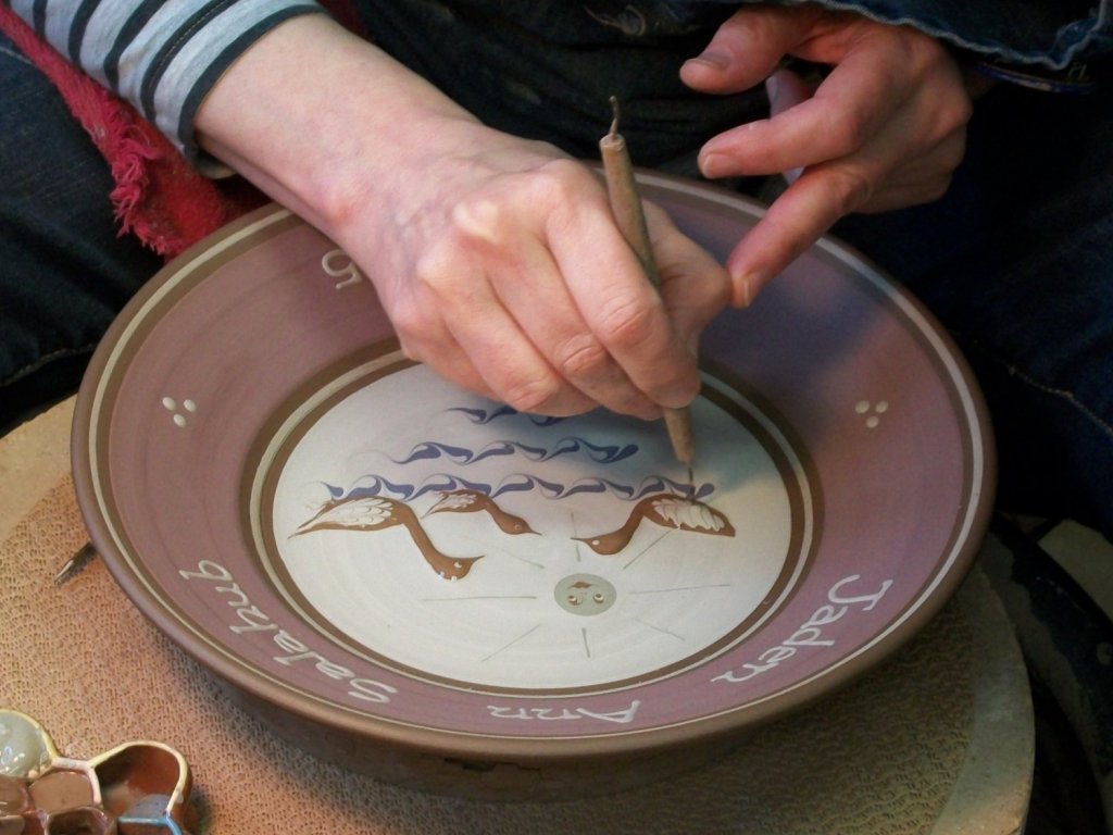

Pam enjoys making family anniversary plates. Her style is noticeably different from Tim’s: playful, using muted pastels. For children’s plates Pam does the throwing and slip trailing/feathering. For birth plates, Pam creates the decoration in the centre and Tim carves the names around the plate rim; Pam then slip-trails the wording.
“… that’s all done with feathering and it gets incredibly precise, meticulous and I just absolutely love that.” 1
“You have to breathe in a certain way which is something that I don’t think I’ve ever talked about [before] … “When I start the letters, I take a breath and then I do a letter and then I take another breath and do another letter … I do them very quickly so I’m not holding my breath and turning scarlet but there is a whole-body involvement in the whole thing “. 1
The Anniversary plates are much desired items. Frequently family requests for birth and wedding versions are multi-generational.1
Plates Just For Pam and Tim
The second type of plates purely reflect their own personal interests and inspirations. They can be functional or, for Tim, personally artistic.
Inspiration comes from many sources. For example, Tim’s pinwheel designs come from his continuing interest in Asian design.

Here the Bowl displays Tim’s interest in Japanese heraldic design, a pin wheel form that energizes the interior with a centrifugal energy.
Earth Pins and Pendants
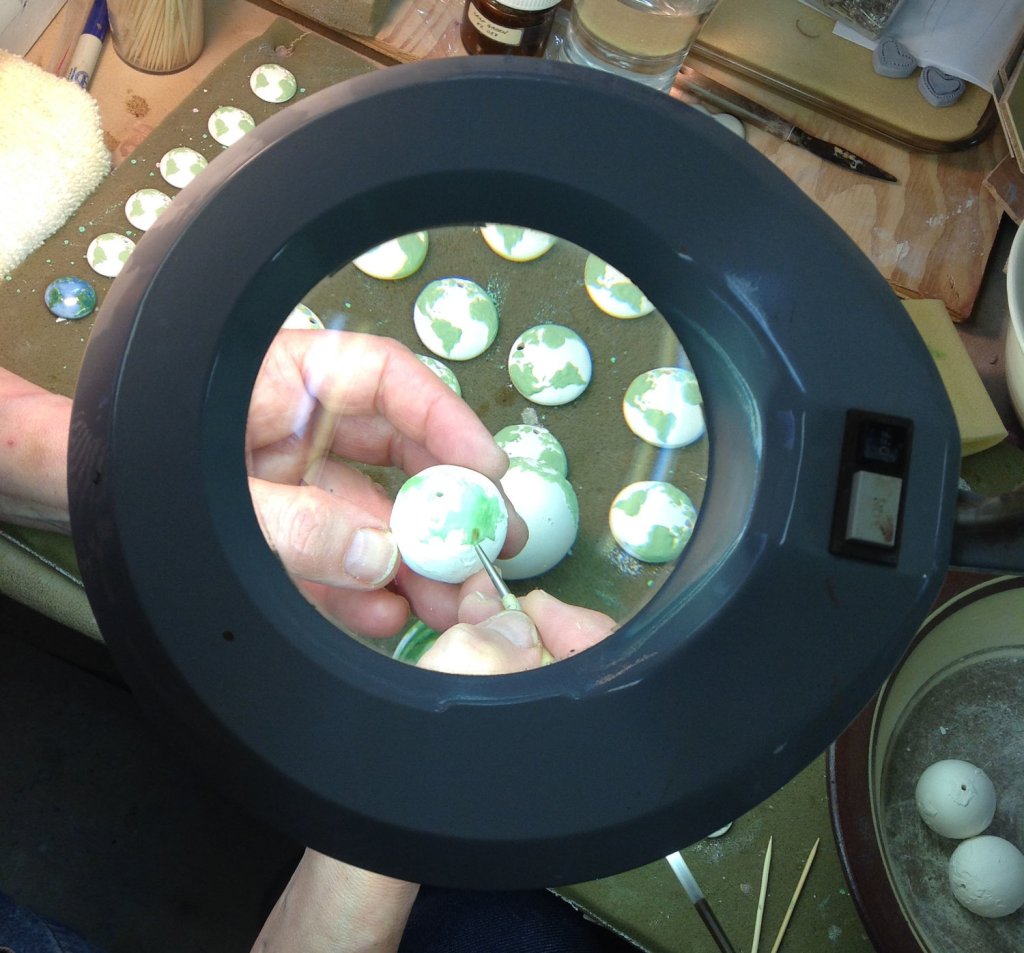
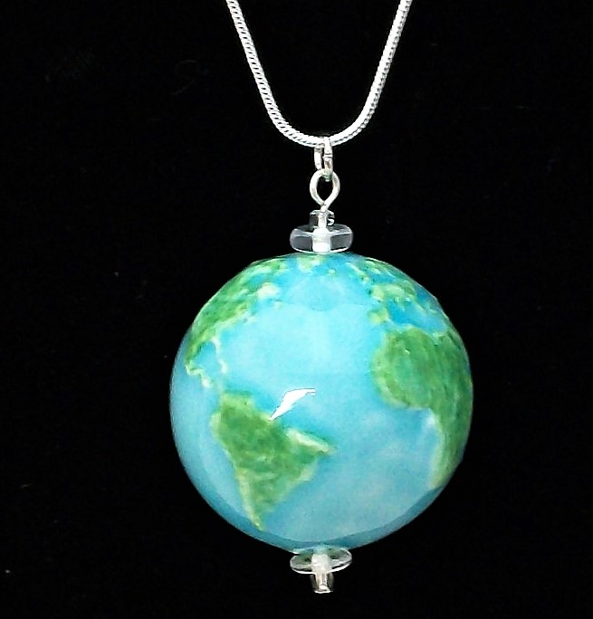
Pam started making Earth Pins in the ‘80s before the internet became popular. Then as pins became less popular as a fashion item she turned to necklaces and pendants. They were far more complicated requiring a two-piece mould that she carved using a large magnifying lens. Pins for Canada and Nova Scotia were developed. The series evolved with the addition of pendants of the Earth, Canada and Nova Scotia.

This Earth Pendant is a shallow domed disc. With dental tools and magnifying glasses Pam carved the image of the earth, in reverse, into a plaster mold. White clay is cast into the mold to create this image. Pam then hand paints the continents with a green underglaze and covers the oceans with either a pale blue or turquoise transparent glaze.6
More recently, Pam has added fully, three-dimensional miniature Globe Pendants.
Other pendants highlight North America Canada, and ‘heart” Nova Scotia. She draws the continents on the inside of the two mould halves, inside out and backwards. The two clay halves are joined, the seam smoothed. They are, therefore, hollow. Pam creates the design and final product. Tim will help creating the press moulds and creating tools such as stilts to fire these small items.
“I think the genius of our collaboration is that we figure out an end product and then walk backwards and say what do we need to invent to make this work.” 1
Pam created this theme through long-held beliefs:
“Be mindful of the planet because this is our home. I’m a very spiritual kind of person.” 1
A New Location, New Explorations: The Old School House
Shifting to the new studio was liberating for both Tim and Pam. Their new studio is in the older section of the old school built in the early 1900, in the room that used to be the chemistry lab. They are renting the space. They had to vacate their old building by March 27, 2017.
Relieved from the demands of being retail shop owners Pam and Tim have looked forward to now also exploring more personal avenues of creation. Says Tim just before the move:
“… I can’t wait. The thought of waking up in the morning and realizing I don’t have to get up and open up the store by ten o’clock will be like being retired.” … I’m hoping it will provide us with time. We’ve been in a very good situation in that we have never had a shortage of ideas but because of the nature of the shop that we have now, some of those ideas are impractical to embark on. So, there are things we would like to revisit given that we wouldn’t have to be divided between a retail shop and studio. We can now just stay in our studio and work. We have our patterns and routines worked out quite well over forty years of doing this. It’s not unrealistic to think we could work 4 days a week instead of seven days a week. 1
Although they have always had the opportunity to create works of a personal interest the new location now enables them to more fully explore that very personal side while dealing with the business side. This is quite typical of that push-pull effect between personal creativity and business needs that so many potters have to deal with.
Though the forms are familiar, the decoration can now be adjusted to personal and perhaps newer client needs. Personalized anniversary and commissioned works will still be a staple, however. These they enjoy making.
Tim now enjoys the time to explore painterly images and his love of ancient Asian pottery.
Always a lover of watercolour painting and nature he has explored new designs as in his “Murder Of Crow” series, or using bees as a decorative motif, or designs of only dots and circles.
Lessons learned from earlier production experience are acknowledged:
“The kick is to find the rhythm in the making.” 1
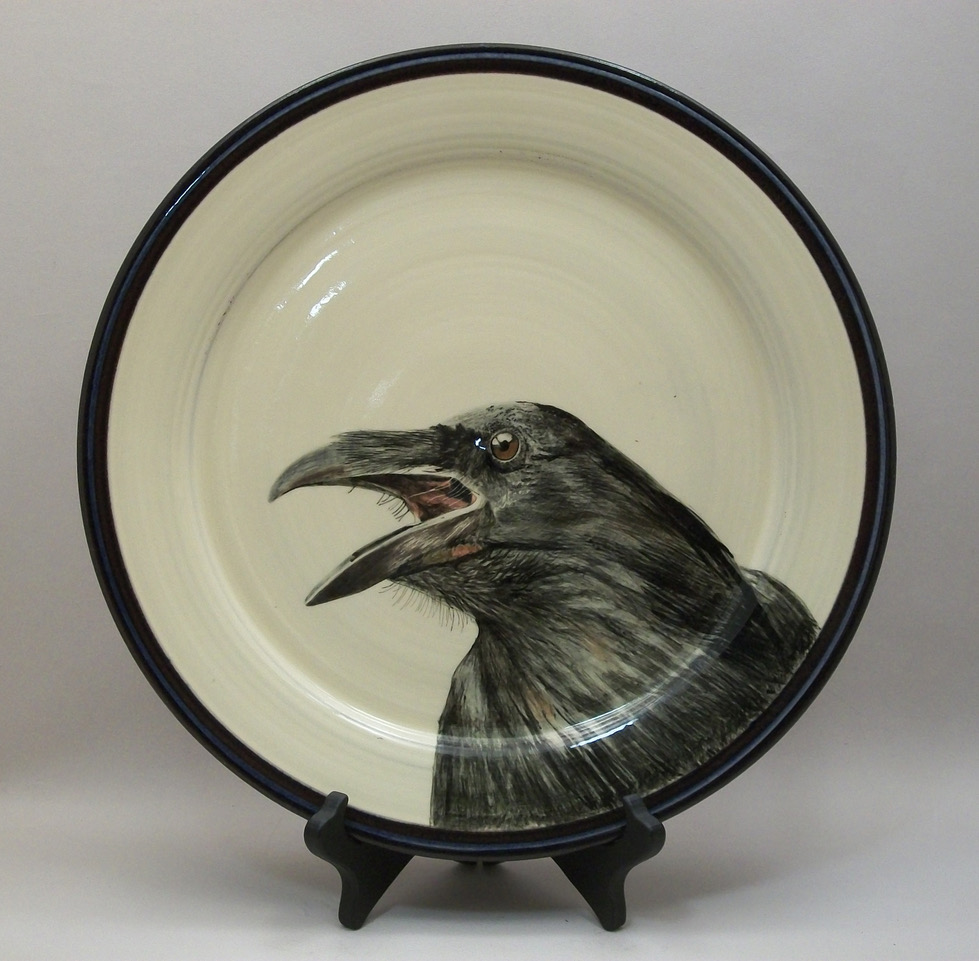
The Crow Plate Made of Lantz clay with white slip and underglaze covered with a transparent glaze and fired to cone 03. Patient layering of colour, with the ability to scratch back through to the white base, gives a greater control over the image.
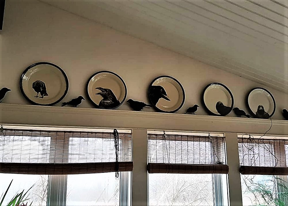
The crow figures in between are Dollar Store crows and are there because his wife loves crows. 1
Urns and Vases and Jars
Lidded ware, including urns, show elements of individual interest. There is still technical sharing, although personal features are now more evident.
Pam has continues enjoying the exploration of the “small” a long-lasting carry over from her earlier days of fashion design and needlework. It will be interesting to see what new creations she develops.
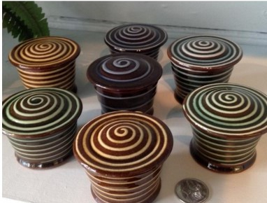
Here a series of Jars are given a sense of scale by the 25¢ coin. We shall see more of her “small” work below. The slip-trailing is precise, controlled. The coloured glazes make for a variety of similar but still unique results.
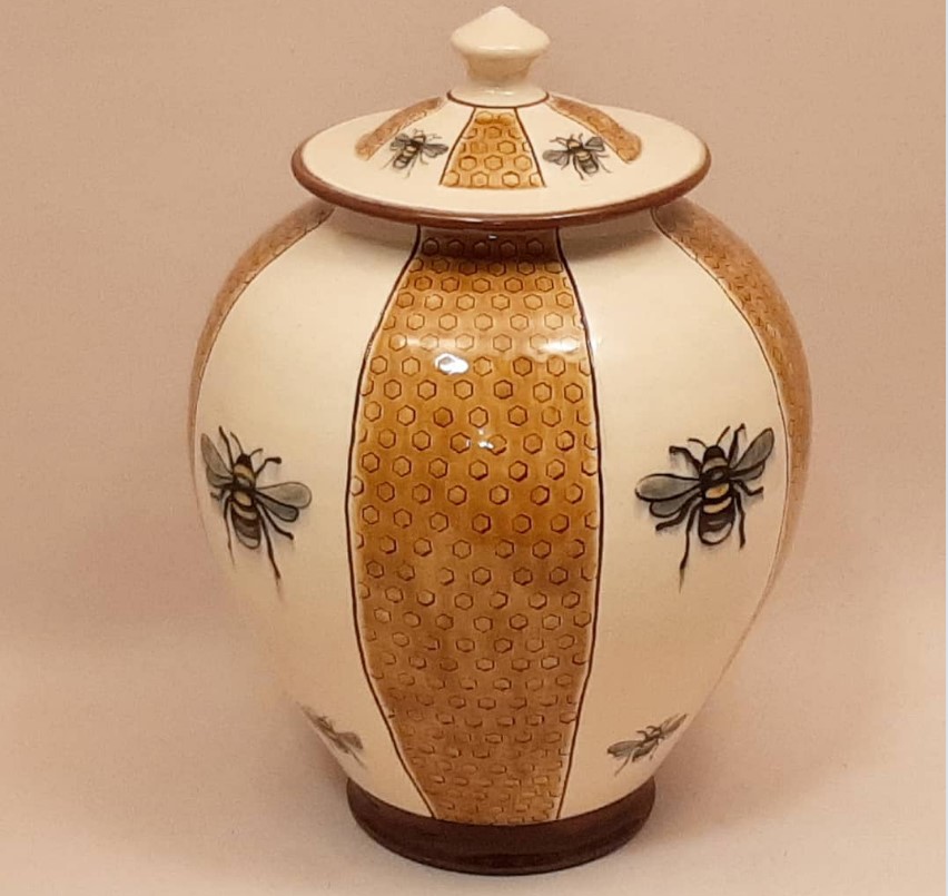
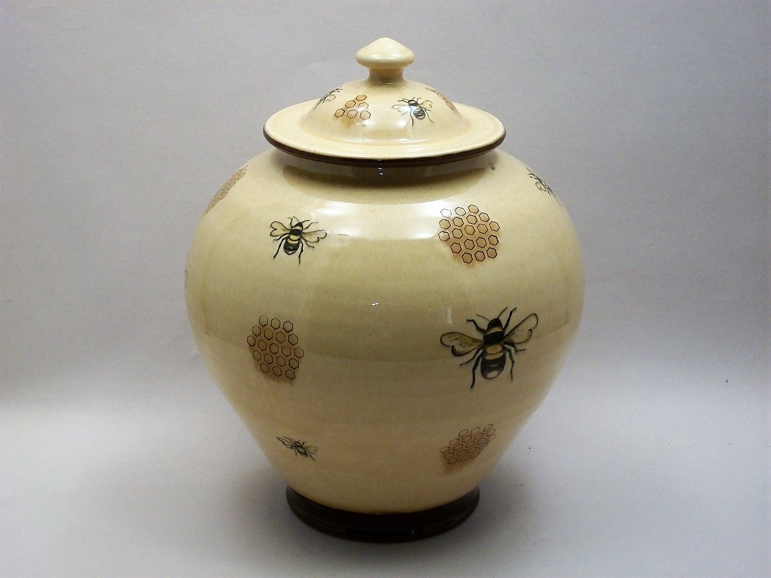
Tim, always fascinated by Chinese and Japanese ceramics, now intends to more fully explore this direction.1 He incorporates Chinese forms decorated with subjects that are of interest to him such as bees and honeycomb. The designs are on jars inspired by 9th century Chinese funerary urns. These two Urns below are interesting from a surface design perspective. The left is of tight, vertical segments, the right of more subtly arranged elements, seemingly more “loosely” placed upon the surface. Yet in these two works Tim keeps the underlying geometry of design elements.
Underglaze hand painted decoration on a white clay
slip background, covered with a pale transparent
coloured glazes. 26.7 cm. Cone 03
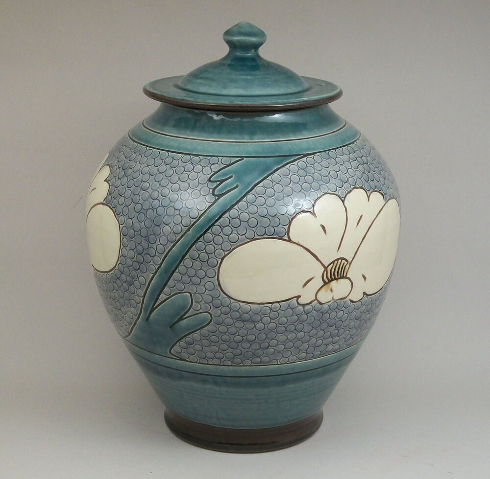
Birdsall Worthington. 2018. Lidded Jar. Hand thrown Lantz clay. Hand painted underglaze decoration on a white clay slip background, then covered with a pale transparent yellow glaze. 26.7 cm tall.
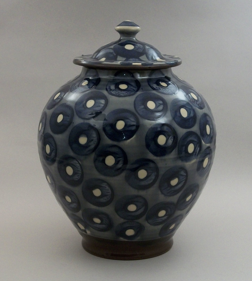
Birdsall Worthington. 2019. Urn. In the combined style of two of types of Chinese pottery: Tang Dynasty and Ts’u-chou
utilitarian wares.
Tim here above explores, with great effect, the potential of varied surface design on a consistent, uniform shape and urn size. The left is of a metallic blue-grey base colour with blue-black circles enclosing cream dots, the whole spiralling down from upper left to lower right. They cover the entire surface including neck, lip, lid and finial. The effect is of mass, solidity; less of thrown pottery than of carved stone. The urn on the right, looks as though decorated by an entirely different artist: the elements, foot, belly, shoulder neck and lip are fully defined. The overall colour scheme is of greys blue-green, and cream. Where elements such as the foot, neck and lid are a solid, blue-green, horizontal band, the belly is more varied: large cream peonies are framed by blue-green stalks that cut across the mid section in a dramatic angle. This whole section is backed by a dense layer of small dots that energize the work. The belly is thus of broad brushwork area and of small circles, these latter done with a piece of brass tubing when the underlying white clay slip had the consistency of cheese. 10
Tim says of such works as he explores other Asian form:
“I love repeating patterns. I also like over-all patterns that don’t require orientation.” 6
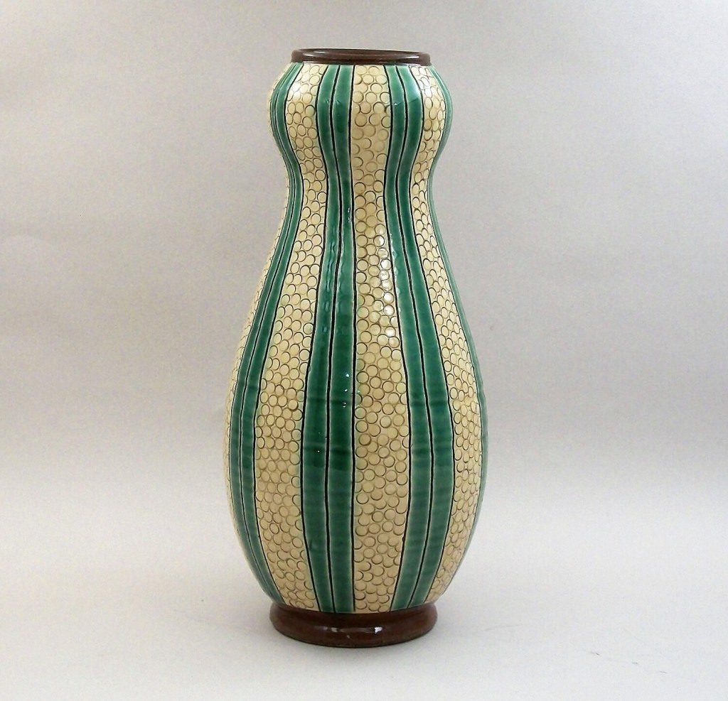

Though the forms are new much of the process is familiar: Lantz clay, wheel thrown and covered in white slip. Again, the variations come in the the decoration. On the left Double Gourd Vase, meticulously incised lines and circles to create a vertical pattern of alternating panels of yellow and green glaze that accentuate the form. Below, on the right a bamboo pattern in amber glaze subtly follow the shape. Forms are here defined by either precise placement of decorative elements, or by the flow of organic elements.
Birdsall Worthington Pottery has a long and respected history in Nova Scotia ceramics. The move to a new studio location and to new opportunities for artistic exploration will continue that history. Their move to a new location has also led to a new marketing strategy using a new website as well as Facebook and Instagram: an interesting blend of traditional inspiration and new technology.
Links to Sites for More Works and Information
- Facebook videos: Both Pam and Tim have their own Facebook pages as well as the Birdsall-Worthington page, on which they often place short videos of the creation of works in progress. Their individual pages tend to be more personal than clay-business based:
https://www.facebook.com/Birdsall-Worthington-Pottery-Ltd-112927425395196
https://www.facebook.com/pam.birdsall
https://www.facebook.com/timothy.m.worthington
- Tim Worthington had a blog several years ago where he often posted pages of a technical matter, especially on slip decoration: https://earthenware1.wordpress.com/tag/slip-decoration/
Endnotes & Bibliography
1. Interviews and correspondence with Pam Birdsall and Tim Worthington. December 15, 2017 ff.
2. Transcript of Ann Mortimer/John Chalke interviews for Canadian Connections, a presentation at the 1980 NCECA Conference, Syracuse, NY, 1980.
3. Thompson Ross, Judy; Allen, David; Czegledy-Nagy, Nina. Down to Earth. Nelson Canada Ltd, 1980.
4. Mackie, Ray (curator) Tyler, Chris. Shaping Space: A Celebration of Lantz Clay. Mary E. Black Gallery and Nova Scotia Centre for Craft and Design, Halifax, 2009
5. Gayle Wilson Shape of things to come.2017-12-20. LighthouseNow. Bridgewater, NS. https://lighthousenow.ca/article.php?title=Shape_of_things_to_come
6. Birdsall- Worthington website: https://www.pottery.ns.ca/
7. Tim Worthington. Earthenware: Thoughts from 30plus years of potting. https://earthenware1.wordpress.com/tag/slip-decoration/ . An old WordPress blog of Tim’s
8. Yanagi Soetsu,Bernard Leach The Unknown Craftsman. 1972. Tokyo, Palo Alto, Calif. Kodansha International.by Yanagi, Soētsu;
Hideyuki Oka How to Wrap Five Eggs: Traditional Japanese Packaging. 1967.
9.Pam Birdsall’s Linkedin page. https://www.linkedin.com/in/pam-birdsall-32637491/
10. Birdsall Worthington’s Facebook page. May 12, 2020. Birdsall-Worthington Pottery Ltd. | Facebook
© 2021 studioceramicscanada.com
