
Carol Smeraldo In The 1970s Checking A Pot She Is Throwing
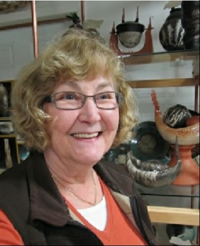
Carol Smeraldo today
Carol Smeraldo Capsule
Dates: 1942-present
Production Dates: 1969-present
Studio Location: East Preston, Nova Scotia
Types of Work: functional and sculptural
Preferred Kiln Type and Firing Process(es): cone 6, oxidation, electric kiln firing for porcelain in two 7.5 cu. ft kilns and one 10 cu.ft. kiln, all top loaders; fast gas firing for Raku in a Randy Brodnax front loading kiln.
Preferred Clay and Sources: Raku clay from Tuckers Pottery Supplies in Ontario; translucent porcelain, “Frost” from Laguna Clay Supplies in California; local Lantz clay from Shaw Brick Co., NS.
Website URL: www.smeraldopottery.com
Blog: http://carolspottery.blogspot.com
Signature/Mark/Chop: Her earliest work are signed “cf or” “cFolinsbee”; then in the One Off Studio as “cSmeraldo” in her own script; signed only if she made entire work since she has used assistants

Carol Smeraldo 1969-72 engraved signature: CF signature.

Carol Smeraldo 1969-72 engraved signature: c Folinsbee N.S.

Carol Smeraldo 1975-1976 engraved signature: Smeraldo 76.
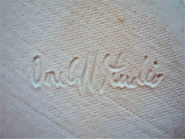
Carol Smeraldo c. 1984-87 engraved signature: One Off Studio for functional work.

Carol Smeraldo c. 1988 engraved signature: One Off Studio stamp for work made by employees but decorated by Carol.

Carol Smeraldo 2005-present engraved signature on sculptural raku work: c Smeraldo N.S.
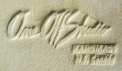
Carol Smeraldo. 2005 to present, custom made rubber stamp signature on production work: “One Off Studio (logo), Handmade N.S. Canada”, forms made by assistants, altered and decorated by Carol.
Carol Smeraldo: A Biography
She has sailed in storms off the East coast, canoed in Canada’s icy Northern Barrens, weathered the creation and running of pottery schools, and oh yes, found time to create her own ceramic work. These are just some of the many sides of Nova Scotia artist, Carol Smeraldo. Carol’s importance lies not only in her work but also in the insights she provides into the state of ceramic arts at the time, the early ’70s and ’80s.
Carol is an artist inspired by place: either external or geographical, usually associated with water; or, more recently, the internal, of mind, of the creative cycle, of life and re-birth, of myth and legend. Her creations say much about her inspiration, whether it be a ceramic deconstruction of myth as metaphor, or her need to learn. Also, to say she is an avid teacher is an understatement.
Carol believes in a lifetime of learning and being open to inspiration in the most unexpected places and experiences. She loves that which takes her breath away especially if it encompasses some mystery. The most consistent theme in her work throughout her career has been water: the ocean, rivers and lakes, including under water. Inspiration has come from living near the ocean, paddling on northern canoe expeditions, scuba diving, or now living near a wilderness lake with nature all around. She is a traveller, having visited outside the Maritimes such places as, Vancouver Island, New Zealand, Australia, Venezuela, and many parts of Europe, absorbing inspiration.
Since 2003 she has also reached into the internal landscape, exploring the ‘Creative and Re-Creative Cycle’, expressing her understanding of the ups and downs of inspiration through myth and metaphor.5
Originally from New Jersey, Carol spent her summers from 1960-66, working as a chambermaid in Provincetown, Cape Cod, Massachusetts, to pay for her education. Provincetown was a well-known art colony attracting New York writers and painters such as Mark Rothko, and Robert Motherwell.¹ She initially wanted to be a teacher studying education, at Wittenberg University in Ohio in 1960-1961. Painting studies followed at the Rhode Island School of Design (1961-63), with a degree in Education with a minor in Art History from Boston University (1965). This was capped by studies in ceramics at the Massachusetts College of Art (1969-70).5 The groundwork for her future activities was set.
In her earliest years she taught art but eventually moved into pottery. Part of this phase, from 1967-69 sounds like something from a movie script but hints at her future success in promoting art. As an art teacher at Prince Elementary School on Newbury St. (the gallery district of Boston) for kindergarten through grade eight she says:
“[I] established an actual Art Room, an Art Club and an annual “Paint Out” event which burst onto Newbury St. with art work all along the sidewalk fence and life size papier maché animals such as a giraffe in the tiny front yard. The art district was stunned, not really having realized there even was a school on their street. The area parents were delighted to help. My supervisor started bringing lots of different art and craft supplies that other teachers did not know how to use. One day a kiln and supplies arrived! I started taking adult ed. craft courses.”5
Pottery became a more important element in her life. Carol describes her new passion and the more limited resources of the time:
“[I] couldn’t seem to help myself! So, then I went back, to the regular classes (at Massachusetts College of Art) and took masters’ classes, … and really got a foundation. And I was still teaching, so I would go there, and spend until 2 in the morning, throwing, throwing, throwing. Because I had only a year, and I knew I had to get it all, while I could, because I was going to be moving. And it worked out, … But after that, I was pretty self-taught. I had to figure things out. And we all did! There weren’t all the books, and computers, and all that sort of thing. You really had to figure out how to do things yourself. “ ²
The main book sources were the universal Leach’s A Potter’s Book and Rhodes’ Clay and Glazes for the Potter. Coloured illustrations at the time were more rare.
Her move to Canada in 1972 was a result of marriage to a Canadian, an Albertan. She came with him when he received a scholarship to work at the Bedford Institute of Oceanography, in Dartmouth, Nova Scotia. The marriage dissolved but she stayed in Canada. Her second and current husband, by coincidence, is also an Albertan, from Jasper.¹
Carol extended her ceramic education in Canada, by taking Advanced Ceramic courses in 1975 from the Nova Scotia College of Art and Design (NSCAD), Halifax. Her learning has never stopped.
She found a fertile field for her energy in the new environment:
” There wasn’t even a Craft Council at that point. There wasn’t anything. There was NSCAD and Max [Roulston] at the Craft Centre (sic). And there were the craft shows at Dalhousie, twice a year, when we would get together.” ²
The period 1972-75 was an active start-up time. She quickly set up her studio and even moved into the equipment supply business:
“I bought 4 Estrin motorized kick wheels for my studio and then became the distributor … I sold wheels all over the Maritimes to emerging potters and to schools just beginning to set up pottery programs. I made lots of pots to sell at the Dalhousie Craft Markets where I met other potters, did throwing demos and held participatory Raku events. We bought our supplies when we could from a potter’s basement in New Brunswick or shipped from Ontario. I taught classes in my studio and mentored more serious students.” 5
NSCAD was to be her initial lifeline.
“ There were very few people in the clay community. Very few potters, really. I did take a course … from Walter Ostrom, as a production potter. He was not into his maiolica yet, he was still into stoneware , … And that was very exciting. I went back in order to fill in the gaps.”²
Around 1974 she
“…took [a] course with Walter [Ostrom]. And I took a course with Franklin Heisler, that was basically five of us going to Europe, and visiting all kinds of different potters and potteries, and Wedgewood China Factory, and Italy, and Spain. It was a fabulous trip really.” ²
While her early work was in the Leach functional tradition there were hints of future directions:
“ …because the whole idea, from Bernard Leach, and my dream too, was to be able to make pots that were beautiful, but affordable to the average person. Therefore, I knew you’d have to make lots of them, and you’d have to make them well. That was the idea that we all had. In the back of my mind, I had the idea of sculpture, and more one-of-a-kind pieces, but mostly, it was to do with making functional pieces. “ ²
Carol describes and laughs at some of her early experiences at that time:
c“The whole idea was that you wanted to make an oatmeal reduction with spots. That was the look. That was the thing. You couldn’t sell dark colours, even though we all loved them, but you could sell oatmeal with spots.” ²
“ If you mix chrome – which normally produces a green – with tin you get a bright pink. This can be quite shocking. I did this a long time ago just before a craft fair. And pink pots were not popular in the ‘70s and ‘80s. There were several nice potters. One fellow came by and said, ‘Congratulations. That is fantastic! No one else has the guts to make pink pots!’ ” ¹
But to more fully understand Smeraldo one has to also appreciate that at heart she is also an organizer, teacher, and as previously mentioned, entrepreneur:
“… you slowly got to know people. But because there weren’t any organizations, you didn’t meet other people very readily. Now I pretty quickly realized, because we had no pottery supply place, and had to order from Ontario or from Maine, that people needed [pottery] wheels. So I became the distributor for Estrin kick-wheels.” ²
Along with her production work she also she taught pottery until 1983.
“… the major activity [was] at craft markets. I also started teaching. I had been teaching in Massachusetts … on a small scale. So I started teaching in my studio. I got to meet a lot of people that way.” ²
Connecting with other potters was a driving force for Smeraldo:
“ I had had a pretty good taste of what it was like to work by yourself, and really craved an environment where there would be more creative people and more space for students. I found working alone really difficult. I just really craved to be more connected with other people doing the same thing.” ²

Carol Smeraldo and Ann Mortimer at the official opening of the Halifax Studio School of Pottery, January 1980.
So in November, 1979, she opened the Halifax Studio School of Pottery in the Marble Building ² on Barrington Street with two partners, the Russian School of Ballet, and the film production company, Doomsday Productions.¹ The school had four potters’ studios, classroom space and a gift shop.5 She operated and taught at the school to 1986 ³ until one of the partners moved out of the building.¹ Through the school she not only met other potters but also developed other major co-op activities:
“… we needed tons and tons of clay. So we would bring in clay, and other people would come in and order, and we would meet, and everyone would come in, and get their stuff off the truck. And if you forgot anything, that was too bad! “ ²
Though a notable, and recognized accomplishment, running the school produced inevitable stresses on her producing her own work.¹ She became exhausted, between caring for children and family during the day and working on her pottery in the evenings. Her situation was familiar to many “mother-potters”.
“I loved teaching but needed to work at home and be with the kids.” ¹
“Well, it was going all right. The problem that I had was that I wasn’t getting any time for my work … [I]n my studio space we had four studio spaces for four potters and nearly 70-80 students. … [T]he only time I could get any personal work done was at night. The other difficulty was that we adopted two children, brother and sister, at the same time. My husband would look after them in the evening, and I’d look after them in the daytime, and I’d work in the evening, until midnight in the studio. And you know, you can’t do that for too long!” ²
Today she is still joyous in the accomplishments of the school and its impact on the development of pottery in Nova Scotia:
“… oh my goodness, a whole slew of people came. We worked together with NSCAD, because at that time, they didn’t have a space that they could use for workshops. And so we would initiate it, and get it started. And they would [bring] chairs … and students, which was really good, since it meant that students and potters and my pottery students as well, who were adults, were all together, socializing together, and enjoying these fabulous workshops! … In fact, during that time, there seemed to be really much more interest in being involved in the community. It was great. Between Homer Lord and Walter Ostrom, there was lots of interest in working together.“ ²
In the excitement and networks of those days she also connected with other notable Nova Scotia ceramists such as Tim Worthington and Pam Birdsall, and the Zimmers, Chris and Muriel.²
In addition to raising a family, running a school, and creating her own work Smeraldo also found time to serve as president and Chair of the Standards Committee of the Nova Scotia Designer Crafts Council (1976-80) and was appointed Director of the Nova Scotia Art Bank (1979-80).³ No wonder she was tired!
But she was still the night owl:
“ In the early days I would get in the zone overnight and see the sunrise.” ¹

Carol Smeraldo of One Off studio display at a craft market. 1979
The 1970s were a “renaissance” period in Canadian crafts. There was an excitement and energy among craftspeople little seen since. In Nova Scotia craft markets were key. But there was no central organization or group at first:
” … [At] the craft markets … It was hard to keep ourselves each in our booths, because we’d want to talk to each other, and share dilemmas, and challenges. And why is this glaze doing this, and all those sorts of questions. Craft markets were great for that. And that’s part of the reason that more and more people realized that we had to have an organization, to get together. We also wanted an organization because it seemed to us that if we didn’t, the government would simply make decisions for us. Because there was interest from the government to promote and to help support the craft industries. But all of us felt it was REALLY important that it be done on our terms, and that it be done for the benefit of the crafts people, and that the Canadian government couldn’t know that without consultation with the craftspeople. So that was a big push to get together, and form an arms-length organization, before the government made up its own mind about what programs should be. And that was the inception of the Nova Scotia Designer Crafts Council.” ²
There was brief interlude in all this activity in Canada. In March, 1982, Carol moved to Washington DC for two years where her husband participated in a scientific exchange program. Carol always the student, and thanks to a Professional Improvement Grant from the Nova Scotia Department of Culture attended George Washington University. She hired a friend to run the school in Halifax while she was away. While in Washington she joined Grey House Potters in Arlington, Virginia, set up her studio, and displayed and sold her work. At university she studied mold-making, casting, and throwing bowls and plates over a plaster hump mold to use back in her production studio in Nova Scotia.5
By October 1986, back in Nova Scotia, she had started construction of her studio in East Preston, attached to the back of the house:
“… where I could be available for my children, focus on my own work more and continue an active production studio with assistants.” 5
In the Spring of 1987 she had her new studio up and running:
“ … with lots of room for all different work stations for clay prep., wheel throwing and hand building, decorating and glazing, a separate firing room with 3 kilns, clay storage, a 2nd separate room for my office, etc., and lots of windows with views of our wilderness lake and gardens.” 5
With this new studio and stepping back from all her previous activity, from 1986 to 2001 Carol focused on production and selling, working out of her studio, hiring assistants and selling wholesale to outlets across Canada and the U.S.³
However, the pull of teaching was too strong. From 2001 to 2013 she was the head pottery instructor at Atlantic Pottery Supply.³ It was inspirational but eventually she was again not getting her own work done. She retired again.¹
She admits to her need to teach, however, as almost an addiction:
” I was born to be a teacher. I just love teaching. I love the excitement of students discovering things, and the “ah-ha” effect when students get it, and its going well for them. And also, after this many years, I just have so much information, and I’m a person who gobbles up all the information, and I try to utilize it any way I can. And so, why should I keep all that to myself? That seems crazy. And so part of the idea is to try to share out some of the experiences I’ve had over the past thirty years. And that’s very exciting to me.” ²

Carol Smeraldo’s studio from the lake, East Preston, Nova Scotia.
But for the past few years, inevitably, as part of the flow of the creative cycle, she has again retired to concentrate on her own work. She now lives and works out of her home and studio, One Off Studio, on the shores of Lake Eagle, East Preston, northeast of Halifax-Dartmouth.¹
Smeraldo has always sought out, teaching and learning – ‘gobbling up’ and ‘sharing’ – to use her own words. Through this need she brought to Nova Scotia, among so many others, artists such as: Canadians Robin Hopper and Ann Mortimer; and Britain’s Michael Casson and David Eeles; and many Americans. She knew of such artists partly from books, partly by connecting personally with other potters, and partly through NSCAD, especially Walter Ostrom, who she said ‘wanted to reach out.’ She also learned through magazines such as Ceramics Monthly and Studio Potter, and through exhibitions. ¹
Also, always the student Smeraldo has continued her learning by taking more recent workshops with other internationally known ceramic artists in addition to those just mentioned above: Jack Sures, Harlan House, Tony Clennell, Bert Borch, and Enid Legros-Wise from Canada; Etsuko Watanabe from Japan; and Americans Cynthia Bringle, Steven Hill , Tom Coleman, Robert Piepenburg, Randy Brodnax, Chris Campbell, and Linda and Charles Riggs, to name only a few. 5
But as before, teaching, operating, creating and parenting would be a drain not only on energy but also inspiration: there would be periods of boom and bust, of creativity and slump. Thus her later, and current, seeking meaning in the myths and metaphors of life, death, rebirth and creation in both her art and her life. More of this in the Gallery of her works below.
For both her creative, organizing and teaching work Carol Smeraldo has received many honours and has been designated:
- 1990 An Honourary Member of Nova Scotia Designer Crafts Council
- 1981 Designated a Master Artisan by the Nova Scotia Designer Crafts Council
- 1980 First Nova Scotia Cultural Life Award
- 1979-80 Director, Nova Scotia Art Bank
- 1976-80 President, chair Standards Committee, Nova Scotia Designer Crafts Council
While accomplishing all this Carol has a endless sense of humour. Occasionally other random thoughts sometimes flash into her conscious realm. While also still a painter she laughs at the perceived value differences between pottery and painting:
“Pottery is the heartbreak craft. You create the work in clay, glaze it and subject it to tremendous heat in the kiln. A painter can make a fabulous painting in a day and charge 3 or 4 times the price. One day while spray-painting details on a work I’m thinking, ‘If I were doing this on canvas I could sell this for three times as much. Why am I doing this?’ When they are on clay people downgrade the value in their minds.” ¹
Many other ceramists would share these same thoughts.
Carol Smeraldo: A Gallery
Some General Thoughts
- The following are some general thoughts on Carol Smeraldo’s work and processes described on this page.
- But be aware, I am only scratching the surface of her production and creativity. She has developed so many subjects, forms, styles and processes, although within a select number of themes. The number and variety of styles and functions are extraordinary, including vases, sculptures, lamps, hangings, wall pieces and other forms. To see the full range of her creations look at Carol’s website .
- Her works can vary from the functional, to representational, to abstract, and to the personally spiritual.
- Some of her works are distinctly traditional, others are plays upon traditional forms. She will frequently combine other media with her ceramics: metals, wood, wire, marbles
- One of her favourite reads for recipes is Ron Roy’s book Mastering Cone 6 Glazes: Improving Durability, Fit and Aesthetics. 4
Early works
Carol Smeraldo. 1970s. Early untitled functional works. Stoneware.
Carol Smeraldo. 1970s. Early untitled functional works. Stoneware.
“These pots are from the 1970’s when I was beginning production work. Having been influenced by Bernard Leach and Shoji Hamada, I aspired to make pots as beautiful as I could but affordable by many. In the 1970’s oatmeal with speckles was very popular as was reduction firing. We cone 6 electric potters were looked down on a bit so we made glazes to look like reduction. The tall vase with ribbon handles is upside down holding dried stuff in its pedestal.” ¹

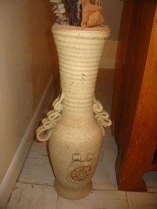
The upside down tall vase hints at her later playing with standard themes and concepts and the naming of her studio, One Off:
“From the beginning, I felt that my work was more one off than straight repetition. For example, when I threw mugs, each one was slightly different as I searched for an ideal. I eventually realized to my chagrin that as much as I loved wheel throwing and had made a lot of good thrown work, I wasn’t really cut out to be a wheel throwing production potter in the strictest sense of that since I couldn’t tolerate making the exact same piece over and over again. Each new piece explored the “what if” possibilities.” ¹
Inspiration was to come also from her travels to Canada’s north. She was inspired by wilderness canoe trips with her husband to the Barrens and South Nahanni regions. Such works reinforce her strong connection to land and sea. ¹
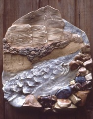
Carol Smeraldo. Cache Rapids: South Nahanni River. 1976. 76 x 74 cm. Stonewares and porcelain. Cone 8 electric.
Cache Rapids: South Nahanni River. 1976. There is an almost ceramic ”Group of Seven” quality to these early northern adventures:
“We went on a trip to the Barren lands in which we were dropped in by float plane, when the lake was open on the edges, and we were going to wind our canoes around where it was open. Unfortunately, the wind came in that night, and blew all the ice in to where it was open, so we chopped our way across, and scootered our canoes across, until we could get to open water again. … that is where the influence came from!”²
This “square” work, a distinct shift from her functional work, is a landscape picture in clay, a close-up, “photo-cropped” style, with cliffs and boulders separated by a turbulent river sweeping down diagonally to the lower left. The whole has a coolness about it, with the waters an icy blue-gray. Cliff, water and boulder surfaces all pulsate with their different surface textures and projections
In a similar theme Smeraldo also created ashtrays, an item so familiar to and necessary for functional potters at the time.

Carol Smeraldo. Non-Ashtray Ashtray. 1976-78.Stoneware 20.3 cm.
Carol Smeraldo. Non-Ashtray Ashtray. 1976-78. The landscape theme continued even in those now out-of-favour tobacco-related items, ashtrays, once a key income source for many functional potters. Typically Smeraldo she gave them her own title:
“ I continued to make lots of functional work with unusual designs and functions such as “Non-Ashtray Ashtrays” where the smoker perched their cigarette between rocks and the idea was that the ocean washed the shore clean.” 5
A late 1970s Bert Borch workshop on stretched clay, with the slab carved and imprinted then slapped down multiple times to stretch into more organic patterns, inspired her to create new relief surfaces. Her winter murals were one result. ¹

Carol Smeraldo. 1979-80. Winter. Porcelain, 71 x 78.7 cm.
Winter. 1979-78. Porcelain, In this seasonal theme Carol took advantage of the inherent colour of the clay.
“I went through a transition time, where I made wall murals that were white on white. I was very impressed with Canadian snow, and that was my response.” ²
New Learnings In Washington DC, 1982ff
The two year break in Washington allowed her to refine her production line and process with new slump molding techniques she returned to Canada and hired assistants to help with the work. Colour becomes more obvious:
“When the opportunity to study design and mold and hump mold making at Geo. Washington U. came up, it seemed timely. I started my new successful lines of production work upon returning to NS. … I reenergized my own enthusiasm for my work by designing and developing new variations of these techniques for more organic style slab hand built production work. I could still teach assistants to make the forms but then I would alter the forms and add more complex decoration with painting underglaze by hand and spraying stains myself for much greater individuality.” ¹
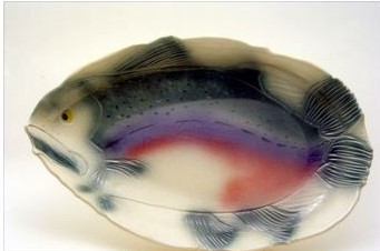
Carol Smeraldo. Salmon Platter. 1990s.
Salmon Platter. True to form much of this work reflects her interest in water. Carol describes the production of this popular line:
” … large platters were made by draping a slab over my plaster form by assistants, then I carved the details, trimmed the rim to match the carving, painted with underglazes and sprayed with Mason Stain colour mixes I developed. The platters varied enough to be considered one of a kind in a series. Medium and small dishes had the carvings in the hump molds but I still needed to trim the rims, paint and spray each one. My work had a lot of “hands on” by trained assistants and myself which somewhat limited production output. I also designed and made candle holders, plates, bowls, etc.” ¹
Raku
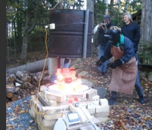
Carol Smeraldo raku firing.
Ever restless Carol revisited earlier processes. She has been working with North American styles of raku for the last 10-12 years, using raku clay from Tuckers Clay and supply in Ontario. ¹ Initially her kilns were electric because of the urban areas in which she worked. She had used gas in her early days in Massachusetts.¹
In East Preston she was grateful for having good neighbours. In June, 2005:
“Having not done Raku since art school, I attended a fun Raku party at Regina Coupar’s studio which rekindled my love of Raku. I showed my engineer neighbor a picture of a top hat style Raku kiln in an ad in Ceramics Monthly and asked him if he thought it was worth the price. His eyes lit up with interest. He mused that he had an old oil drum and some angle iron out back. I left to go out to dinner and when I got back I nearly ran over my new Raku kiln in my driveway. I added Fiberfax held on by clay buttons, a weed burner and propane tanks. Now I just had to balance using Raku and porcelain as well as making space and accommodating their need not to contaminate each other in the studio. “ 5
More recently she has upgraded to a newer, Randy Brodnax, gas, front-loading kiln, primarily for raku.¹
Carol has since experimented with just about every raku method, even trying raku in porcelain but found it “dicey.” ¹
Carol Smeraldo. 2013. Raku Plate. Trailed wax resist seaweed pattern. 29.2×3.2 cm.
“I also use a resist method to make interesting patterns on Raku pieces with wax, metal hardware cloth, and live, green vegetation such as ferns. This leaves a light clay colour pattern surrounded by … orange when sprayed with highly acidic iron, ferric chloride.” ¹
Raku Plate, 2013. The plate is a simple form. The design a series of concentric circles penetrated by an off-centre seaweed motif. The blue-orange complementary colour scheme is quite typical of Smeraldo’s love of contrast. But here it is done with subtlety, providing not only a colour shift but also a pleasant gloss and matte contrast.

Carol Smeraldo. 2011. Raku Vase. Horsehair carbon painted, black porcelain finial,
On the Raku Vase, 2011. Smeraldo describes her process of carbon painting:
“ … when I remove a piece from the 1750-1800˚F kiln, [I] throw sugar at it until the dots are black and crisp, I lay on or drag combustible material on the hot pot and as it burns it impregnates the clay with the carbon as a result of it’s burning. I mostly use peacock feathers although most larger bird’s feathers also work and I use coarse horsehair from fiddler’s bows which they have to have restrung quiet often. … The strands of horsehair make wonderful black carbonized squiggly lines whereas the feathers make multiple lines.” ¹
Sometimes on such works as this she will include “black” porcelain, a finial or handle blackened with carbon in the raku kiln or with permanent india ink for aesthetics where white is not appropriate.¹

Carol Smeraldo. 2009. Black and white naked raku vase. Wheel thrown and burnished. 19 x 23.5 cm.
Black and white naked raku vase, 2009. With her re-discovery of raku, ever the student, Carol explores the many sides of the raku process. Here she exploits the crackle and peeling effects of naked raku developed from her workshop with Linda and Charles Riggs. The form is simple. The contrast of white and black has the look of a cracked and carbonized eggshell.

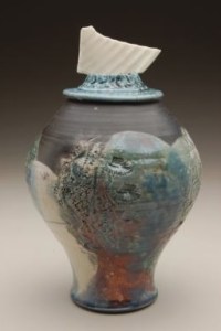
Carol Smeraldo. 2011. Raku fired lidded Jar. Wheel thrown, terra sigilatta, burnished, iron fumed. Copper pipe and wire and crystals. 23 x 14 cm
Raku fired lidded Jar, 2011. In addition to the subtler tones of terra sigilatta and her favoured seaweed motif Smeraldo uses added media, metal and crystals, to play off against the ceramic surfaces. The sides of the cylinder gently swell at the colour shift about halfway up the body and then subtly reduce to the shoulder. The whole is a monochromatic study of shades of terracotta reds.
Polychrome and Porcelain
Porcelain had mildly interested Smeraldo for some time: for example, she had long admired Enid Legros-Wise’s works:
“Enid Legros, she was wonderful. She validated more feminine pieces: exquisite, tiny and in porcelain.” ¹
But it was a 1976 Cynthia Bringle workshop at Haystack Mountain School of Craft, Deer Isle, Maine, that fully introduced her to porcelain and its potential. Earlier she had shied away from porcelain, thinking it “too enticing”. But she was to find a compromise with a relatively newer product, a cone 6 translucent porcelain, with enough flux to bring the temperature down. Translucent porcelain has a preciousness Carol likes.¹ Porcelain also appealed to her painterly side:
“… when I took that workshop at Haystack with Cynthia Bringle, … that was it for me. I was like, ‘Where has this wonderful stuff been?’ … I’ve been working with porcelain since then. It’s an unforgiving material, but it’s lovely, because of the whole surface of colour. It’s like painting on a white surface instead of a tan surface. The response to colour is wonderful.” ²
A further development occurred in 2006 while travelling in Australia:
“[I] attended a craft show and saw cone 6 translucent porcelain for the first time. The Australian supplier also had a booth. I arranged for a shipment of Cool Ice. It turned out that they shipped it through Laguna Clay Supply in California. All in all it took 9 months. When the shipment arrived, there was [also] a bag of Laguna’s newly developed cone 6 translucent porcelain, Frost, included which was good promotion on Laguna’s part and lucky for me because Cool Ice only fired to cone 5 and bloated badly in my cone 6 firings but Frost was just fine. “ ¹
She has at times worked to bring translucent porcelain and raku together,¹ usually in the form of attached finial handles or lid-like forms.
“[Porcelain] opened a whole new chapter in my career. I began to search for a way to express my lifelong love of contrast by combining opaque, dark Raku with translucent white Frost. At first I made wine cups and experimented with carved thinly stretched slabs of Frost. When one broke, I saw that I could use the shards as finials on lidded Raku jars. Cone 6 Translucent Porcelain is quite difficult and challenging to work with but the results are stunning. Frost takes ceramic colourants beautifully since it fires very white. I know that accidents are opportunities that often produce amazing new directions, if I don’t panic and instead look for ‘The What If? Factor’.” 5
Part of the evolution into porcelain involved a translating of her raku techniques into porcelain forms.
Carol Smeraldo. 2007. Ocean I. Covered raku jar with translucent porcelain fragment on sculptured lid. Carved and stretched. 21.5 x 15.2 cm. Photo: Stephen Hill, Center Street Clay, Chicago.
Ocean I, 2007. The wrap around of stretched clay learned from a much earlier Bert Borch stretched clay workshop was more loosely applied in porcelain.

Carol Smeraldo. 2008, Ocean Mystery I, MCS porcelain with a translucent (Frost) finial, 36.8 x14cm. Photo by Steven Hill. Reproduced in Ceramics Monthly, 2008.
Ocean Mystery 1, 2008. Reproduced in Ceramics Monthly, 2008. The Eight Month Workshop. The porcelain work has a “half wave collar” and a carved base. The whole is more of a shell within a shell or an egg within an egg, a hint of the birth/re-birth theme that Smeraldo was developing at the time. The colours and “sea” designs are characteristically Smeraldo. There is at the same time a ‘weighty fragility’ in the masses and edges. Colour plays off against engraved patterns of submarine kelp and rolling combers, waves cresting and foaming against a shore.
Carol Smeraldo. 2013 Shell Beacon 2.68 x 26 cm. Raku and translucent porcelain (Frost clay), aluminum and lighting kit.
Shell Beacon 2, 2013. Here Smeraldo taken an easier route to combining porcelain and raku using the two media as distinct elements in an undulating water column and shell lamp. She has exploited the translucent nature of a pierced, fan-shaped, scallop shell, its edges burned a soft brown. This sits atop a raku base that ripples upward like a kelp forest. The colours are favourites, orange and blue. Carol has extended the conventional use of the word ‘functional’ to include “lit sculptures” (that provide “mood” lighting with LEDs ¹) lamps and chandeliers. She is not the first to do so. Ceramists had been making lamp bases throughout the last century. But here she has included the whole package, including aluminum base, wiring and bulb, in a less conventional, more sculptural form that relies on exploiting the translucency of porcelain. This work is part of a cycle that Smeraldo calls “Journey 3: Into the Light” 3 where she incorporates light, literally and figuratively, not only into her work but also into the source of inspiration.

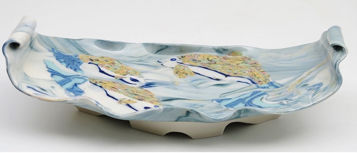
Carol Smeraldo. Receiving: Open #1. 2003. Porcelain bowl on pedestal with lid, marbles. 37 x 36 cm. Wheel thrown, carved, impressed, sprayed, Photo by J. Beveridge .
Receiving Open #1, 2003. The marine motif is here more subtle, disguised within a functional form. Essentially an abstracted lower shell shape, the flaring vase is surmounted by an inverted conical vase as a lid or upper shell. The whole is banded in soft yellows, pinks, blues and greens. The overall form represents an oyster. To enhance the analogy Carol includes glass marbles hidden between the two “shells” to symbolize pearls. The curves and counter-curves are elegant, a series of cones stacked one upon the other in minimalist fashion. The work was part of her exhibition at The Craig Gallery, 2003, A Symbolic Journey in Porcelain. “Journey” either as record or symbol is a sub-theme in her work. The exhibition indicating the scope of her work also had hanging ceiling-to-floor mobiles, a large cauldron, and a huge hanging planter like form.¹
Murrini: More Colour
More recently, around 2014, Smeraldo learned the murrine technique at a Chris Campbell workshop in Ontario. The technique, based on the Venetian millefiori glass process enabled her to add colour to her works in a new manner. Campbell also showed her the stains needed to get the colours she wanted in cobalt copper and manganese. ¹
Carol expands on the inspiration for the technique:
“Through the years I had repeatedly been stunned and inspired by seeing Dale Chihuly’s glass. The layering, swirling brilliant colour combos of his Venetian influenced work took my breathe away. I experimented with colouring white clay and layering different colours of stoneware and white porcelain in my early murals and hanging pieces in earthy colours but I craved to work with brilliant, clear colours in more complex patterns. The Chris Campbell workshop provided the information and techniques of making coloured clay canes (bricks) to be combined in different ways to produce Murrinis. I was already using pure white translucent porcelain, Frost, which is perfect for this work.” ¹

Carol Smeraldo. 2014. Flower Fish Vase. White Translucent Porcelain wheel thrown vase translucent porcelain murrinis. Clear glaze overall. 2240˚F oxidation. 21 x 10cm.
Flower Fish Vase, 2014. Sometimes the murrini are attached as miniature slabs or strips, either on specific pot elements or as winding spiral.” ¹ This vase design is inspired by floating petals and flowers on the surface of water with fish flitting by below. The resulting effect is one of a Japanese kimono design wrapped around the body.
Sometimes such layers are pressed or rolled in pieces and the work thrown from the inside.” ¹

Carol Smeraldo. 2014. Swirl Vase 5. Wheel thrown translucent porcelain. Clear glaze overall. 2230˚F oxidation. 11.4 x 14 cm. porcelain.
In such works as Swirl Vase, 2014, Carol will also incorporate the murrini colour into the white porcelain body to be thrown.
“It’s weird because your fingers bump until it slowly pulls. The pull of the hands makes them go ‘spirally’. There is some stretching some mixing.“ ¹
Carol Smeraldo. 2014. Upriver Journey. Murrini translucent porcelain. 10 x 29.2 x 15 cm.
To achieve her colour effects Carol trims pencil-thin porcelain rolls, then forming a pattern in a brick, cuts them with a fine wire. She then layers them around the works and impresses or rolls them. Different layering effects result from the way she cuts and re-layers. She prefers a herringbone effect.¹ In works such as Upriver Journey, 2014, below, Smeraldo has incorporated the colours right into the clay surface. The subject is water-based, leaping fish. What is clear from such works is her overall fondness for asymmetry across the surface. Murrini can lend themselves to a regular, consistent pattern. Smeraldo shies away from this.
Recent Works and Boats: Myths and Metaphors
While she was exploring colour in one Journey Carol was also delving into symbolic meanings with raku. She created boats in simple clay colours: browns, blacks, white, grey.
Boats are not just a symbol of the sea or maritime life but also a symbol of a spiritual life or journey, a theme long steeped in history, especially from the Mediterranean.
Since 2003 she has worked with the idea of personal cyclical and creative cycles, adding to her repertoire of subjects, techniques and processes. She has personalized as a metaphor the Demeter-Persephone re-creation myth, integrating it with her love of water, boats and oceans, working with the idea of inspiration that floods down over the artist.¹
Carol explains:
“Early on in my study of the creative cycle, this interest merged with the Greco-Roman myth of Demeter and Persephone, and the metaphor of the oyster producing the pearl, and motifs from my lifelong connection to the ocean.” ¹
This makes sense as a key theme for her since she has always lived and explored near the ocean and water.¹ Although she does not now live directly on the ocean, water and its themes, as we have seen, have played a continuing influence in her subjects and images. Earlier in her life she sailed in Barnegat Bay , New Jersey, and later in Mahone Bay and offshore of Peggy’s Cove in Nova Scotia .¹
“I often sailed with my husband. I ‘womanned’ the tiller. I get seasick but during one storm I was too scared to be seasick.”¹
Boats are where she becomes most symbolic, not just as a reflection of her sailing and canoeing days. They are here deeper, more personal and intimate than physical or athletic objects. These abstracted form force us to look at objects in unconventional ways, to break out of stereotypes. These are not the classical Greek goddess forms but vessels, containers for hopes and aspirations. She moves from the outer representational of landscape, fish and sea forms to the inner meaning of personal struggle as an artist.
Smeraldo has moved into the sculptural with her boats. They can be stand-alones or groupings. Though non-functional as actual water craft they are signs, representations of means for a deeper life-journey, having moved beyond any true functional pretensions. They are expressions of her deep feelings about her own artistic trajectory, a cycle of inspiration and slump, periods of frustration familiar to just about all artists. Mythical death in artists can be termed a slump, lacking inspiration.
The Boats not only mix clay colours but also media.
“The Learned Boat” represents the “rocky” internal creative journey in the crucible of life from Impressions to Inspiration.” ³
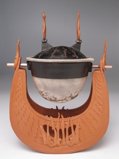
Carol Smeraldo . 2009. Learned Boat: Percolating Impressions. Wheel thrown, hand built, sculpted, carved, inlayed, twice burnished terra sigillatta. Lantz clay, black and white naked raku slip resist lidded container, with a large marble inside, suspended on a copper rod. 30.5 h x 20.5 l x 15 w cm.
The Learned Boat, 2009, is a three-part piece with local Lantz clay. The work is inspired by Greco-Roman red and black ware. The American Ceramic Society’s Potters Council chose this piece for their Raku Calendar in 2010.³ The Mediterranean inspired vessel’s hull is a deeply folded and arced bowl, a form high in the bow and stern. Engraved and applied designs flicker, flame-like. The ruddy roughness of the hull contrasts in colour and texture with the supported bowl. Further illustrating her love of contrasts the hull is opened, penetrated and screened with upright flame-like oars beneath the solid, “heavy”, enclosed mass of the black and white container. Also, secreted within the container is a marble, whereby she adds the metaphor of the shell that spits out what it doesn’t want and creates a pearl. ¹
The work is part of a series:
“The boats are series of four. They gather inspiration and keep it inside during down time. The influence of inspiration eventually rises to the surface and the artist takes off in that direction. The cargo is the inspiration they are carrying.” ¹

Carol Smeraldo. 2009. Under Sea Fleet: Rock the Boat”
Under Sea Fleet, 2009: Rock the Boat” gives a sense of the scope, scale and context of these boat forms.
Over time the boat forms have changed.
“But now I’m carving pots and stretching them, rather than leaving them a flat shape. So it’s interesting how themes keep winding, weaving their way through your life. … “Why are you changing direction, doing something different” and I’d say “Well I don’t know, I just need to do this.”” ²

Carol Smeraldo. 2011. Ancestor Boat 4. Trailed vertical sacrificial glaze. 15.2 x 29cm.
Ancestor Boat 4, 2011. The boats begin to fold in on themselves in the gunwales, with gentler edges and decorated glazed hull surfaces. Their cargo area now becomes more open, accessible, displaying miniature pots, variously wheel thrown and altered with carbon painted horsehair or terra sigilatta and burnishing. The boat concept is more modest, less a galleon than a more modest transport.
The designs continue to evolve some even becoming larger.

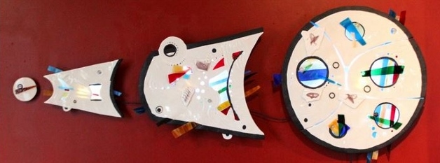
Carol Smeraldo. October 2012. Rise Again, at the “From the Sea” exhibition at Swoon Gallery.
The picture on the right shows the scale of her work. Eventually the boats develop sails and rest upon smooth, cylindrical columns. The columns thrust the boat up vertically, surfacing from some deeper oceanic-psychological depth. Simple sails imply lateral motion. The whole effect of the shape is an embellished T-form.
One may ask, ‘Why the pedestals?’ Carol replies
“It’s to do with inspiration being released and coming to the surface.” ¹

Carol Smeraldo. 2012. Rise Again: Fully Loaded Inspiration. Wheel thrown, hand built, carved. 71 x 40.6 cm.
Carol Smeraldo, Rise Again: Fully Loaded Inspiration, 2012. Fully loaded is an understatement in the variety of forming, firing and material processes. The boat, finials and pedestal are raku fired and iron fumed; a copper tube mast supports five translucent porcelain “sails” with sepia toned decals of whales; three of the “sails” are wood fired and two electric-fired; two shell form finials are added; the “boat” is bolted to a tall pedestal with carbon trapped speckles and streaks. Such boats begin to suggest an energy or momentum powered by sail and thrust from the depths by the column. But the boat’s sails are also symbolic, suggestive, lacking the strength and structure to power the vessel at this moment. Yet the combined masses and flows of the forms assert themselves with a potential energy striving to become kinetic energy.
Wall Works
Carol Smeraldo has a long experience in creating mural and other wall works. These started as far back as 1976 with her Nahanni wall pieces shown above. Many of them were landscape-based. They play with Smeraldo’s love of multiple layers with different surface patterns, textures and colours. In the work Expansion she tries a new direction.
Carol Smeraldo. 2013-14. Expansion. Translucent Porcelain, stained glass, marbles, artist-made decals of whales. Hand built, carved, stretched and cut out. Clear glazed. Cone 6. 2232˚F oxidation. 50.8 h x 127 w cm.
Carol Smeraldo. 2013-14. Expansion. This work is not just is a four-section wall mural, a cone, now flattened, segmented and pierced, but is also pure love of form and design. It is a joyous play of surface, texture, colour and light. Smeraldo continues her interest in using artificial light by using marbles and LED lights, and hidden associated electrical connections. Although she has created multi-media works before this work moves more into a “constuctivist” mode. There is a tension between colour and form. Geometric shapes and effervescent bubbles of pure spectral colours are confined within white bordered segments; some shapes burst out of the confines of the borders like blisters, or like matter emerging from a quantum foam. The whole has a brightly hued painterly quality reflecting Smeraldo’s continuing interest in painting. Often the inspiration for such a work evolves after the spontaneous collection and storage of found objects:
“Things would come along and attract me, that’s how I work. A tin of marbles in Walmart; a collection of seaweed to be stored in the studio. It’s about being in the moment.” ¹
Where next? We have followed Carol Smeraldo from the external ‘Wow,’ to the interior ‘ This is me” Throughout her career Carol has made it clear that she moves within certain favoured themes. Yet she frequently chooses to break out, to explore new meanings and forms: of myth and metaphor, of media and colour, of representation and abstraction. Creation, re-creation and exploration are about as close as one can get to her future directions; and there is of course the eternal pull on her to teach and to organize. To fully appreciate the range of her creations and thoughts, and to follow any new directions, visit Carol Smeraldo’s website.
NB: By the way If you have stories or pictures of Carol Smeraldo or her work please pass them along to me to share with other readers.
Major Collections:
COMMISSIONS (A Partial List)
- 2008 Chandelier: seven part translucent porcelain, Kamloops, BC
- 2002 Nova Scotia Community College, Bridgewater, 9’x7’ acrylic mural
- 1991 ACPOA, Halifax, 800 signed numbered limited edition sculptures
- 1984 National Research Laboratory, Washington, D.C., presentation plaque
- 1974 Mt. St. Vincent University Art Gallery, Halifax, multiple planter works for the gallery entrance
COLLECTIONS (A Partial List)
- Art Gallery of Nova Scotia, Halifax, NS;
- Nova Scotia Designer Crafts Council, Halifax;
- Nova Scotia Art Bank;
- Nova Scotia Cultural Affairs-Craft Office;
- Numerous private collections
Endnotes & Bibliography
1. Carol Smeraldo. Correspondence and interview with Barry Morrison. 13/3/13 ff
2. Carol Smeraldo. Notes from an interview with Alison Cude, July 14, 2008. Provided by the artist. The basis for a handmade book by Alison, Carrying It Forward, 2008.
4. Hesselberth, John; Roy, Ron. Mastering Cone 6 Glazes: Improving Durability, Fit and Aesthetics. Paperback. Publisher: Glaze Master Press; Unknown edition.
5. Carol Smeraldo: Art Career Chronology provided by artist.
6. Steven Hill. The Eight-Month Workshop: A Journey of Discovery. Ceramics Monthly. June/July/August 2008.
7. Carol Smeraldo Page. Nova Scotia Potters Guild.
8. Nova Scotia Potters Guild. Shaping Space: A Celebration of Lantz Clay. Exhibition at the Mary E. Black Gallery, Halifax, NS. Sept 11 – Oct 25, 2009.
© 2017 studioceramicscanada.com
