
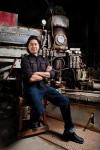

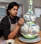
The Many faces of Brendan Tang
Capsule:
Dates: 1975 – present; born Dublin, Ireland
Production Dates: 1994 – present
Location: currently Vancouver
Types of Work: Sculptural
Preferred Kiln Type and Firing Process: electric kiln; cone 06-04
Preferred Clay: white earthenware (aka “ghetto porcelain”)
Signature/Mark/Chop:

Brendan Tang Signature
Brendan signs works with a handwritten signature on the bottom or where it won’t show; incised when leather hard usually; therefore, sometimes the date will be earlier than the actual finish date of the work. ¹
Websites: (a sample) Brendan Tang’s website
Brendan Tang: A Short Biography
Brendan Tang has moved from early functional ware to post modern art to become one of the best known and most tech-savvy artists in the Canadian spectrum of ceramics. His online links show his connectivity.
A multi-ethnic heritage, an immigrant and then naturalized Canadian status are all part of Brendan Tang’s art and his thoughts about his art. Born in Dublin, Ireland of Chinese-Indian-Trinidadian heritage, his family settled in Nanaimo, BC.
“My parents grew up dirt poor in Trinidad. My father’s family owned and operated a laundromat. My mother’s family was also from a lower class. They were able to negotiate that and travel to Ireland and my dad was able to study and come over here. He’s now retired but he was a plastic surgeon in Nanaimo. They were always in the process of reconciling low and high culture.” 11
Brendan uses his art to balance the New World experience with his family’s development and place in old and new societies:
“I was always using my work as a vehicle for political commentary on a broader social or individual scale where my own self identify fits in within a western context.” 11
Yet he did not let this context become a limitation. Contact is a much needed personal and creative outlet for him:
“I get a charge from social contact; however, this conflicts with the solitary nature of my studio practice. To combat my isolation, I’ve gotten into the brave new world of social networking. It’s actually a little embarrassing how much time I spend on online, as any of my friends would attest to—this includes my two Facebook sites and my website/blog. Through these venues, I gain camaraderie with artist peers who are also in the studio, ceramics or otherwise. “ 5
Tang has moved through several jobs and styles and inspirations to arrive at his current, widely recognized style. His interest started toward the end of his high school years, around grade 11 or 12. He had always been interested in drawing and design but looked for a 3D extension of his 2D work. He admits to not being interested in clay and glaze chemistry. His needs were and are more immediate.¹ He liked ceramics because ceramics was:
” … a material you could take out of the bag and manipulate it immediately. This was the first hook in getting into ceramics.”¹
But there is still a 2D foundation to his sculpture:
“I was taking what I was making from a 2D realm into a 3D realm. … Whenever I was working two dimensionally there was a distance, an illusionary space that I was creating …and I couldn’t co-exist in the 2D space. It was almost like looking through a window. Working three dimensionally allowed me to co-exist with it. I found it quite exciting.”¹
He started more formally on his ceramics career in 1994 – 1996 with a Diploma in the Visual Fine Arts from Malaspina University College in Nanaimo, British Columbia. This was soon followed by a Bachelor of Visual Fine Arts, Interdisciplinary, from the Nova Scotia College of Art and Design (NSCAD), in 1998.³
The year 1998, after his NSCAD graduation, was a key year. It was at this time he considered himself a professional ceramist.¹ But NSCAD was followed by a five year period from 1998 to 2003 of small regional exhibitions in Halifax, Nanaimo, Parksville and Vancouver, and of various ceramics related jobs as he sorted out what he wanted to do.
“I was figuring out where I was and wanted to be in the ceramic world…It was a great opportunity to find out what my niche was to be.” ¹
His work experience included being owner/operator of the SiO2 ceramic studio in Nanaimo, Manager at Vancouver Island Pottery Warehouse in Nanaimo, guest lecturing in Victoria and Nanaimo and as a ceramic technician at the Metchosin International Summer School of the Arts.³ He also worked with and studied with JoVic Pottery in Chemainus.¹
“There were a number of different hats I was trying on, be they teaching, functional ceramics, or working as a ceramics supplier.” ¹
Eventually he became manager at the pottery warehouse but he was not 100% satisfied with being manager and pottery supplier. This led him to investigate going back to ceramic school.¹ Nevertheless, working at the supplier had helped him get an idea as to what was going on in Vancouver Island and the Gulf Islands.¹
His career accelerated in 2003-2006 with his move from Vancouver Island to obtain his Master of Fine Arts in Studio Arts from Southern Illinois University in Edwardsville, Illinois. Since that time he has exhibited in Montreal, Toronto, Calgary, Portland Oregon, Edwardsville, Oregon and St. Louis, Missouri and elsewhere.³
About this time he became aware of the funk-inspired artist, Howard Kottler and his humour. Tang says:
“Humour is a big part of my life … that was when I stopped doing all that serious research.”8
Since then his exhibition success and reputation has increased, almost exponentially. He has also won major awards including the Winifred Shantz Award For Ceramics in 2010, and the RBC Emerging Artist People’s Choice Award in 2012 to name just two.
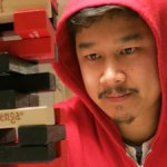
Brendan Tang Emily Carr Faculty Photo
Two other key aspects of his career have remained anchors: lecturing and teaching in such places as the Emily Carr Institute of Art and Design, Thompson Rivers University in Kamloops, the University of Regina, the Ontario College of Art and Design, Sheridan College, the Mendel Art Gallery in Saskatoon, the European Ceramic Work Centre, s’Hertogenbosch, the Netherlands, and the 46th General Assembly of the International Academy of Ceramics in Dublin, among many other locations.
Gallery and Analysis:
(All illustrations are used with the permission of the artist)
Early Work 1995-2003
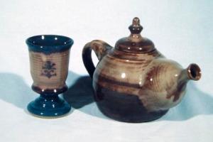
Brendan Tang. Teapot and Goblet, 1995
Teapot and Goblet, 1995. These pieces from his Malaspina University student days fit into the general trends of developments in BC ceramics of the time. Though the works are at the same time typical of the age, they also show hints of things to come. The wheel-thrown goblet and teapot are dark in overall tone with deep blue and grey-brown glazes. The glazes run wet-in-wet into each other. The works are heavy, solid, thick, especially in the lips and handle. They are obviously wheel-thrown with the throwing marks still very much evident. But, is that a Ming bottle emerging as a spout; and what about the baroque scroll design on the goblet’s body; or that large finial of a teapot handle?
As he developed his more well known style and his general approach to creating his work his interest in drawing and design remained important, partly as a labour-saving technique, while at the same time he explored potential of clay:
”I do a lot of sketching beforehand. The materials I choose are really labour intensive, so if I can get a lot of the conceptual legwork done through drawing, it’s a lot quicker as opposed to figuring it out in clay or whatever other material I’m working in. …I think it’s that sort of amorphous state. Ceramics brings its own visual language to the table, but in the same breath, it’s a sort of material that, if you work it long enough and in particular ways, you can mimic a lot of other things. I like its ability to camouflage itself and make itself look like wood or plastic or metal. I’m interested in its mimicry”.7
He started low fire work before he went to grad school. ¹ When he came out of NSCAD he was producing cone 6 functional ware at the local JoVic studio. His only reduction work was in an occasional raku firing with JoVic ¹
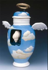
Brendan Tang. Angel Urn, 1999
Angel Urn, 1999, is a work from just after his NSCAD graduation. Although the forms are still thick and heavy the effect is now dramatically different from his ealier BC style. The work plays like a joint, Funk play on Wedgwood Jasper Ware; or if you prefer, Rene Magritte’s Surrealism. The results of Tang’s interest in 18th century European ceramics and 20th century art are beginning to show. The mood is now different: not “serious” ¹ as in his earlier work. The urn displays a deliberate “clunkiness” at odds with its source. The pale blue body has painted faux-sprigs of cumulus clouds. The shoulders are flanked by ornamental handles, too fragile to be functional that sprout as wings. A haloed lid sits uneasily atop an exaggerated cylindrical neck. But the most arresting feature is the dark blue, recessed box with its gastropod shell insert. Appropriation, multi-media form-penetration, colour and a touch of humour point the way to future explorations.
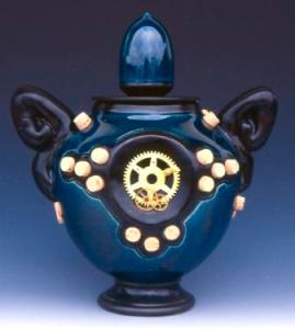
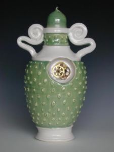
Brendan Tang. Blue Cog Urn, 2001
Brendan Tang. Cog Urn, Green, 2001
Blue Cog Urn, 2001 and Green Cog Urn, 2001.These two Cog Urns show further development into his more recognized later style. Both works are frontal. The inserted cogs are front and centre, like a cartouche. Both works have the thick pasta-like handles, perhaps more functional in these instances than in Angel. They both display a similar stupa-like cover. Yet within the year the change is dramatic. The blue urn is an intenses dark blue with a single star-like central cog. Around the surface are patterns of contrasting plugs. The green urn, however, is immediately recognizable as a ”Brendan Tang” work, a precursor of a style that is easily recognizable in his Through The Gilded Looking Glass (TTGLG) phase. The surface colour has lightened. The multi-cog cartouche will soon be replaced by portrait decals. The surface is pimpled with diagonal bands of almost blistered nodules. The spaghetti handles are like some über-Baroque church’s facade volutes. Though the green urn is not yet as personally ornamented, “Tang” has now arrived!
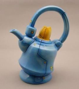
Brendan Tang. Teapot, 2003
Teapot 2003, is a further play on non-functional functional ceramics. The colour has lightened with darker blue lines suggesting riveted, mechanical joints. Industrial looking tubes and connectors define the handle and spout. Yellow rivet-like spots mark the surface. The whole is capped by the yellow lid. The off-kilter angle of the pot body hints at the nonsensical humour of a “Mad Hatter’s Tea Party.”
Although his surfaces can seem complex his approach to his work and purpose exist on several levels. On the practical and technical he also sees himself as
“ An additive person in that I will work on a wheel-thrown or slab-built component, and then work on composition in a collage approach or process. … Early on I set my sights on being a form kind of guy as opposed to being a surface person, with glazes and that sort of thing.”¹
Through the Gilded Looking Glass (TTGLG)
Generally, on the personal level, there is humour in all of his TTGLG and Manga Ormolu (MO) work, from his self effacing self-images and titles, through almost toy-like robotic samurai, to sagging geriatric looking clay to almost whimsical non-functional tools. In early works you can openly laugh with Brendan. The later are more subtle as you wrestle with form and non-purpose, of familiar forms in unfamiliar contexts.
Tang started working on his Manga Ormolu works (ver 2.0) as early as 2003 but he was developing in parallel his Through The Gilded Looking Glass (TTGLG) series. Through The Gilded Looking Glass was a major stylistic and conceptual change. He never looked back to his earlier “serious” student days.
“There was something I wanted to take into my ceramics. So I found myself gravitating towards those really big archetypes within the material history and looking at the Ming Vase, looking at the palace ware. These are objects that someone can look at and have some association with, even if it’s with little Chinatowns scattered across Canada and North America.”¹
TGLG displays a wide variety of forms that reflect his interests and messaging. These can be overtly political or self-deprecating but overall they move into the manga/anime subject matter that would follow.
Although not a literal use of the Lewis Carroll story or its images Tang uses the devices of reversing societal norms and unexpected juxtapositions to question conventional thinking and assumptions:
“ I always liked the magic of the west coast and the narratives of such stories as Alice in Wonderland and Through the Looking Glass. … The objects I’m creating are of this world but not of this world. … I like that in the same way as Alice in Wonderland and Through the Looking Glass they become those “otherly” things in a place that exists and doesn’t exist.” ¹
Further studies in art history and his interest in the 18th century European fascination with the Orient led to the study and use of ormolu.” ¹ TTGLG was at the same time a play on beauty and on the status of decorative and fine art:
”Through the Gilded Looking Glass is a collection of works that infiltrate and exploit beauty – a notion intimately connected to the decorative arts. The works are indeed beautiful; inspired by 18th century French porcelains (Sevres and Meissen) and ceramic ormolu, these meticulously crafted, richly ornamented vessels lure and please the viewer. The grandiosity of the excessive ornamentation – including gilded leaf, [sgraffito], painting and decal ornament – is amplified by wall decoration and dramatic lighting. If it is possible to be too rich, perhaps these vessels are. … The resultant tension between the decorative arts and nontraditional elements invokes layered reactions from the viewer: attraction, surprise, confusion, and reflection.” ²

Brendan Tang. Just What Is It That Makes Asian Men So Appealing?, 2005

Brendan Tang. Royal with Cheese, 2005
These two works show how sharp the transition can be as the theme evolved. Humour, central to the works in Through the Gilded Looking Glass, is apparent in the titling of the works: Just What Is It that Makes Asian Men So Appealing?, 2005, with its “too cool” posing on the left, and a photo-bomb style of “in your face” humour of Royal With Cheese, 2005, on the right. These two bear all the marks of faux 18th century Rococo. The decal decoration is at the same time literal, personal and comical with images of Tang himself front and centre. The gilding hints at another era, lavish and excessive in its purpose. The bases suggest an instability or fragility, at odds with our modern canon of ceramic foot design.
But humour was not necessarily the only purpose for inserting his own image. There is also the exploration of class and identity at play along with the non-western immigrant experience:
“I was appropriating those symbols as icons and using them as vehicles for ideas. … I was making palace-ware vases that were really over the top with gold filigree. They had a central medallion that would traditionally have been reserved for a white aristocratic male. I would put my own image in there.”11
“By employing satire, I create a point of access. As in the statement, ‘many a truth was said in jest,’ humour offers the viewer is a portal to a further reading of the works.” ²
In these early works there is also a wide variety of political and social commentary be it an anti-militaristic theme or the impact of technology.
Brendan Tang. Passenger’s Paradise, 2005
Contrast the above works with Passenger’s Paradise, 2005. Its ridiculous ornamental elements and swaying plastic flowers immediately teleport us into the 20th and 21st centuries and to the opposite side of the world. This work is transitional, more exotic, pre-cursor robotic. The shape is now a like a three part Indian stupa, with gilded banding, handles and finials. But the ormolu is now supplemented by song birds and boxed happy face flowers. Rather than the overt self-deprecating ethnic humour this last work now throws the onus back onto the viewer. Traditional ormolu now becomes replaced by more nonsensical forms and images. Eventually the ormolu itself will morph into a more contemporary of techno pop forms emerging from almost organic Ming ware.

Brendan Tang. Mk-84, 2005
mk-84, 2005. Here there is a mashup of multi-media and styles. From a distance the overall effect is one of an exotic head-dress and a black, almost faceless mask. Is it African, South East Asian or some Hollywood melange? Toy soldiers crowd the forehead like some chaotic invasion beachhead. The stars and stripes and the ormolu-coated, atomic cloud are a not too subtle indication of the American origin of the soldiers. Conversely, out of this chaos arises a background of golden rays: a new day or atomic radiation or Hollywood Art Deco? Which is it? In such works the 2D play of shadows on the wall is also a design element, visually extending the dimensions of the 3D work into an inverted, flattened image. With works such as this and Passenger’s Paradise Tang has moved into world of sculpture. Yet both are still essentially two dimensional, wall mounted.
“ In the TTGLG I was very much dabbling in that pop sensuality pulling in an icon and symbol that had a tremendous amount of meaning and cultural cache, and taking and tweaking it and seeing if I could co-opt it like a guerilla.”¹
Brendan Tang. Opposites in Contract ver. 2, 2006
Brendan Tang. Opposites in Contract ver. 2, 2006 (detail)
Opposites in Contract ver. 2, 2006 (and detail) is a wall-mounted variant of the ormolu theme, looking like some rusting and abandoned plumbing or electrical system. Ormolu grows out of the left of the work, heavily textured like some grey, leaden, soldered repair, punctured, with grass growing out of the opening. It is mechanical, not personal. There is, however, an eerie, almost alien-arachnid feel to its almost organic legs and antennae. Rather than a three dimensional, free-standing sculpture this is a wall piece, a “small” installation, minimal in colour and projection. Its lines and connections prefigure and also contrast with his later Manga Ormolu ver. 20-l, 2009 (below.)
Brendan Tang. Forever Foreign, 2007
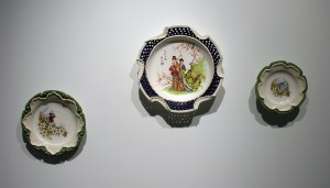
Forever Foreign, 2007. The title of this grouping reflects the immigrant’s ambivalent experience: “Who am I exactly? Canadian or other?” This is a grouping of three plates: the centre and largest a scalloped form with a traditional Chinese scene, two Chinese women in a landscape with plum blossoms and Chinese calligraphy; the lower left plate show Tang, viewing through binoculars, a Pacific maritime scene including a birch bark canoe. White Dogwood, BC’s official flower, screen the foreground. The right hand plate is a classic, almost cliché, BC mountain-lake and canoe landscape. The two smaller plates are framed by green ormolu surround. The ormolu on the central, largest plate has a folded, scalloped, pastry-like white border that turns back onto a blue fretwork. The tri-part arrangement is an overt synthesis of roots and present themes. Tang, in this grouping plays with and extends the look and ’feel’ of ormolu, moving away from Rococo gaudiness. Also, the arrangement, in its wall mounted format, continues his interest in 2D design. The direct, personal imagery will soon be replaced more subtle social and cultural references.
From here onwards, in the shift to Manga Ormolu, the ormolu will develop a smooth, geometric, mechanical quality, linked with Ming ware forms and subjects. In the transition from TTGLG to Manga Ormolu he notes:
“They both share a very similar conceptual root. Both share appropriation of the decorative arts as a vehicle for content and ideas.” ¹
In TTLG although there is a frequent visual Tang presence – pictures of himself for example – he was also trying to minimize the tactile imprint:
“In TTGLG in terms of the technical there were times I was definitely trying to formulate as best as I could those vase and forms so that my hand, my presence disappears from it so for people they become some sort of object from some place or decorative art museum.” ¹
Manga Ormolu (MO)
Tang was developing Manga Ormolu during this same time.
“For the most part. I think [people] react to the playfulness of the work and the bright colours. When I go into designing these things I’m trying to infuse some of that wow factor of new technologies and branding. I want it be a little like Christmas morning so when you see the work, you want to play with it.” 11
Brendan Tang In his studio, Nanaimo
“There are people who are more familiar with the traditional vases who see the work, not necessarily insulting, but unsettling. When they look at it, they react like they don’t know what’s happening they don’t like how tradition is being changed or altered.” 11
A frequent question he deals with is why he works in clay:
“The biggest challenge in working with ideas in ceramics is ceramics’ rich history: a lot of people come to the material with their own assumptions. We saw that in the 80s, 90s and early oughts when ceramics was not part of the contemporary art discourse. I think that’s partially because there are a lot of traditionalists who were looking at its affiliation with the decorative arts and put it on the sidelines. The biggest hurdle – which I think is slowly eroding – are people’s ideas about the material. … I do get the common question: why are you working in clay? I wonder if painters or photographers or videographers get that question.” 11
In TTLG his images are often personal. In MO imagery consistently reflects Ming (and Delft-ware) subjects and forms. His decal self-images on the earlier TTGLG works added a literally personal aspect to these works. These started to disappear as that series evolved. The MO works have a more subtle, less in-your-face quality. The imagery becomes ‘civilization-based’ and techno-based: “Just What is it that Makes Asian Men so Appealing?” is now Ming/Manga/Anime. Further the works become more fully three dimensional and:
“in the MO the work becomes more abstract as when the Chinese vase starts taking on elements of folds, skin or fabric … broken down or distorted. The MO become a bit more surreal.. The TTGLG is a bit of dipping its toe into the surreal, whereas in the MO. I’m diving in a bit more.”¹
After 2006 Tang’s MO “Transformer” imagery changes to the hybrid Ming-Techno-pop forms.
He now uses white earthenware exclusively, low-fired, cone 06-04, in an electric kiln¹. He spray-glazes and hand-glazes all underglaze work, airbrushing the robotic parts and hand painting the blue and white parts, all in one firing.¹
” I use two painting approaches in my current body of work. Airbrushing underglaze allows me to create a super polished look. More meditative is my practice of hand painting blue underglaze in the fashion of classical Chinese decoration.” 5
To avoid explosion accidents in the kiln; most works are assembled when leather hard, dried very slowly and bisque fired; airbrushing is the next step. ¹ Always attentive to the air flow required and to potential differences in wall thickness, he then low-temperature fires the work.¹
“If I was working in porcelain or stoneware I would be much more savvy with ‘Bondo’. Working at a low temperature you don’t get that pyroclastic deformation you would with high temperature“ ¹
For Brendan process followed intent:
“Ormolu and form pushed me to low fire.” ¹
In his evolution he has also maintained a practical focus, keeping an eye on the market:
“There was something I wanted to take into my ceramics. So I found myself gravitating towards those really big archetypes within the material history and looking at the Ming Vase, looking at the palace ware. These are objects that someone can look at and have some association with, even if it’s with little Chinatowns scattered across Canada and North America … to tap into something that would have the biggest bang for the buck.”¹
and
“I did have an interest in the more esoteric work as I developed the Manga Ormolu series. I found myself going down those roads and doing research into more obscure forms and different decorations and the stories imparted in the original form. I found if I go too far down those roads I’m talking to a smaller and smaller audience.”¹
Plus there was a more personal reason. Parental approval played its part, usually:
“I’m always trying to make work my parents could get.”¹
“When I started doing the work, I showed it my Mom. She said: ‘I really like that Chinese vase but why do you have to do all that other stuff to it?’ That was probably the most honest read that you get from people who are unsure about what’s going on.” 11
Although Tang describes the reasons for the Manga Ormolu works in art-speak on his website, in conversation he is less formal:
“The Manga Ormolu stuff came out of the ormolu tradition. …It was an interesting thing for me to see in terms of this idea of cultural appropriation. … These were ideas that had happening in the material world and trade and commerce for a long time. I found it really poignant as well.”¹
Candice Okada has an informative summary of Tang’s purpose and effect in his art:
“The frivolousness of manga and anime are qualities which make Tang’s ceramic sculptures approachable and accessible to all people, enabling them to grasp the deeper meaning of his delicate Chinese ceramic vessels fitted with futuristic robotic prosthetics. And even if viewers don’t fully realize the artist’s intentions, hopefully they will simply “pause and reflect,” as Tang puts it, on the piece that stands before them. He adds, “artists aim to help others understand and view our world in a richer and much more interactive way.” “10
It is the historical work of his Chinese heritage, specifically Ming ware, and his contemporary culture, manga/anime/techno-pop, that he uses to look at issues around appropriation, cultural assimilation and globalism. Although the works impress the viewer with their mix of the familiar, the almost-familiar and the unknown, Tang seeks deeper meanings in his work with an expectation of beyond the surface:
“The really interesting thing about the MO work is that is does lure people into the object. … Once they are interested they can start unpacking it or start contextualizing it and asking what is this work about, what’s it a critique on. It’s a very subtle critique.” ¹
There is a broader socio-economic purpose too. He has an interest
“… in looking at class structure, where classes develop and how we structure our lives. The class divide, ethnically as well as economically is interesting as well, and worth exploring.” ¹
Included in these divides also is the divide of generations: those brought up knowing Chinese art, or Pop Art, or Techno-Pop, or manga/ anime will find different entry points in appreciating the deeper intents of his work.
“Manga Ormolu, through content, form and material, vividly demonstrates the conflicting and complementary forces that shape our perceptions of Ourselves and the Other. By employing satire, I create a point of access.” 9
Manga Ormolu Versions 2.0 &3.0
The dating of his series’ works indicate a minor time overlap with TTGLG. Tang explains this is because he incises his signature in an inconspicuous part of the work in its earlier leather stage. The firing of the work is not always immediate, resulting in a final date often later than the signature suggests. ¹
The division of the MO into series is not only chronological but also indicative of changes in the works. In the earlier versions are the forms are tight, mechanical, with sharper angular, flat planes. There is a shift from the European Rococo-derived ormolu effect of western and “other” to an all “other” an effect of Asian, Chinese and Japanese. In early work the link to 18th cent. Ormolu is more apparent; in later works the techno pop and manga versions create other forms, some that look like appendages.
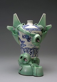
Brendan Tang. MO ver. 2.0-e , 2003. 29.2 x 22.9 cm. (front view)
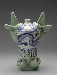
Brendan Tang. MO ver. 2.0-e , 2003. 29.2 x 22.9 cm. (rear view)
MO ver. 2.0-e , 2003. 29.2 x 22.9 cm. The central form is based on the Chinese “Meiping” or Plum Vase. Early in his career Tang was also exploring the effects and themes for which he has become better known. The titles become less of an explicit narrative on socio-economic themes and start to assume computer based “update” themes such as this “ver. 2.0-e.” Earlier works particularly capture the imagery of popular Japanese robot figures of manga, anime and Saturday morning cartoons. Not as mechanistic as the imagery of the Transformers they incorporate bottles and vases into quasi humanoid images. The wheel thrown and hand decorated blue and white bottle is supplemented by cylinders, rings and planes of pale green. There is a front and back to these works. The anthropomorphic or robotic effect is frontal. The reverse emphasizes the Ming vase and its dragon motif. How you approach the work conditions your response. From the front memory links are created to toys and cartoons. On the reverse the bottle and its design are more dominant. The wings and rings now become a planar, monochromatic, abstracted ormolu. Planes are like wings and ailerons signifying flight capability, so beloved of anime robots. There is a contrast between the blue and white ware with its imagery and craquelure and the smooth surfaced, glossy mechanical shapes.
Tang is modest in his assessment of his own “Ming’ pots:
“I’ll think that my work is emulating some exquisite Chinese art, and then I’ll see the real thing and I’ll think mine is so bad. Thankfully, people are only looking at mine for seven seconds.” 8
But here Tang is not trying to replicate the quality of Ming ware; rather, he is exploring the use of Ming as the “signifier” to achieve his concept and result.
Brendan Tang Manga Ormolu ver. 2.0-o, 15″ diam. (Photo David Miller.)
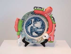
MO ver 2.0-o, 2009, 38.1 cm diameter. In the version 2 series Tang explores more forms of Ming ware: plates, double-gourd bottles, lidded jars and the like. In such works as ver.2.0-o, the blue and white plate is literally front and centre. The plate, as it sits on its stand, is deliberately off-kilter. The scene has been rotated clockwise. Yet the totality of the plate and its subject are fully recognizable. The outside edge of the “famille verte” type plate is surrounded by a thick, arc-shaped ormolu of pink and pale green, with wires, and faux sutures, plugs and buttons. The whole from a distance gives the effect of a circular saw or some fanciful disc-brake assemblage. One can see the move from gilt and surface gaudiness. The ornate detail of the plate contrasts with the simpler, flatter mechanistic border. The familiar looks as though it is being swallowed by the unknown.
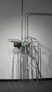
Brendan Tang. Manga Ormolu ver. 2.0-l, 2009. 71.2 x 25.4 cm
Manga Ormolu ver. 2.0-l, 2009. 71.1 x 25.5 cm (detail) is a contrast with Opposites in Contract ver. 2, 2006 (above) with its similar wall mounted placement. But the the pipes and tubes are now replaced by cleanly drafted circuit board connections directly drawn onto the wall: mechanical has now become digital. The central ceramic form reaches out across the wall as though it is extending digital roots to anchor itself to establish its place and permanence on the 2D surface.
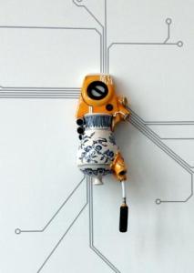
Brendan Tang Manga Ormolu ver. 3.0-a, 2007, 33 x 63.5 cm
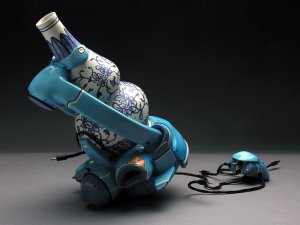
MO ver.3.0-a, 2007. 33 x 63.5 cm. Here Tang is using another favoured Chinese form, the “Huluping” or Double Gourd shape. Works are now becoming larger. Sometimes they seem almost recognizable, such as a microscope in this case, a tool with wire connectors to what could be a computer mouse. It is recognizable but nonsensical at the same time. The blue and white double gourd are complemented by a turquoise structural ormolu that in this case suggests a moveable, mechanical form.
Manga Ormolu Versions 4.0 & 5.0
Later MO versions begin to show flowing, sagging forms combined with tubes and grommets, etc., as though the mechanical is growing out of the organic form in some life-form that is both biological and technological, distorting the clay. He uses traditional Ming shapes. The works can now become increasingly larger and more complicated in surface.
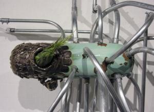
Brendan Tang. Manga Ormolu ver. 5.0-b, 2009. 40.6 x 27.9 cm.

Brendan Tang Tank Vase, 2009
MO ver.5.0-b, 2009. 40.6 x 27 cm, and a similar work in its leather hard pre-glazing stage. Based on the “Baoyueping” Moonflask, there is an ambiguous relationship between the traditional and contemporary. Is the Ming swallowing or enveloping the mechanical; or is it giving birth? Is the mechanical bursting out from the traditional. The upper Ming form flows, sags and folds over the tubes and buttons. Yet the effect is also of the work growing legs. Where the earlier version Manga Ormolu works might fly this work could walk on prosthetic octopoid-like legs. In fact this work has already moved off its base and stands directly upon the display surface.
2011 Tang Manga Ormolu Ver. 4.0-m (2011), 44 x 30
MO ver. 40-m, 2011. 63.5 x 30.5 x 35.6 cm. Here he is using the “Huluping”, Double Gourd vase. The the tight constriction of the waist creates an organic, female steatopygic quality, like some Chinese Venus of Willendorf. Lime green and white ormolu forms define the foot, waist and throat, contrasting in their simple surface flatness with the Ming blue and white carp and peonies that fold in on themselves in a tight bodily deformation. The whole rests on a conventional base. Here the Ming forms and decoration dominate. The techno-pop elements serve to either support, or constrict or attenuate.
Jill Sawyer in a Galleries West article observes:
“This is a more violent relationship, … work. “The robotic parts are pinching and pulling up on the skin of the vessel.” It plays with the concept of the made object — in reality, if you pressed too tightly on a ceramic vase, it would shatter.”8
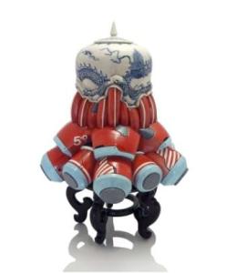
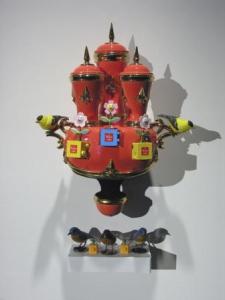
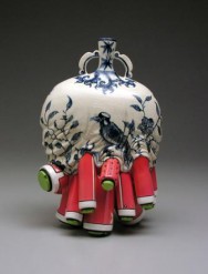
Brendan Tang. Manga Ormolu Version 5.0n, 2013
M O Ver. 5.0n, 2013. Although the octopoid and colouring imagery are similar to above the work has now returned to a more precious status sitting on its own stand. This particular work has a symmetry not seen often in his work. As Tang shifts his intent the focus of the work is now on the red, white and blue forms and their design. The blue and white form sits like a cap bundling the shapes together, stopping them from spilling onto the supporting surface.
Where next?
Brendan has been working on expanding the material and technical aspects of his work including a “secret project” mentioned in his blog 2a. This direction is more abstract than pop.¹
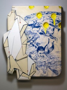
Brendan Tang. Fragment 2, 2013
Since 2011 Tang has been working on “fragments”, that look like large thick tiles incorporating blue and white Delft ware design. The works still seem to be in the concept stage. They incorporate thrown forms and incised lines. A fuller description of them can be seen on the video “ekwc Studio Tour” made while he was at the European Ceramic Work Centre, ‘s-Hertogenbosch. The works in form and surface design explore Tang’s continuing interest in drawing and 2D design. The works are thick fragments like some recovered archaeological wall-piece slab. They are, however, artfully shaped and covered with computer generated digital polymorphs outlined by incised lines. They also have fragments or sections of his digital “Swimmer” designs (which can be seen on his website). The shallow, lemon-yellow lightly indents puncturing the blue and white image, are an inversion of his earlier projecting buttons and knobs.
Tang is also currently exploring the potential of a 3D printer, for example, on the mechanical parts of MO.¹
“These ideas are kind of idealized; we wish upon them. But there’s a lot of other digital technologies, like 3D printing. I’m trying to figure out what the aesthetic of that is. What is it about 3D printing that can be executed by the printer and not via clay or wood or metal. There’s something about that mathematical control and repetitive nature. It’s interesting enough for me to keep on digging and drilling into the idea. Who knows where the work’s going to go.” 7

Brendan Tang, 2014 prototype shelf in studio.2014
Prototype Shelf In Studio, 2014.
“Recently I’ve been playing with the robotic elements. I’m making them three dimensionally on the computer and then 3-D printing them. That’s something I’d like to play with more.” ¹
The eclectic sample of works here take on a monochromatic look. Some move back onto the wall: one is a wire-frame model, another an abstract female head with an ormolu gloss. On the shelf, from left to right, sit a Ming bottle laying on its side, its base replaced by a coal black “sunflower” plug; to its right a bisque-like, abstract version – can one say that? – of one of his Manga Ormolu series; and to the far right a double gourd bottle is tied down atop a rickety looking base, that itself looks as though it has the permanency of “pickup sticks.”
He has also experimented with incorporating sound, especially in more recent exhibitions such in Montreal and Vancouver:
“There was something I did for a show in Montreal that had sound emanating from it. … I wanted to create a sonic representation of the ideas behind Manga Ormolu. I’d taken very traditional Chinese music and chopped it up digitally and remixed those with contemporary sounds and beats and have it crescendo and de-crescendo and play it through one of the pieces. One had a speaker system housed in the body of the vessel. I’m interested in creating a space where ones are playing music, other just sounds and there is a call and response between the objects. I was kind of surprised by how the presence of sound permeated through the space and created an atmosphere for the work.” 11
Brendan Tang. #lovechild, 2013. 56 cm at Gallery Jones exhibition.
#lovechild, 2013. 56 cm. He has also worked with fellow artist Alex McLeod on multi-media exhibitions such as the 2014 Gallery Jones exhibition. Here he is not only collaborating in the exhibition concept he has also cleanly fractured his standard Manga Ormolu work, exposed its interior and positioned it in front of a wall-mounted flat screen. A Youtube video was made focusing on this one piece, Ceramics, Digital Video Mixed Media 2014. Another video#lovechild shows a bit broader view of the exhibition
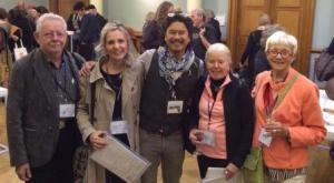
Brendan Tang with Les Manning, Susan Collett, Ann, Mortimer and Ann Roberts at the IAC General Assembly Dublin 2014
Brendan has extended his reputation, recently returning from an International Academy of Ceramics General Assembly in his birth town, Dublin, Ireland, where he made a presentation on the subject of Identity. There he was able to connect with other major Canadian and international ceramists. Although his forms might and techniques might change, for his presentation he confirmed his original focus:
“A common theme throughout my ceramic practice is the reflection on culture and its role on identity. The Manga Ormolu series attempts to reconcile the expanding gap between our collective material history and our objectless digital futures. Through this hybrid of ideas, I have found that the Manga Ormolu series is also an excellent vehicle to address other contemporary ideas such as the body and technology divide, and cultural appropriation in the age of globalization.” 12
Though the forms change the foundation remains the same.
Links to Sites for Videos and more Interviews:
Tang’s work is exhibited in Canada and internationally. He has been profiled by The Knowledge Network, and featured in printed publications including The National Post, Wired (UK and Italy), and ELLE (Canada). In 2010 he received the Winifred Shantz Award For Ceramics; in 2012 he received the RBC Emerging Artist People’s Choice Award.
Brendan is a most tech savvy artist. There are many examples of Youtube interviews and others on the internet. In addition to those mentioned above the following are just a few:
Youtube video of the work #lovechildinstallation. Ceramics, Digital Video and Mixed Media. A 2014 collaboration with multi-faceted artist Alex McLeod as part of Fan Fiction 2014, at Gallery Jones. 1:26 min.
Youtube video of EKWC Studio Tour , 5:42 min. A short but informative video of a 2011 project “ fragment” Brendan was working in the European Ceramic Work Centre, ‘s-Hertogenbosch, that shifts between 2D and 3D design.
Youtube video of Brendan Tang and the RBC Emerging Artist People’s Choice Award, 2012: .
CANADIANARTSCHOOL.CA’S PEOPLE + PRACTICES IN THE VISUAL ARTS SERIES. In this video, sculptors Lois Andison, Brian Jungen, Allyson Mitchell, Evan Penny and Brendan Lee Satish Tang assemble unexpected materials and innovative methods in order to explore contemporary identity.
Knowledge Network: cArtographies ; A 49 minute video on BC artists; The Tang section is approximately 3:18 minutes long ( from about minutes 12:00 to 15:32). Partly about “sugar bombs” exhibit, Kamloops Art Gallery. It shows Tang’s initial frustration working at the wheel throwing a pot (literally), and then seeking inspiration exploring cliffs and caves, discovering new inspirations and returning to his studio to throw and fire a Manga Ormolu work for the 2009 Sugar Bomb exhibit at the Kamloops Art Gallery .There is no dialogue in his section. cArtographies. Producer Leah Mallen; Director Brian Johnson. Knowledge: Twofold Films.
Breaking Boundaries, October 7 – January 30, 2011, Gardiner Museum, Toronto. 4:29 min. The video includes four artists but there are interesting segments on Brendan Tang and his works throughout the video.
Fluff Interview: published on Oct 16, 2013. Fluff interviews Vancouver ceramic artist Brendan Tang in his East Van studio. http://www.rentfluff.com. produced by Jess Goldstein, Shane Edwards, Jane Kienzle. A 4:37 min interview with interesting shots of Brendan’s work and studio.
Brendan Tang – Artist Feature, Mendel Art Gallery. Saskatoon.Click on the Download the MP3 link. Brendan introduces his work in the Sugar Bombs exhibition and elaborates on his interest in ceramics. He also addresses his position in both craft and fine art realms, and reconciling the ideals of contemporary art with the realities of making a livelihood. 4min 28sec / 4MB.
Major Collections:
Public:
Vancouver Art Gallery; Museum of Human Civilization; Rodman Hall Art Centre; The Art Bank, Kamloops Art Gallery; Mendel Art Gallery
Private: (selected)
David and Florence Guerlain Collection; Robert Sobey Collection, Dr. Ron Porter Collection; Jean Charest and Michèle Dionne Collection
Brendan Tang is currently represented by Gallery Jones in Vancouver.
Endnotes & Bibliography:
1. Brendan Tang. Interview and email correspondence with Barry Morrison.
2 . Brendan Tang Website.
2a. Brendan Tang Blog.
4. Wesley Benjamin Colclough IV. Transforming Hybridities: Brendan Lee Satish Tang’s Manga Ormolu and Michael Nicoll Yahgulanaas’ Haida Manga. A Thesis in The Department of Art History Presented in Partial Fulfillment of the Requirements for the Degree of Master of Arts (Art History) at Concordia University Montreal, Quebec, Canada. April 2012.
5. Ceramic Arts Studio Visit: Brendan Tang, Kamloops, British Columbia, Canada. By Ceramics Monthly, January 17, 2011 Ceramics Monthly/Ceramic Arts Daily.
6. University of Lethbridge: Design Now, March 8, 2010.
7. Denisa Kraus. Posted on February 19, 2014. The Navigator: Brendan Tang: mimicry in material culture: Interview with Johnny Blakeborough.
8. Jill Sawyer. Break Out – Brendan Tang. Galleries West, July 2011 .
9. Apostolos Mitsios. The-hybrid-sculptures-of-Brendan-Lee-Tang. The hybrid sculptures of Brendan Lee Tang. published in: Interviews, Art, 08 December 2009.
10. Candice Okada. Futuristic and Techno-Global: The Ceramics of Brendan Lee Satish Tang. Feb 5, 2010.
11.Kevin Griffin. Brendan Tang: the collision of high and low art in Manga Ormolu. Vancouver Sun. April 10, 2014. An interview with Brendan on his Manga Ormolu ceramic works in Fan Fiction, an exhibition with works by Alex McLeod at Gallery Jones.
12. Tang Presentation Summary on Identity. International Academy of Ceramics Sept 2014-09-17: Moving Objects – From Geographic Pasts to Virtual Presence. International Academy of Ceramics General Assembly & Conference 2014 Final Programme. PAST – HYBRID PRACTICE – IDENTITY & INFLUENCE – FUTURE.
——————————————————————————————————–
© 2015 studioceramicscanada.com
