

Capsule:
Birth Date: 1942
Production Dates: 1969 – present
Current City/Province Studio Location: Calgary, Alberta
Types of Work: Functional and Sculptural
Preferred Kiln Type and Firing Process(es): Electric kiln cone 04 and lower; high-fire soda vapour glaze for functional work
Preferred Clay and Source(s): B-Mix, Coleman porcelain, other stoneware or porcelain. Sometimes paper clay, sometimes Columbia White for sculptural work
Website URL: barbaratipton.com
Sample signature/Mark/Chop:

Barbara has had several marks over the years. Lately she has been using a simple “BT”.1
Biography:
You might know of Barbara through one of her many paths: her editorial work with the periodical Ceramics Monthly in the late 1970s and the 1980s; or Contact Magazine, firstly in Alberta, then across Canada; or her teaching; or her exhibiting—in Canada and the United States, the British Isles, Europe and South Korea; or as a ceramic artist and functional potter. Either of these last two paths, especially, will delight or challenge you. Visually their difference will seem like two separate artists at work; but both types come from a deep, ‘meditative,’ inner, creative core. Look at her two works below, both vessels, but oh, so different!


Left: Barbara Tipton. Pink Coral, Green Sea. 2007. Collection: Alberta Foundation for the Arts. Right: Barbara Tipton. Hand-painted Porcelain Pitcher. ca. 2011.
Let’s back up a bit and get closer to earlier details of Barbara Tipton’s life and career.
Originally from Kankakee, Illinois, then various cities across the eastern U.S., Memphis, Tennessee, is where most biographies of Barbara begin. The city came into her life for basic, family reasons:
“My father worked for Dupont and was always being transferred. He ended up in Memphis and we stayed there.” 1
There she displayed an early side of her three-part career arc, an early journalistic talent, working on her high school yearbook. 1
The Memphis Academy of Arts, (now the Memphis College of Art) was the starting place. Initially she was studying printmaking and drawing but in her first year she took a ceramics course “for fun”, was “captured” by the medium and ended up majoring in ceramics.1 Though that one course re-oriented her final, artistic direction, Tipton still maintains an interest in printmaking and drawing. The results can be frequently seen in her work.1 Barbara graduated with a B.F.A. (Ceramics) in 1969, having studied with Thorne Edwards.
Graduation was followed for a few years by “horrible jobs.“1 This work experience was enough to start her thinking about obtaining a graduate degree at Ohio State in Columbus, Ohio. To better prepare a portfolio for MFA application, she continued part-time at the art college, studying with newly arrived Peter Sohngen. She started graduate work at OSU in 1972, concentrating fully on ceramics in a programme of more independent studies. She received her M.F.A. (Ceramics) in 1975
Teaching was a second career path.3 While at OSU she was a Teaching Associate; after receiving her degree, she served as a sabbatical replacement in ceramics at Denison University, Granville Ohio.
Barbara has worked principally as a studio artist, her third career path, since 1975 3 with intervals in teaching and publishing.
Like many graduating students she found the luxury of using a gas kiln in the outside world a rarity but also found electric kiln results lacked the surface nuances she sought. She researched other inspirations to achieve those results .1 One early style arose from her interest in the traditional 16th and 17th century English slip trailers such as Thomas Toft and Ralph Simpson. Linear Images and lattice work were to become features on these works.1 She also avidly read periodicals such as the US Studio Potter magazine and British Ceramic Review and Crafts magazines.1
Many first know of Tipton through her years at Ceramics Monthly magazine. Prior to this she already had several years of experience in publications: firstly, on her high school yearbook; later when “coerced” in college to work on its newspaper; after graduating she even worked at a “sash and door” trade publication in wood-working.1 As it happens, Ceramics Monthly was published in the same city, where she had taken her graduate studies, Columbus, Ohio. She frankly states that her start at the magazine was “partially income driven.” 1 Firstly as Copy Editor in 1978, she moved up to Associate Editor in 1982.1 During this time she also edited and published two books on tips and techniques for ceramists, Great Ideas for Potters and Answers to Potters’ Questions.
This is a period when one needs to dig a bit deeper for examples of her work, for a most professional reason:
”I didn’t think it appropriate to promote myself while at Ceramics Monthly,” 1
While in Ohio she met her future husband, John Chalke, and moved with him in 1986 to Calgary, Alberta. There she has continued her pottery, developing and experimenting with new works in soda firings, exhibiting, teaching—especially at ACAD (the Alberta College of Art and Design, Calgary)—and even taking a brief turn (1992-95) as editor (again) of the Alberta Potter’s Association magazine, Contact.
Barbara has since lived and worked in Calgary creating her signature tea cup works, a major contributor to the artistic and educational scene. Her work has been reproduced in such major publications as 500 Cups by Lark Publishing (2004), Soda, Clay and Fire by Gail Nichols (2006) and The Ceramic Spectrum by Robin Hopper (revised edition 2001).8 Yet she is a private person, sharing herself through her art rather than widely broadcasting her persona. Whether sculptural or functional her ceramics are impressed with a deeper, meditative level. Here there is power, a power that reaches out to others.
Gallery
General Comments
Waddington’s Auction House lists Barbara in its Claridge Collection Auction catalogue of April 2015 as notable for her “deconstruction of cups and saucers.” 6
To understand Barbara Tipton’s work one must appreciate simple facts she declares with passion:
“I love pots. I really do! That whole process of throwing is what drew me into ceramics. And the feeling of clay.” 1
“When I make pots I immerse myself.” 1
Early Works and Slip Trailing
“I’m attracted to the history of pots and the romantic notion of potters.” 1
While at graduate school in Ohio she preferred to work in functional ware, although there was the constant pressure to create “Art”. It was here she realised her “real love for salt glazing and firing,” and incorporating drawing.1 Sculptural soda firings would come later.
Since, as mentioned, gas-fired kilns were few and far between after graduating Barbara added her own twist when using electric kilns:
“I had an electric kiln for functional work that I would fire to cone 8. But because the stoneware body was “greyed” with iron and some of the glazes looked like celadon the work would look like it was fired in a gas kiln.” 1
Still, there were limits. She further explains the aesthetics she sought at the time:
”My glazes in the electrical kiln didn’t have much nuance; the surfaces were bland, That made me start drawing on my work, breaking up the surface to make it more interesting. That’s when I started slip trailing.” 1
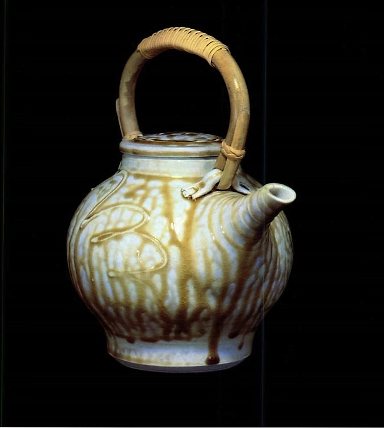
Teapot. This teapot is an early example of a favoured subject. It is simple, functional, with a yellow glaze loosely applied, dribbling down the body of the form with a hint of calligraphy.
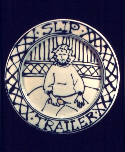
On the Slip Trailer Plate, from 1983, the influence of traditional early English potters such as Toft and Simpson is most evident in the slip trailed lattice design on the rim and the simple linear design of the self-portrait, where Barbara sits full frontal, her slip trailer in hand. In such a work Barbara shows her love of illustration, capturing a moment, a snapshot, on the surface. Not only is this a plate form but also part of a life story, including text. This combination of design and narrative is an ongoing feature of much of her work. This plate is a literal example of Tipton’s using personal imagery in her work. She will continue to add more personal meanings to her later wall pieces.
Cups, Plates and Teapots
As part of her love of pots Tipton created her “art” pots as works that would take them out of the kitchen and cupboards, the usual resting place for tea cups and saucers.1 Also, in the 1980s illustrating was a key feature of her surface designs.
“I’m faced with, in a sense, media prejudice. Pots often end up in the kitchen. Even if they are made for the wall they end up in the kitchen. So, I’m trying to do something that is important to me, to bring that lowly utilitarian form and treat it as an art object, to put varied surfaces on it, and change its perception a little bit.” 1
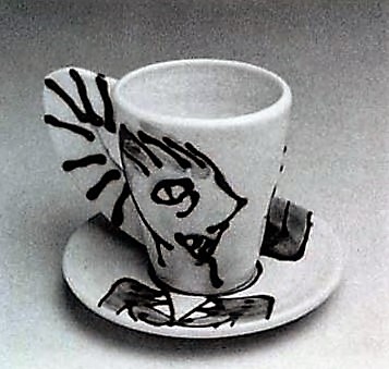
Slip Trailed Cup and Saucer. In an early cup and saucer venture Tipton creates a functional cup and saucer duo. The slip trailed faces on the cup form match or line up with the male and female torsos on the saucer. The handle is a simple slab form striped with slip. There is a bit of play or whimsy in the work, the faces quickly sketched in profile with an “Egyptian eye” staring back at the drinker. The visual-link between cup and saucer prefigures her later physical coupling of the cup and saucer bodies; here the cup and saucer are separate elements and are functional, though barely so.

The Collector is packed with detail. There is the obvious central motif here, torso and head image in a style reminiscent of Egyptian art: body frontal, head in profile, the eye frontal. Quickly drawn, the image is more fully articulated on the flatter surface of a plate. The design now has a hint of narrative, in the title and the figure holding a vase. The figure is dressed in a suit and tie and clutches the vase. Is there an element of parody here, a recognition of the nature of the art market? The colours are primary: reds, blues and yellows, applied in thin washes. Part of the thin rim is a line of deep red dots; the rest a black ribbon, marked with sgraffito and the title “the Collector”. The whole is a signed expressionistic painting on ceramic.
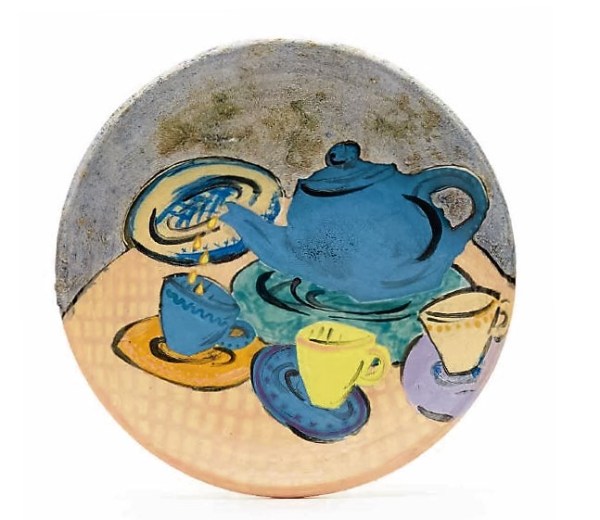
In A Search For The Truth About Ceramics (Utility) Tipton uses “lowly” teapot, cup and saucer as subjects on a decorative plate. Such plate forms themselves were essentially surfaces for Barbara to give pictorial expression to a favoured theme. The design is a simple still life, yet there are hints of future distortions, especially in the placement of the foreground lemon yellow cup and its blue saucer that link with her later wall sculpture explorations.
Teapots and Tea cups for the Wall.
- Barbara’s flat wall works are earlier, starting around 1986.1 In such works the surface is used less as “canvas” and more as an integral part of a sculptural, three dimensional form.
- On looking at Tipton’s wall cups one must put aside conventional forming and throwing thoughts or assumptions, and the idea of them. Each work is unique, based on the forming process of the moment.
Heather Setka says of Tipton’s cups:
“… her clever deconstructions of cups and saucers engage larger art-world debates about the status of craft and the precious object.” 12
- Sometimes, like impasto, her glazes swirl; sometimes they are globs and beads; sometimes thin, flat washes.
- What look like washes are very thin slips. Glassy areas can be slip-trailed or glaze-trailed, or even washed over a crawled glaze.1
- The colours and textures, the result of her explorations in soda glazing and colour, are low-fired, cone 04 and down, in an electric kiln.1
- Although the themes and forms of her sculptural works are European the seemingly rugged and random surface effects and colours have hints of Japanese influences.
“Over the years I’ve discovered there’s quite a lot of freedom in working around a single theme. With a central image in mind I can press thick slabs by hand, employ marking tools or bisque press molds, or form thick shapes and join them. As the clay changes, I attempt to catch it at the right moment; I’m constantly on the lookout for something that seems to ring true as an expression, a sidelong glance, a dim remembrance.” 8

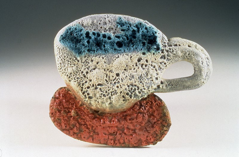
Bronze Cup with Blue Interior has the look of some crushed artifact. The cup and saucer are wheel thrown with steam flowing out of the blue interior like some Scythian ornament. The handle was deliberately broken and re-assembled.¹ Here the surfaces and colours are minimal so the eye focuses on the tension of the dynamically counter-balanced forms.
Recovered I (Caribe) is ten years later. The theme again is recovery, discovery, excavation. Here in dramatic red , white and blue the silicon carbide volatiles in the glaze have bubbled to the surface and escaped giving the cup and ironic porous look, almost like old bone.

First Oakleaf shows Tipton’s use of additions of recognizable visual elements frequently come from nature, placed in a thought provoking, enigmatic juxtaposition. Saucer well and cup interior are both yellow, tying the two elements visually together in a general profile. A crusty combination of white crawled glaze over blue glaze and slip further unite the work. The cup handle is a thick, extended, “u-shaped” coil balancing the basic diagonal slant of the work. The cup rim with its circular row of teeth-like beads provides a distinct contrast to the conventional and expected smoothness of the rim. Then there is that small red and green oak leaf within the hollow of the cup. It is a form and colour shift derived from nature. Perhaps one could go into a deeper psychological analysis of its presence, or perhaps it is just an oak leaf that fell into a cup of tea. Ambiguity, something Tipton likes in her work..

Turquoise Cascade is more a top and interior view as cup and saucer are flattened and stretched. A “deeper” interior in a glossy turquoise glaze is framed by the gloss of a black rim. The small saucer well is similarly treated. The cup body and handle and the saucer are a black that is almost hidden by droplets of a crawling ochre glaze that rest like liquid beads upon an immiscible surface. The contrast is so simple and so striking in both colour and texture, and so controlled. The contrasting glaze areas also highlight contrasting formal depths: turquoise concavities of the interiors of cup and saucer; crawling yellow on a black matrix cover the convex body of the cup and the “flatter” planes of the saucer.
Cups “Not For The Kitchen”
Tipton’s cups are a constantly shifting balance between the love of subject and the love of clay itself: its substance, its paradoxes of “difficult-ease” and “sturdy malleability”.
“An experiment to create a cup-like shape on the wheel without physically touching the clay resulted in my most recent sculptural work. My intention with these objects is to work rapidly so that the clay retains a “fresh” quality. Glazing these works has become a lengthy process of building up layers, adding imagery or further visual texture. Many of the works retain their visual identity as cup and saucer; others retain those origins only marginally. Whatever the outcome, my aim is not to be too specific, and I’m pleased when a certain amount of ambiguity creeps in.” 11
Tipton’s creation process is one constant evaluation and modification:
“I use slip and glaze. I have glazes that crawl revealing the colour of the clay underneath. I might not like the colour of the clay I am using but it has a whitish body with a lot of grit that will stand up, and it fires without collapsing. But when it fires it has a buff colour I don’t care for, so in some of them I might put on a white slip, or blue slip, or even a black slip. In turn that will decide what glaze or other surface I will put on top.” 1
Thus in Tipton’s act of creating there can be accident, assessment, further refining, and experimentation. Her approach in her cups displays her ease and comfort in handling clay on the wheel:
“Often the way I approach them is [to] just grab chunks of clay in my hand and throw them down on the wheel. I don’t wedge. It’s from a pug mill, it’s homogenous and probably air free. I throw chunks of clay onto the wheel until it’s a huge mound. I then get some sort of tool while the wheel is rotating, aim at the middle, open it and push it aside. Sometimes I use tools on the outside. Some of what comes off I might use as a handle.” 1
A work might be fired three or four times.1
“The making part is rapid but lengthy … I want them to look immediate but they’re not. They take a long time.” 1

")
left Barbara Tipton. Delft Extract. 2009. Ceramic. 13 x 19.2 x 17 cm. Collection: Alberta Foundation for the Arts. right Barbara Tipton. Wedgwood Inchoate. 2013. ceramic sculpture, 10.2 x 12.7 x 12.7 cm.
These fully 3D works are literal, obvious cup and saucer forms. The cup-saucer join is now eliminated, making a one-piece work. These two cups are a reference to the British and European ware collected and treasured as “art”, sometimes to be used, more often to be stored and displayed in cabinets. The blue and white glaze surfaces are hallmarks of these two styles: Delftware with its blue and white and “Wedgwood” reminiscent of blue Jasperware. Although similar in general colour scheme they are poles apart in textures, internally the ‘Delft” is cascade of crawled globules, polished white surfaces and decals; the “Wedgewood” is more simple, restrained, with thin washes of blue slip and glaze. Externally the “Delft” is blues, whites and greens with decals, all flowing down to the cup-saucer “join” and to the thinner saucer rim. The “Wedgwood” exterior with its thin, blue, slip wash and crusty white, “sprig-like”, patches suggests some figurative activity complemented by the human tendency to make patterns and images out of random shapes. Its saucer is fat-lipped like some blue bagel.
Experience still lets us read Tipton’s works as two parts, cup and saucer. But Tipton reminds us that:
“What appears to be a saucer is part of the pot.” 1
One reason for this one-piece approach is practicality for such exhibition pieces:
“I want to have some look as two separate pieces but want to keep them as one piece. Partly for practicality sake but also to remove them a little bit from function. It’s also awkward to pick one up. They are heavy [for their size].” 1

Amazonia is a riot of tropical colours – reds, greens, yellows – and of surface textures and edges. It’s as though the very energy of jungle life-force has taken over the surface. A small smooth spot near the base shows a decal of a very early map of south America with the Amazon river, flowing into the saucer. The surface is so complex “parts had to be put back on.” 1 There is a rugged, primal quality of rough edges and textures, all supported by a double lipped saucer. What look like washes are very thin slips containing mica.1
If I haven’t made it clear yet perhaps I need to say that Barbara Tipton likes a variety of images too as in Amazonia above. She used decals in grad school. Now she often makes her own black and sepia decals with her laser printer, using an iron based toner, then firing them to the point where the glaze under them begins to fuse and the iron sticks.1
Intuition plays a major part as she develops her forms:
“Over the years I’ve discovered there’s quite a lot of freedom in working around a single theme. With a central image in mind I can press thick slabs by hand, employ marking tools or bisque press molds, or form thick shapes and join them. As the clay changes, I attempt to catch it at the right moment; I’m constantly on the lookout for something that seems to ring true as an expression, a sidelong glance, a dim remembrance.” 8
 - Copy")


Barbara Tipton. 2013. RivuletsWith Yellow Passage. Multifired, multiglazed clay with stains, decals. 7 x 19 (from handle on left) x 13cm. Collection: Alberta Foundation for the Arts.
These three images show the chromatic, tactile, and spatial complexity of Tipton’s works, features often lost in a 2D screen image. Colours, designs, decals and added gemstones create a sensuous form almost hidden beneath its many layers. The cup and saucer forms are both squared, providing flatter surfaces on which to lay colours, crusts, decals and textures. The cup interior swells open like a bell flower with shades of yellow, lime green and orange, and is smooth, inviting the eye into its depth. The cup and saucer exterior forms morph into an exuberance of colour, textures and design, all heightening the visual and tactile joy of a familiar form.
But there is a price. Barbara says of her surfaces
“The surface creates another problem, a visual problem. It takes a really long time to solve that. I look at it as various types of planes, [further] broken up into [smaller] planes, and sometimes try to apply colour, sometimes to draw back, to cut back. It usually takes several firings and applications of surface mixes.” 1
There is an expressionist need also:
“I wanted the shapes more gestural. I try to change the way I work each time, to keep it fresh.” 1
“Less Obviously Cuppy”: or Harmonies upon a Cup?
Tipton’s further thoughts on technique are worth visiting as we look at some of her more abstract works.
“Most of my sculptural objects center around the idea of the cup and saucer. These works originated as wheel-thrown forms, altered and assembled, but this evolved into drawing on the surface of paper clay slabs and forming them intuitively into three-dimensional shapes. An experiment to create a cup-like shape on the wheel without physically touching the clay resulted in my most recent sculptural work. My intention with these objects is to work rapidly so that the clay retains a “fresh” quality. Post-forming is a time to fiddle with details, and glazing these works has become a lengthy process of building up layers, adding imagery or further visual texture.” 8
She usually approaches her work with no preconception as to how it will turn out. So sometimes a cup doesn’t look like a cup:
“It’s an intuitive thing, something I don’t reason.” 1
And:
“Some of my wall pieces do not look like cups but in my mind that’s my starting point. It reflects back to the fact that the cup form is one of the earliest, most basic of forms. Something we can drink from, get nourishment from, pass back and forth. It’s so elemental; to make people look at that form but change it. In my mind they are all cups.” 1

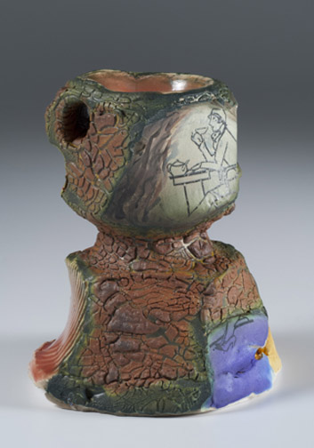
LEATHERN shows how in this “series” of works the cups and saucers are more abstract, often separated as different colours, and of shapes that mask their sources. Here the cup body ripples with almost human torso musculature. Green heightens the bulging forms. The lip and handle are waves and blobs of red, green and yellow, while the saucer is now covered in ripples of purples and blues.

In Cup on Cup/Horse on Hill the forming process suggested an image to Barbara.1 The cup form, though more obvious, is almost masked by the “horse”. But still there are the key elements: the cup interior, almost missed, is hidden on the top as black; the cup form itself forming the body of the horse; the orange handle is the horse’s head; and the crescent saucer with its yellow-red well and brown rim. Barbara exploits the yellow form and its glaze crawl, by touching up the horse’s legs and belly with a strip of blue and purple, the whole creating a beaker form in the process: a cup form within the cup: a vessel within a vessel. She manipulates crawling for aesthetic effect where so many artists see it only as a defect.

Sometimes as in Traveling (Under Uncertain Skies) Barbara’s works can be more deeply personal. She says of this work shown in the Alberta Craft Council Gallery, Edmonton:
“… like many artists’ works, this piece is probably autobiographical as well as allegorical. I’ve been fortunate to have traveled a bit in my life and there are still places I’d like to visit. There have been some unsettling times and much of my recent travels have been in my mind. However, skies are clearing; I’m thinking of traveling again geographically.” 8
The work is lush in colour and surface texture. The colours are autumnal, and with blues purples, greys and ochres, some glossy, some matte. A blue-purple horse slowly steps its way over rocky ground beneath a band of oak leaves. Horse and oak leaves are a favoured motif in Barbara’s works. How many artists can create an expressive landscape from a cup and saucer form?
3D Sculpture Forms
Tipton will often let a germinal form lead to further explorations:
“I try to work differently each time to keep fresh. One method of working for me is to go into the studio and discover something, not to make the same thing over and over again. I’ll start working without any preconceptions and then see what happens. Then if I like it I’ll do quite a few of them.” 1
Her adding or subtracting clay is flexible:
“Sometimes I have to add clay back. I cut through and have to add back. It’s a more free-form expressionist approach.” 1
Although flattening the entire form, as against a wall, is one way to modify the cup/saucer shapes, another is to flatten the surface curves, to cut or bat them box-like into flat, planar surfaces on a free-standing form. The works below seem ‘harder’, more brutalist, as though cast from concrete, more obviously carved and shaped. Some of her other works look almost “soft” by comparison.
“ My thinking is how little can I do and still have it looking like a cup? … And I wanted it to be a shape that was much more gestural and not controlled, and that ‘stop motion just before it all flew apart kind of look.” 1
“Post-forming is a time to fiddle with details, … [g]lazing these works has become a lengthy process of building up layers, adding imagery or further visual texture.” 12

Carved Blue, was displayed at the “A Departure of Cups” exhibition at the Willock and Sax Gallery, Banff, the work is rugged, with sharp edges as though carved along cleavage planes. The colour is dark, in blues, purples and blacks, with just a hint of complementary orange. Like many such works it was probably opened all the way to the bottom then plugged where it narrows.1 The hole of the handle is what clues us in to the fact it is cup and saucer based. There is a monumentality in the 2D screen image that belies the fact that it is only 10 cm high.
“… all [such] pieces … are low fire. The clay used varies: it can be stoneware or porcelain, Just bisque because it won’t be drunk out of. I’m not worried about it being vitrified. … [These] cups and saucers are all fired in an electric kiln. The more recent ones only fired to cone 04 and down. 1
In Then and Now, the saucer, a pedestal, is more sharply facetted than the cup. The two forms are conjoined. If you look carefully the decal of the woman on the cup is continued in the blue patch on the lower right. A linking element she has played with since the 1980s.
“A 1930s ‘proper’ woman drinking from a perfectly functional cup seemed a suitable image to place on an ‘improper’ cup. In a sense, this work continues her play with the idea of function.” 8
“If I put a decal on or add china paint then that’s a much lower firing. Sometimes they will have several 04 firings just to build up the surface.” 1
Functional Ware Today
“Making pots does make me happy. … I like to think of myself as a potter and wish I could keep getting better.” 1
“…craftwork which attracts me – no matter what material – exhibits a certain amount of care as part of the maker’s intention. This care is part of the forming and finishing of the object as well as consideration of how it will be perceived by its future owner. I’d like to think that my own work exhibits such care. The forms I make, whether utilitarian or sculptural, refer back to the roots of pottery making: objects made to transfer sustenance to the user.” 8
Tipton’s functional works are simplicity of form, design and purpose, direct and restrained in their surface treatment and colours. She doesn’t enter her functional works in exhibitions except for occasional exhibits at such venues as the Willock and Sax Gallery, Banff, and the Alberta Craft Council, Edmonton. Functional ware and slip trailing return her to her roots and early love of simple clay and surface design and process. In their creation there is a deeper immersion, a personal satisfaction that is less of an artistic struggle.
The scope, the variety of Barbara Tipton’s functional forms and styles is extensive. Below is a small sampling.

Cloud Bowl. In her functional ware, as in her sculptures, Tipton approaches her work as though she is “immersed” in another meditative or contemplative plane as her hands connect with the rotating, soft clay on the wheel.
“When I make pots I just like to immerse myself in that act.” 1

Batter Bowl, is typical of much of her functional work the forms are simple with the throwing marks evident. The glaze is smooth, glossy, in rustic colours of light brown and green outlined in blue-black. There is a simple leaf design, Zen-like in its simplicity of form and line decorating the exterior. The form is a simple bowl, its lip pulled to pour the contents. This is a work meant to be used, physically handled as well as enjoyed.

These Latte cups, unlike her exhibition pieces her functional ware sometimes follows the norm of a series, of similarly replicated works. The mugs are swollen-bellied with her favourite leaf and stripe designs.
“Tipton is inspired by historical drawings, ceramics and churches and regularly searches the Internet for images. She delights at blue-and-white Chinese floral patterns and herbal drawings from the 16th century. She uses such illustrations to create decals that give her work unusual character.” 12

Another interest of Barbara’s, especially those of antiquity, is seen in Horse Plate. Here a horse motif, a favoured theme, was inspired by Paleolithic painting from such places as the caves of Lascaux and Altamera, The design is simple, central, a painting upon a new, once clay surface, now stone.
“For most of my artistic life, I’ve made objects for daily use as well as objects intended primarily for the eye and mind. Both serve fulfilling aspects for my role as an artist, and again, the process of making each type of work reinforces and informs the making of the other. Pots thrown on the wheel generally approach a country aesthetic, being simply constructed, sometimes drawn on, soda glazed and/or wood fired.” 8
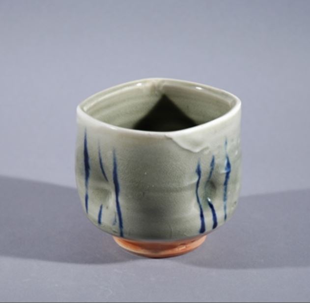
Yunomi further shows Tipton’s broad range of interests. Here in a nod to Japanese forms and styles Barbara displays the breadth of her talents. A simple thrown cup, squared, slightly impressed for holding, with simple vertical blue lines. Here there is deformation but from a different canon, Japanese.
Other Directions, Possible Future Works?
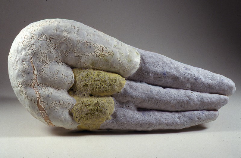
Grey Terminus, a final work shown is an outlier, not a work that one would have thought was created by Barbara Tipton. Here in a horizontal orientation it looks like a wing or hand but not a cup and saucer. It is a larger work. The colours are subdued, grey-white, grey-purple and muted yellow. The surfaces vary in texture with the colour. So far, basically a one-off, Barbara hinted in conversation that this might be an essay into future directions. Let’s follow up a couple of years from now
Major Collections:
Barbara Tipton’s works are in private and public collections throughout Canada, U.S.A. and England, including:
- Canada Council Art Bank
- Glenbow Museum
- Alberta Foundation for the Arts
- Calgary Civic Art Collection
- George R. Gardiner Museum of Ceramic Art
- Aaron Milrad, Toronto
- Standard Ceramic Supply, Pittsburgh
- Charles Bronfman Corporate Collection, Montréal
- San Angelo Museum of Art, San Angelo, Texas
- The Ohio State University, Harrison Museum of Art
- Utah State University
- Ceramics Monthly Collection
- Anatol Orient, London
- University of Alberta Permanent Collection, Edmonton
Endnotes & Bibliography:
1. Barbara Tipton. Interview and email correspondence with Barry Morrison. September 16, 2016 ff.
2. Barbara Tipton. CV from Website
3. Willock Sax Gallery, Banff, AB. Barbara Tipton page
4. Tourtillott . Suzanne J.E. (Editor). 500 Cups: Ceramic Explorations of Utility & Grace. Lark Crafts. February, 2005.
5. Barbara Tipton. Books titles etc. Answers to Potters Questions. Publisher: Ceramics Monthly; 1st edition (June 1, 1989); and Great Ideas For Potters. Publisher: Ceramics Monthly; Fourth Printing edition (June 1983). Great Ideas For Potters. II. American Ceramic Society; 1st Printing edition (June 1, 1998).
7. The Willock and Sax Gallery, Banff is a major outlet for Barbara Tipton’s functional ware.
8. Tipton Alberta Craft Council – 2015 Feature Gallery – 2015_
10. Bradbury, Tara. ‘March of the Mugs’:Artists team up for group ceramic show. The Telegram. February 27, 2014:
11. Barbara Tipton Facebook Page.
13. The World’s Women On-Line!
14. Alberta Craft Council. Barbara Tipton April 6-July 2, 2013. Alberta Craft Magazine. Quarterly. Spring 2013, p. 7.
© 2018 studioceramicscanada.com

wonderful photo montage, descriptions, personal thoughts, and history. I’ve enjoyed reading it through immensely. Thank you for this, Ruth Lehmann
LikeLike
Barbara is a most generous perdon
LikeLike