

Keith Campbell 1987

Keith Campbell Today
Capsule
Dates: born 1947, Hamilton, ON
Production Dates: 1967 – present
Location: North Bay, ON
Types of Work: functional and sculptural
Preferred Kiln Type and Firing Process: Electric kiln; oxidation
Preferred Clay: early work stoneware; since 1973, porcelain
Website: Keith’s Home Page Link
Signature/Mark/Chop:

Keith Campbell’s Chop Mark
A Short Biography:
Born in Hamilton, ON, Keith Campbell spent much of his early years in Niagara Falls, ON. His interest in ceramics started in high school. Referred to Sheridan College, Oakville, he was originally interested in furniture design. Since he had to take all media he became fascinated by clay and stayed with that medium. He studied under Bob Held, Vivika Heino, Ruth Gowdy McKinley and Jack Sures. The program at Sheridan in those days – only two years long at that time – demanded extensive critiquing and quizzing of students. At the time Sheridan had no equipment. The students and teachers had to build it all. By the time he left Sheridan in 1970 Keith was not only versed in all aspects of creating works and building a studio, he had already participated in thirty-three different exhibitions. Participating in exhibitions has always been a particular interest of his.
His work history started at an early age. Prior to his graduating in 1970 with a Diploma in Glass and Ceramics from Sheridan – the first graduate of the program – he worked at the college as firstly as a pottery studio technician from 1968-1969 and then for the summer of 1969 as an assistant to Jack Sures. Keith was already becoming well connected.
He and his classmates, Diane Creber, Ken Cumberland, Jane Agnew, Linda Stewart & Gillian Lewis were the first graduates.1
At the time, around 1967, he could see shows organized by the Canadian Guild of Potters but he was more aware of what was going on in the U.S. than across Canada.
This student phase of his life was to be paid back many times as a teacher, workshop leader and animateur, essentially for the rest of his life. Between 1970 and 1977 he taught at various colleges throughout Ontario: Mohawk, St. Clair, Sheridan, George Brown. But it was his late 1970s move to Corbeil and then to North Bay, Ontario, and his work at Canadore College, that became the home for much of the rest of his career. It was here, in addition to creating his work, that he became the key organizer and educator in ceramics for the region: First as Professor of Ceramics and Director of Artsperience, Summer School Of The Arts from 1977–2003; and then as Professor and Artist In Residence from, 2004 To Sept. 2009, and Coordinator Of The Fine Craft And Design Program. From 2009 as full time Studio Artist, (Artist In Residence Emeritus.

Keith Campbell in his Canadore Studio. Source North Bay Nugget
In 1998, ever mindful of the demographic changes in the ceramic world he developed the two year Fine Craft and Design Diploma Program at Canadore. The program was designed:
” to meet the needs of students who will graduate with all the necessary skills with an emphasis on marketing, advertising and business so the graduates can set up small studios as cottage industries. This program is meeting the need of the craft market place in today’s world. The program will fill the gap in replacing retiring craftspeople as well as bringing new life and vision for the future of crafts in Ontario and Canada.”2

Keith Campbell and the North Bay Potters Guild, March 2014
Some of those demographic and economic changes have now had their effect in cut backs that have affected the academic ceramic world in Canada. More recently there have been program changes at Canadore, and Keith, the perennial optimist, overcoming major health problems, is now involved with establishing the North Bay and Area Potters Guild.
Keith has exhibited extensively, at last count in over 280 exhibitions. He is accepted into just about every show he has entered and has won numerous awards His awards of excellence and best in show are too numerous to list. He is one of the thirteen original founding members of Ceramic Masters Canada. Most recently he has been Artist in Residence Emeritus at Canadore College, North Bay, Ontario. He was into was inducted into the Niagara Falls Arts and Culture Wall of Fame on October. 26, 2013.This is probably a first for a clay artist or craftsperson to get this kind of recognition.1
Other Keith Campbell Factoids You Just Have To Know
Hobbies: Keith collects Button Hook’s.
Records: Keith still holds a weight lifting record at Stamford C.V.I. in Niagara Falls, ON. He broke the record in the 130 lb weight class by curling 130 lbs in 1967. This record still stands.”2
Honours and Awards: As of October 2013 Keith has fifty four.

Keith Campbell’s Business Card
Art Gallery and Analysis of Keith Campell’s Work
General Thoughts

Keith Campbell, Alexander Wood – Gay Pioneer, (2009) c/6 porcelain, 52 x 26 x 20 cm, oxidation, airbrushed with underglaze stains with a clear glaze over, thrown, pressed and handbuilt with pulled handles. Courtesy of the artist.
Keith believes the finish is what separates the professional from the amateur.1 More recently he has moved into historical and social commentary – often little known – in his subject matter as well. Still, he has always enjoyed underglaze pencils, airbrushing and photo images as key elements of his design.
He originally worked in two main styles. The first involved throwing porcelain and bisquing. He then draws on the surface with underglaze pencil and creates such forms as lines with black stain. He’ll then spray it with a clear glaze and fire it with cone 9 or 6, whichever he was doing at the time, then add lustres and refire to cone 018. Often he will use decals in his multiple firings.1
His second process is more complicated. He uses airbrush to create scenes in multiple colours, and then uses templates and drawings to build up areas. This can take from one to four hours or even up to a full day per piece. In effect it is a painting on clay. The layers upon layers of design and glaze give his work a subtle depth.1 This style has evolved more recently in to his more whimsical and sometimes subversive subject matter on sculptural and decorative functional vessels.
1973 was a turning point for Keith. Up to that time he had been mostly working in stoneware. He had been doing porcelain technique on stoneware but it was not working for him. Since that time he has worked in porcelain.
Surface, or finish, as mentioned above, is important to him, although one has to have good forms to start with. Keith likes to throw but will also incorporate hand-building into his work. He feels it is the glazes and decoration that people react to. He moved more into working in porcelain, feeling porcelain is a happy medium between stoneware and glass. He also feels that porcelain is seen as delicate as opposed to stoneware, producing a different frame of mind and appreciation. Keith exploits the fact that porcelain reflects the glaze because it has no colour itself, like a canvas. He calls his work “clean” requiring a steady hand to get the machine-like lines. It is tight and controlled. This quality is also reflected in his firings: he does not have many kiln “accidents” although spoilage is a problem because of the porcelain; he likes to repeat his successes. When he went to porcelain he acquired the “preciousness and respect for the clay.” His earlier work is on the cusp of functional and non-functional. It is functional but is so highly decorative that people might not use it but they can use it, and it is nice to use. His later works are less functional, more to be viewed and read or interpreted as statements in their own right.
His earlier works often contrasted sparkling glaze with the metallic sheen of lustre, or with the flatness of a matte unglazed bisque surface. His more recent works such as his Louis Riel series (see below) show an interest in a newer expression of content that goes beyond form and colour into the story, often with a paradox: history paints Riel as a murderer; more recently he has been portrayed as a “founding father” hero. Keith has thus moved beyond the pot as form and surface to the pot as commentary. Its use is not purely functional and tactile but also intellectual and emotional.
Early Work
1970s

Keith Campbell. Three Straw Flower Holders With British Flag
Straw Flower Holders with British Flag, Stoneware, Raku, Tallest work approximately 16 cm. high. These were shown in the Canadian Ceramics 1971 Exhibition at the Royal Ontario Museum. Although lacking the delicacy of his later works of the 1970s Keith is already showing his historical interests.

Keith Campbell. Yonge Street Shoes, 1975.
Yonge Street Shoes, 26 cm long x 17 cm high, porcelain, cone 6, glaze and lustres. These were in the Art in Craft Exhibition in 1975. Already Keith is exploring subjects beyond the non-functional and beginning to show that sense of humour that will be a constant in much of his later work. The high platform shoes are a comment on 1970s fashion and a deliberate poke at the pretensions of the time.
Ceramic Hinged Works

Keith Campbell Porcelain box with porcelain hinges, 1976 – 77.
Hinged Box 4. 1976-77. By the mid 1970s Keith’s work takes a dramatic stylistic turn. All these porcelain boxes with porcelain hinges were made in 1976 – 77, reduction cone 10 with cone 018 lustre and black flocked interiors. This is an oval box with hinge and flocked interior with mother of pearl blue lustre and gold. He says of these quite fragile works:
” They were fun and drew a lot of attention. I even went on TV in Toronto to show them.”1

Keith Campbell “Lollipop Box,” 1976
Lollipop Box. 1976, porcelain, cone 10 reduction, cone 018 lustres, 23 cm long. A work similar to this won an award in the first exhibition of the OPA called Down to Earth in 1976. Lollipop boxes are playful riff on functionality and sculpture. One does not know what these containers are until told or the lollipop is placed inside or nearby. Even then there is the sense of child’s play countered by the admiration for the sophistication of form and technique.

Keith Campbell “Double Lollipop Box,” 1978.
Double Lollipop Box, 1978, cone 10 porcelain, reduction with lustres, 45 cm long. This particular work won an award at the National Canadian Ceramics Exhibition in 1978.
Interestingly most of the lollipop boxes were bought by dentists.1
However, in spite of the success of these works Keith moved from the Funk look of this early period and began to address other techniques:
“ In the late ‘70’s my work changed with my environment! I started to work with airbrushing stains on my bisque porcelain work, then glaze firing them to cone 6 oxidation.1

Keith Campbell. Plate With A Tendril Design, 1978.
Porcelain Plate with tendril design and scalloped edge, 1978, 21 cm., wide, press moulded, Tendril design drawn with under glaze pencil, cone 10 reduction, lustre cone 018. This work won an award in the second OPA biannual exhibition called Fired Up ’78. The design results partly from an interest in Celtic interlace design that is linear, contrasting with the surrounding bubble foam of precise, simple circles. The effect is like a miniature landscape, a river detail of water reeds and foam ,of a back water eddy. Is it the emergence of life or its submergence by foam? The design is surrounded by super-bubble circles of the plate lip that in turn evolve into an animated ogee-scalloped, edge-pattern. The whole effect is restless, dynamic in design and form.

Keith Campbell. Large Covered Jar, 1978.
Large Covered Jar, 1978, porcelain, tendril design drawn with under glaze pencil, cone 10 reduction, lustred, 32 cm high. The overall shape of the vase and lid are simple, classical, elegant in their proportions. The tendrils design is here more animated and intertwining, creating a shallow, abstract depth. This is counterbalanced by the simplicity of pure, clean lines that define the throat and rims of lid and handle. Like the plate above the colour is simple, restrained in muted browns and blues on white. This contrasts with some of the primary colours he uses in his later historical works.
1980s
The early part of the ‘80s continued the forms, designs and technique of the late 1970s. There was a period of intense colouration with experiments in landscape themes, scale and surface handling. By 1985 Keith soon, however, was to use the tendril theme in new, sometimes controversial, ways, in his “Flying Fat Lady” works.

Keith Campbell. Two Plates, 1978.
Two Plates, 1980. airbrushed and drawn with a clear glaze, approximately 30 cm. Keith moved to Callander, just outside of North Bay, Ontario, in the late 1970s. The northern landscape, so different from southern Ontario, provided him for a while with immediate inspiration as it has done for so many Canadian artists. However,
“These plates with scenes were so popular I stopped making them because I figured they were too middle of the road.”1

Keith Campbell. Tall Landscape Vase. 1982.
Tall Landscape Vase. 1982, porcelain, 45 cm high, cone 6 oxidation, glazed interior and airbrushed; glaze stains on the outside; with no exterior glaze but a thin spray of frit to seal the surface. Works such as this are romantic in their design. They are simple, elegant forms with a landscape theme that hearkens back to the nationalistic romance of the Group of Seven. They are in a word, as corny as it might sound, beautiful. Yet there was another pull developing in Keith’s oeuvre, the need for social and historical commentary.

Keith Campbell Covered Jar, 1984.
Covered Jar, 1984. Thrown and altered airbrushed stain, glazed interior, no glaze on the outside except on the stem; over-fired creating a pebble surface, cone 6, gold lustre. This work was exhibited in the “84 CLAY EH! Exhibition” in Calgary. This form with its sensuous, fertile, ovoid shape is a precursor, a link to his works of the Flying Fat Lady series from about 1985 on.1
In short because his earlier works were so popular he felt he was not on the right track for himself, artistically. He moved on to other form and content. From the early 1980s on he has worked on developing a more personal aesthetic and style. Much of his work is produced to satisfy his own artistic needs rather than produced for a customer or client.1
Flying Fat Lady Series
Keith has never been one to shy away from controversy and political correctness. This new series was the first of exploratory themes that would occupy him for the thirty years and more. Initially they involved gender issues, later Canada’s historical past and its social present. His work in the 1980s begins to morph in look, content and effect. Keith began to exploit his interest in Celtic interlace patterns, a loose form of which was seen on his plates and jars of the late 1970s. These developed into tendrils which in turn evolved into the women of his series.1
Keith says of the series:
“I am using a tongue in cheek theme. It is all about levels of knowledge and understanding.”1
He was to use this series until the mid 1990s

Keith Campbell. Merrily Merrily Down The Stream, 1985.
Merrily Merrily Down The Stream. 1985. cone 6 porcelain, airbrushed, etched, airbrushed, press mould/thrown, scalloped edge, 32 cm. This work, shows the transition from the landscape form of tendrils morphing into the flying ladies. The tendrils occupy the upper area of the plate undulating upwards like river-side reeds. The schematic women, a further evolution of the tendrils, leap or fly in an ecstatic, dancing counter-movement, horizontally from right to left in the stream below.
“You can see I am starting to put in sexually elements in this series. People got a real kick out of these works. I only offended a couple people. The purpose was using the sensual form like a Peter Paul Rubens painting. You cannot get sensual with a twig like form. I am also holding up the image of women as a great symbol.” 1
Keith Campbell. Balancing Gold Balls, 1986.
Balancing Gold Balls, 1986. Porcelain, 36 cm high, thrown covered jar with sculpted Flying Fat Lady at top, airbrushed stains, underglaze pencil drawing, lustre, cone 6, oxidation. This work shows in its form Keith’s simple and classical elegance of the basic lidded-cylinder form with a subtle surface decoration of stains and underglaze pencil. The figurative finial or handle is now three dimensional, a hand-modelled shift from the two dimensional image of the plates.

Keith Campbell. Sweeter Than Honey, 1989.
Sweeter Than Honey,1989. Porcelain, 20 cm high., airbrushed, red glass enamel, gold lustre fired to cone 018, oxidation cone 6, A honey pot, this work was in the exhibition “Fit For A King” at the Gardner Museum. Here Keith was using the theme with a more overtly sexual element. The honey pot is itself a sensuous rounded inverted bowl, delicately decorated in pinks and red dots. The use of gold lustre defines margins and sections. The Lady is now larger, a dominating part of the overall design. Here it seems less a handle; the pot itself seems to act as a base, a pedestal for the hand-made sculpture.
“People loved this work especially the figure of the Flying Fat Lady as the dipper into the honey.” 1

Keith Campbell. Taming Of The Screw, mid 1990s.
The Taming of the Screw. Mirror with aluminum frame. Porcelain with clear glaze and platinum lustre, 122 cm long. cone 6 and cone 018 oxide. This image, a section of the frame, shows the female figure slowly morphing into a screw.
”The theme is basically a statement on how women are screwed at every level. This work caused a huge uproar at the College because I had it hanging in the offices of Continuing Education. Human Resources at the College tried to have me take it down. After I explained all the levels of the work they let me keep it up. They said it was ‘Raw”! I said yes and that was it. I think it was very successful as a work. You cannot beat public opinion.” 1
More Recent Works: Dead Things, History, and Commentary
Keith not only likes to comment but also to teach. These have been long-time passions.
He has more recently moved to more explicit, sometimes more shocking, works involving road kill or political commentary, or playing on words suggesting mortality. Sometimes the obvious subject is from nature, sometimes from Canadian history. The direction initially fluctuated, from capturing the elegance of his earlier forms and surfaces to tongue in cheek commentary, to outright expressions of frustration, with current political events.
As seen from his earlier works Keith has made it a point to not be conventional. A subject might now appear, e.g. Louis Riel, but it will be in different forms. Also, history and even death have become a subtext of his work. But typically Keith, he refuses to dwell on the morbid or funereal. Perhaps this has something to do with his series of major coronary operations; maybe it is something inherent in Keith’s psyche. Now a new messaging becomes a constant in his work.

Keith Campbell, Road Kill, 2005
Road Kill ( a New Canadian Scenery). 2005. Keith relishes Canadian history and Canadian culture. He researches it, studies it and frequently plays with it. His humour is at times puckish as in his Road Kill works which are a “Campbell” version of the northern landscape. It does not sit on a pedestal or hang on a wall; rather, it sprawls in an obvious place, on the floor, the “road surface” of the gallery.
In his recent works the image, the message, is increasingly important. To do this he modifies the platform to enhance the story in a symbiotic relationship. The form of the pot and its elements are modified in a post-modern fashion. The art of throwing is now not the only focus; rather, there is also snapshot narrative re-constructing some of the main themes in Canadian history along with sculpted appendages and narrative surfaces playing their part. The works are no longer mere vessels but platforms for commentary. As a theme is repeated – and he does repeat favoured themes – the pot becomes a two dimensional form, or a diorama, or a plate, a plaque, or just plain sculpture reminiscent of funk. They are now a history picture show with sometimes the lesser known “heroes” of Canadian history, sometimes with trenchant commentary on past and present notables,
“My work revolves around the themes of Canadian myths, legends, and history. Most of these works reflect my sense of humor. I find it interesting examining the themes of the historical works I create and how the events look from this time period …It is extremely important for me that the viewer becomes visually involved with the work.” 4
These works are designed and constructed by throwing, hand-building and other sculptural techniques and by using a variety of specialized decoration techniques such as photo stencil imagery, air brushing and spraying, as well as drawing and painting The works can also go through a number of firings from glaze to onglaze to lustre, C/6 to C/015 to C/020.4

Keith Campbell, #1 (PM Harper), 2012.
Stephen Harper Is #1, 2012, Porcelain. 20 cm high, cone 6, air brushed photo stencil and hand painted, thrown and handbuilt, Created for the Burlington Art Centre Art Mug Auction. His images of current politicians can bring extensive criticism onto Keith. The works can start out simply such as this work. The image is of Prime Minister Stephen Harper in a hockey shirt with a hockey stick as a handle called “#1.” The form and subject seem innocent enough:
” The PM is a big hockey fan and I received a lot of flack for doing this piece. … He is the First Minister whether we like it or not. I wanted to call it #2. If you try to drink from this cup you get the stick in the eye so watch out!.”1
But his commentary can become more caustic as the occasion demands:

Keith Campbell, Time to Change the Roll (PM. Harper) 2011.
Time to Change the Roll, 2012. Porcelain, 20 x 18 x 16 cm. Thrown and hand sculpted in cone 6 porcelain, air brushed photo stencil image in black underglaze stain and brushed underglaze red stain. This work resulted from Harper’s proroguing Parliament.
“This is important because I see it is the job of artists to make references on political actions. There seems to be very little of this going on which is sad. Have artists been gagged?” 1
As mentioned previously Keith has pursued an agenda of bringing lesser known historical personalities to the fore, such as Darcy McGee, Canada’s assassinated politician, or Alexander Wood, the nineteenth century ”gay pioneer” or by revisiting what is conventional interpretations of Louis Riel.
“Usually my subject matter is dead but I am doing more relevant Canadian Historic events. I cannot stop creating even though I am not up to the level I usually am. Life is short and then you die. Ha! Ha! That is a saying. not what I have planned.” 1
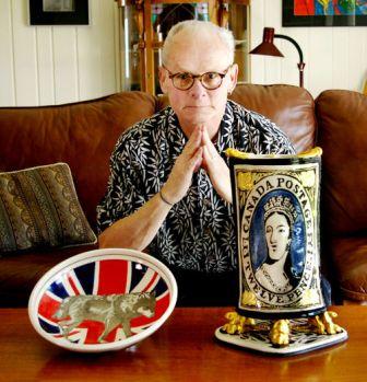
Keith Campbell with his Works Wolfe, left, and Canada’s Holy Grail .
Keith Campbell with his entries for Fireworks 2013. “WOLFE” cone 6 porcelain bowl on the left and ‘Canadian Holy Grail” on the right. Works such as these are a parody of printed commemorative wares that show sentimentality, or adulation, or the kitsch of historical or celebrity figures.
Canadian Holy Grail, 2013. 38 x 27 x 22 cm. Handbuilt, pressed mould beavers, Photo-stencil image with under glaze stain and clear glaze, under glaze pencil drawing, 24 carat gold-leaf, was inspired by the first printed stamps in Canada in 1851. This stamp of Victoria as a young woman sold for a million plus dollars a few years ago and was referred as the Holy Grail. He adds a twist to The innocent looking “Wolfe” bowl. The title is:
“WOLFE” because it refers to General Wolfe. Of course people will think I spelled wolf wrong because I have a wolf image in the middle of the Union Jack. I love the idea of getting people to look further and if they don’t it is their loss.” 1
Most of his work is historical but he has also moved onto the realm of social commentary, moving into historical and contemporary (as in the Harper works above) “craftivism”:
Campbell has a fascination with such controversial figures such as Louis Riel, delving into the controversy of the traitor vs Father of Confederation debate. Perhaps this reflects an innate rebellious streak in Keith himself as he displays as tongue in cheek humour both in imagery and in titles. The montage below shows the scope and scale of such interest.
 Works from left to right:
- A Difference of Opinion Louis Riel and John A Macdonald. 2006, 37 x 4 cm, cone 6 porcelain, air brush photo stencil with underglaze stains, underglaze pencil and clear glaze. Thrown, oxidation.
- Rebellion 1885 (Louis Riel) (2007) 53 cm high, cone 6 porcelain airbrushed with photo stencil images, underglaze pencil drawing and painted underglaze stains with clear glaze. Thrown with sculpted handles. Collection of the Winnipeg Art Gallery.
- Brown Tie Affair (Louis Riel). 2010, 47 cm x 35 cm x 6 cm, cone 6 porcelain handbuilt, photo stencil airbrushed in underglaze stains, etched, wall mounted.
- The Mounties Always Get Their Man. 2010, 36 x 14 cm, cone 6 porcelain thrown with lugs, airbrushed photo stencil and hand brushed images with underglaze stains. oxidation
- Winter of Discontent, Louis Riel. 2012, cone 6 oxidation. Porcelain with photo stencil images with black underglaze stain, clear cone 6 glaze, gold lustre fired to cone 018. size 50 cm x 26 cm. Handbuilt, Collection of Dr. Warnie Richardson.
Some subjects are interesting because of the repetition or juxtaposition of images on a variety of forms, others because they are obvious commentary on what Keith sees as an historical controversy or injustice. With Keith the mood can be patriotic loyalty, or a reconsideration of accepted history, or a straight poke in the eye.
Toast and The Toast Exhibition

Keith Campbell, To Be Toast. 2010
To be Toast, 2010. Stoneware, 21 x 25 x 25 cm. cone 6 oxidation, clear glaze with stain and platinum lustre fired to cone 018, thrown and handbuilt. Keith does not hesitate to laugh at himself in his work. Works such as this are an hommage to Robert Arneson’s 1965 funk work, “Toaster.” With such autobiographical works Keith inserts himself right into the exhibition theme. Keith himself has dealt with major health issues over the past years. Typically such work is done with humour. “Toast” is Keith’s play on words: at the same time the word says a “toast to the honoured figures on the gallery wall”; that “they are the toast of the town of Canadian history”; that they are toast, “they are dead”; and finally, “they are ceramic toast slices.” They are all four meanings at the same time. Keith has turned to flat tile-like pieces of ceramic toast installing multiple pieces to make the whole comprehensible and literally spelled out on the gallery wall. The pieces of toast are for sale individually and most of the names would send most people back to their history books to identify who the person is. If so Keith has identified one of his goals. But Keith also has a humourous caveat:
“Here is an important note: When you put a person on the toast make sure they are dead. I had swimmer Marilyn Bell on one and she is not dead. So I made a new piece of toast with Emily Carr on it. Oops!” 1

Keith Campbell, The Toast Exhibition, Tom Thomson Gallery. Courtesy of the artist.

Keith Campbell, The “T” of Toast. Courtesy of the artist.
Toast. 2010. Installation size 83 x 420 x 1.25 cm; 40 pieces of porcelain shaped toast each 13.5 x 12 x 1.2 cm, slab-rolled, template-cut, airbrushed photo stencil images, underglaze stains and pencil and etched with no glaze; fired to cone 6 in oxidation. Each piece continues the historical theme but the flat wall-mounting is a new way for Campbell. It is a full installation piece of slices of toast, each bearing the portrait of someone Keith considers of interest to Canadian history. The work, (or is it works?) were originally part of a thirty piece travelling exhibition that ran from 2011 to 2013. A book on the exhibit was produced in December 2013 by the Johnathon Bancroft-Snell Gallery.
Originally the concept was for a multi-piece sculpture:
“I had thought of making a loaf of bread with crust ends so people would have to pull out each piece to find out what is on it but make it so one is led to the next piece to get the whole story or “loaf”.”1
The installation approach was the final result.
Always the educator Keith produced a key to identify the individuals on each toast slice:
“Of course I had a key made so people could find out if they knew the individuals on the toast. It was like a test of knowledge on Canadian History. People really got involved and would start talking to other people who were viewing the work at the same time. It truly opened the door to interactive communication. I have plans for other works like this for the future!”1
Recent Works, 2013ff

Keith Campbell. A Truly Historical Canadian Moment, Canadian Amphora Series, 2013.
“A Truly Historic Moment in Canadian History” 2013, porcelain, 56 cm high, cone 6 , thrown and sculpted, Air brushed and hand painted, stenciled. It depicts MP Justin Trudeau (Liberal) boxing Senator Patrick Brazeau (Conservative). This work is from Keith’s Canadian Amphora Series. It depicts the boxing match of Trudeau against Senator Brazeau, Liberals vs the Conservatives. The urge for elegant, post-modern form with political commentary has now resurfaced. Playing on a classical Greek amphora form Keith portrays not a mythological or battle theme but an “heroic” theme of good over evil. Not only is the content of the subject wrapped around the surface in a non-classical style but the very contours and shapes of the amphora have been modified: the neck extended to precarious lengths; the handles sculpted as boxing gloves; the body now sitting on its own bell-shaped base. The image celebrates in a post-modern fashion a new mythology, for who know how Keith will translate future history of good over evil.
To show the intensity of his passion Keith says:
“I think this represents what Canadian feel is what should happen. Let the leaders step up and battle it out. It is primitive but like the old saying goes “put up or shut up”. If the conservatives had won Canada would never heard the end of it but the liberals won so it got pushed to the back. Typical!” 1

Keith Campbell. “Never Enough For The Duff”! 2015. .
“Never Enough For The Duff!”, 2015. Height 38 cm, C/6 Porcelain, oxidation, bisque and then glaze firing, sculpted thrown airbrush stencil, drawn and painted with stains with a clear glaze. Here Keith steps into the political kaka of senate spending. His imagery is uncompromising in its meaning and feeling. The esteemed personage stands upon a pedestal that has the look and feel of a collapsing, aluminum can money bank. The left hand is extended, palm up in a not subtle gesture.
Slide Show and Update: Keith Campbell
Keith very much wears his political heart on his sleeve. He says on his page on Jonathon’s website:
“My works are created using the theme of Canadian myths, legends and history. The finished work is usually referred to as “visual storytelling”. My work is all about the narrative! I want each work to develop a conversation with the viewer that contains layers of understanding. I am no longer concerned with functionality even though most of the forms are pottery-like.” 6
In the new Frye Canadian Ceramist Collection book on Keith’s political work Bancroft-Snell writes in the introduction:
“Keith Campbell is one of Canada’s leading working artists in clay. He is also much more. He is a raconteur, a political historian as well as a satirist. He can be as biting as the most adept political cartoonist. He doesn’t just court controversy he creates it. His works have the potential to make one laugh and with deeper contemplation can make one weep.” 7
There is also a side to Keith that goes beyond satire and whimsy, that shows his deep love for Canadian history as seen in such works as his “Artifact: The Samuel de Champlain Paddle” in the gallery below.
Other links to Keith Campbell’s Art:
Canadian Toast Short Documentary. by Adam Michalowicz. . 4:44 min. Published on Oct 18, 2013. Miniature documentary assignment for the Fanshawe College Advanced Film program Youtube video; Jonathan Bancroft Snell Gallery; although it deals much with advertising the gallery it show extensive images of Keith’s recent work, “Toast”, and features a Keith’s unique “alter-presence” at the opening; Johnathon starts talking about Toast at about 1:32 minutes into the video.
Pottery Artist Pokes Fun: A North Bay CTV Station interview with Keith Campbell that looks at works on Duffy, Wallin and Harper among others. It is a short 2 1/2 minute video preceded by a 33 second ad, but worth the wait.
Major Collections: (a partial list)
Archives of Ontario, Toronto; Royal Ontario Museum; Canadian Museum of Civilization, Gatineau; Nickle Arts Museum, University of Calgary, Calgary; Varazdin City Museum, Varazdin, Croatia; Winnipeg Art Gallery; Canadian Clay and Glass Gallery & Museum, (Indusmin Collection), Waterloo; Benson and Hedges Collection, New York; Art Gallery of Burlington (Fusion: Ontario Potters and Glass Collection); Ontario Crafts Council; Imperial Oil Collection, Toronto; Mr. & Mrs. M. Koffler Collection, Toronto; Joan Chalmer’s Collection, Toronto; David and Audrey Mirvish Collection, Toronto; Veronica Tennant Collection, Toronto; Lynn Johnston Collection, Corbeil, ON; Jonathon Bancroft – Snell, London, ON.
Endnotes and Bibliography:
1. Barry Morrison. Personal Interviews with and emails from Keith Campbell
3. Laura Stricker. A Whimsical Art Journey.Sudbury Star. Monday, January 14, 2013.
4. FUSION: The Ontario Clay and Glass Association: Keith Campbell Gallery Page.
5. Gil McElroy. Death (Almost) Becomes Him. An insightful review of Keith Campbell’s recent work and the impact of his recent health issues on his subjects and forms. International Sculpture Centre website: http://blog.sculpture.org/2014/06/04/death-almost-becomes-him/
6. Keith Campbell page on Jonathon Bancroft- Snell’s website.
7. Jonathon Bancroft-Snell. Keith Campbell. Ronald. P. Frye, Canadian Ceramist Collection. ; 1st edition (Oct. 23 2014). Introduction.
© 2016 studioceramicscanada.com

Great article… thanks. Particularly thankful for some of the details on the early days and first graduates of Sheridan. The program is coming up to its 50th anniversary in a couple of years and the history of the early days is not well documented.
LikeLike
Thank you, Gordon. One of the reasons I started the website was to record histories that were not well documented or fast disappearing. Check out the page on Ruth Gowdy McKinley for further information on Sheridan
LikeLike
I studied under Keith at George Brown college in the 70s and never forgot him. Even then, it was apparent that he had something more to say and was full of creative energy for the medium. Good to see his career enjoyed success.
LikeLike
Thank you, David. I too have always admired Keith’s skill and the passion of his voice
LikeLike
Thank you for the slide show update Barry! Your site has the most comprehensive profile on my development in in clay. I am truly honoured to be part of your very important web site on Studio Ceramics in Canada!
Cheers,
Keith
LikeLike
You are welcome, Keith. A pleasure working with you and receiving your new works.
LikeLike