
Robin Hopper RCA


Capsule
Dates: b.1939 Selsden, Surrey, England
Production Dates: 1956 – 2017
Location: Chosin Pottery, Metchosin, Vancouver Island
Types of Work: Functional and Sculptural; thrown press-moulded, carved, beaten
Preferred Kiln Type and Firing Process: propane and electric; oxidation, reduction, combination; cone 9-10
Preferred Clay: porcelain
Website:Robin Hopper
Blog: Robin Hopper’s Blog
Facebook: Robin Hopper’s Facebook Page
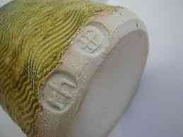
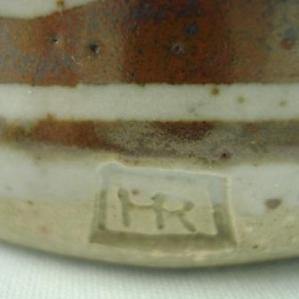
Signature/ Mark/ Chop:

Foreword-
This page is an update.
On this website Robin Hopper’s is the name most accessed. His page was one of the earliest posted on this site. The site, its formats and content, have evolved. His update is long overdue.
Robin Hopper is a ceramist whose reputation is so wide and so respected he might be called a ‘personality’, perhaps even a ‘star’, but the ceramics business does not seem to encourage such terms. Yet his name pops up on more CVs, websites and workshops than any other. In this update, among other things, I am including a bit more of his earlier life in England since so much of his life from that time period was a foundation for his later life and work, in spite of the many twists, turns and detours.
A Brief Biography
Robin Hopper is a name that is familiar to almost everyone in ceramics. His multi-phased career, now based on Vancouver Island, BC, has reached ceramists, collectors and galleries across the continent and beyond. He is an artist who has no problem with talking about the twists and turns of his life, the downs as well as the ups. Yet he says it all with a puckish sense of humour, Life for Robin Hopper has not only been a story of artistic development but also, an almost, a comedic screenplay that he enjoys in its telling.
“Robin Hopper is a man of many parts, mostly worn out, rusty or dysfunctional, due to a lifetime of excesses! He started working with clay at the age of three and is still doing it over 70 years later. His lengthy, peripatetic career as a mudpusher has included side trips into working as a Professional Actor, Stage Designer, Property Maker, Stage Manager, Stage Carpenter, Grocer, Greengrocer, Jazz Musician, Teapot, Wine and Beer-Bottle, Trumpet, Trombone and Bugle Player, European Travel Guide, Founder of Several Clay/Art/Craft Organizations, Alchemist, Geologist, Primatologist, Linguist, Ornithologist, Botanist, Ceramic Historian, Educator, Author, Garden Designer, Lecturer on Japanese Garden Design, Laborer and Star of Stage, Screen and Potter’s Wheel!” 7
A child of the Second World War and the London Blitz he found, while playing, clay, exposed by Nazi bombs around his south London neighbourhood. This proved for him an improvised form of toy making and entertainment. 3
Yet the career of the Robin we know today could have stalled, failed a number of times:

Robin Hopper. Bowl. 1958.
“I started full-time art education in1955 at Croydon College of Art in England, and should have graduated in 1961 with what used to be called the National Diploma in Design (NDD), the British equivalent of an MFA (Master of Fine Arts, plus a little extra!) I failed, disqualified on a technicality. The examinations were National and strictly controlled. I was a leading a double life… of student by day and professional actor by night and Wednesday afternoon matinee performance. … I had a small part in the British Premiere of “Inherit The Wind”. I wasn’t supposed to leave the exam room until the late afternoon on Wednesday. I had finished my work on the Design exam and took myself off to Work at St Martin’s Theatre. I was failed because of that little act of rebelliousness, but it never made the slightest bit of difference in my life in ceramic education. I always led a double life, but not always the same doubles. I was always something of a rebel and non-conformist.” 6
As an aside, lacking the “MFA” was not a problem, He was granted the equivalent after teaching for ten years when asked to teach in Toronto.6
When he had completed his studies he set about earning the money to set up a studio but not in clay!: 6
“After five years as an art student, the last of which I was also an actor, I didn’t touch clay for four years. Instead, I worked backstage in theater for a third of each year, a third of each year as a travel guide and the last third as a self-employed Prop maker for the West End theaters.” 6
After this phase, with sufficient funds he set about establishing his studio, with a strict business approach that not only made for a solid base for the future but also formed a part of the content of his teachings later in Canada.
“I took from my art school years several high-disciplined activities that helped me in several ways. I realized that it would take a long time to rely on the art side of pottery making to be able to make a living in the early 1960’s. Unless you had a name like Leach it was almost a lost cause. I spent my final year in college working on functional ware and high-speed production throwing. There is always a market for good, well-designed and well-made functional ware. It was all very disciplined activity, but set me up nicely when I entered the Marketplace. I also I did other things to pave the way with gold until I felt confident enough and had saved enough cash to get a studio together. … I was never an amateur, hobbyist potter. Once I was hooked on clay, I knew it was to be both love affair and livelihood.” 6
The styles and approach he developed from his market research would in effect become his “canon” for functional ware. He would use these learnings in his future approach to proportions and scale in his functional work.

The Canadian phase of Robin’s career started in 1968. Artistic restlessness, spurred by the decline of the British economy in the 1960s, combined with the presence of relatives in Toronto, and serendipitous interviews, landed him a job at Central Technical School in Toronto,3 the same school that gave birth to the Canadian Guild of Potters in 1937. In 1970 he moved on to Georgian College, Barrie, Ontario. He soon set up a studio in Hillsdale, north of Barrie. During his three years at Georgian he founded and served as head of its Ceramics and Glass Department. During his stay there he stressed with his students not only the artistic and technical aspects of designing and producing but also the importance of thinking of themselves as professionals and businessmen. Many of his students also gained professional experience by working with him in his studio. By 1972, wanting to have more time to create, he had left Georgian to work out of his Hillsdale studio. This was a further step to a full-time Canadian studio ceramic career.
However, intuitively sensitive to the environment, he found the humid summers and long cold winters of Ontario not to his liking. Fortune again stepped forward when he learned of a property on Vancouver Island. 3
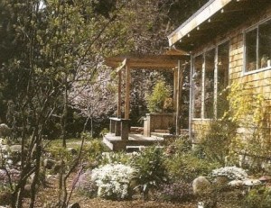
Five years later in 1977 he moved his studio and family to Metchosin, on the southern tip of Vancouver Island, to set up his home, studio and garden. He has been living and working there ever since, creating his production work, his one-of-a-kind pieces, and many books and videos. In the meantime he has picked up such awards and honours as the first Saidye Bronfman Award in 1977 and has been acknowledged as an honorary member of NCECA. He is He is the Founding President Emeritus of the Metchosin International Summer School of the Arts. He was elected to the Royal Canadian Academy of Arts in 2002.

Along with the recognition from his clay work he has achieved a fame for his many books, videos and workshops. His name appears on other artists’ resumes, too many to count. I have included a listing of many of the books and videos below. He is renowned internationally for his almost uncountable workshops and lectures. There are few places it seems he has not been. After such a demanding history of sharing his talents and knowledge Robin has more recently been listening to his body.
“My aging body decided that it doesn’t want to push clay around in my studio anymore and opted for other alternatives!”
There is now less pottery production and no workshop travel. He has moved into old and new interests: following up on his graphic media training with his ceramic substrate pictures; he has also moved into social media with his blog and Facebook site; ebook publishing with “A Potter’s Garden: An Artist’s Approach to Creative Garden-Making”; perhaps most of all he now indulges in a long term love, gardening. In these latter he has move from ceramic creating to directly life-creating activities.
Robin has a tremendous sense of humour. His self-portrait pictures on his blog and Facebook pages show one of his most endearing traits, his ability to laugh at himself. His humour is almost puckish about life and fate. He is not afraid to share them. He said of himself:
“I’ve always operated at a mile a minute in several different directions or layers at the same time, half expecting the whole thing to come crashing in at any moment!” 3
Now he shares himself in Swansong13 part of which can be seen on Youtube. The video with a riff on the Rolling Stones song, Sympathy For the Devil,-badly sung, is typical of his self effacing humour .
“Please allow me to introduce myself, I’m a man of clay and glaze, Pushed mud around for seventy years Or twenty five thousand days.” 7
A Robin Hopper Gallery
General Thoughts On Robin Hopper’s Art
- One can approach a study Robin Hopper’s body of work from different entry points: by form, technique, surface design, or ‘series theme’. He has mixed and matched them throughout his career to produce a consistent “Hopper look” or style. While form was always critical his many videos, and books such as The Ceramic Spectrum and Making Marks, also display his interests in the intricacies of manipulating and composing colours and
- One should also remember that in art school he also minored in graphic arts, and that approaches or methods from those media influenced his decoration and approach to surface as in his multi-layering of coloured glazes. He has lately returned to more painterly graphic styles in his substrate work
- His creations vary from production pieces to unique exhibition-quality works. Most of his work is on the wheel, the final work assembled, batted, carved or folded disguising the wheel-thrown origin. Occasionally he will use press-moulding techniques. At any times he draws on his vast ceramic-history knowledge of British, Asian, Mediterranean and other cultures’ ceramic and glaze techniques.
- There are two fundamental aspects to Robin’s work: it is in harmonizing the simple and the complex that Hopper shows his genius. His forms are simplicity in themselves, minimal in most cases. But his surface decoration is where he plays, with surface modulation and colour, and with landscape or abstraction. There is always a harmony between form and surface design. Robin has written extensively on both.
- His forms reflect the influence not only of natural, oriental and ancient Classical shapes but also of recent artists such as Hans Coper and Picasso.
- His surface subjects reflect his love of the macroscopic landscapes, of sky, mists, water, forests and mountains; or the geological, as in core samples, sedimentary layers and mineralization; to the intimate, the almost microscopic, as in his love for his garden, its flowers, other plants and inhabitants,
- Central to all his work and to his lifestyle is the importance of ambience and environment. Robin absorbs the elements of his surroundings, the environment. His stay in Metchosin, the longest residency of his life, is a lifestyle choice.
- I will occasionally include some of Robin’s more technical explanations about how he creates his work. Robin is very much the “sharer”.
Functional Ware

Although many people know of Hopper’s work from exhibitions of his one-off, decorative vases, pots and dishes, he remained, until recently, a functional potter as well. He uses his Metchosin studio and gallery as the sole outlet for his work.
“ I find a particular satisfaction in the making of functional ware that is quite different from one-of-a-kind artwork, although I really enjoy both.”3
His functional work ranges from the eminently useable on a daily basis to works that are almost one-off, more functional in name and original form, but almost too special to be used too frequently.
Yet as a student he initially discounted the production and functional side of his work:
“ As a student of fine arts I vowed that I would never do production work and prostitute my art by making a range of domestic wares … I thought I was above all that. And was going to produce ‘real art! Interesting how one’s values change over time!” 3
His own market research helped in the change and attitude: 6
“ … I realized that I needed to change my plans and initially make my income by doing something else or making a line of functional work. In my last year in college, I decided to specialize on designing and making a functional range as a “bread and butter” line and do one-of-a kind work as an occasional treat. … I quickly amassed a range of preferences for all basic domestic items that became my general design guidelines, based on actual use.” 7
In short he was setting up his personal ‘canon,’ principles, or criteria for a set of forms, proportions, and surfaces he has basically used throughout his long career. For example:
“The teapot, cream and sugar set … became my standard ware for over 40 years. I did it in five different glaze and color variations. When It came to making a fair living from making domestic ware, I always felt it best to give the client what they wanted without compromising the work. I always turned down commissions that were not my design. It invariably saved a lot of grief and misunderstanding.” 6
Typically Robin he adds:
“I have no idea how many teapots I’ve made in my life. Thousands, for sure. Funny thing is that I don’t generally like tea! As an ex-Brit that might be viewed as treason! 6

Although a Tea Set , the observant viewer will notice the subtle differences in glaze colour. Robin explains:
”The difference is from the firing, everything else is constant Even in white glazes I normally used 10% tin oxide to enliven the color available from Iron. Iron with tin in oxidation or light reduction. gives a much richer chestnut shade. The teapot is fired in fairly heavy reduction. The creamer is fired in medium reduction. They probably came out of different firings. Production potters generally make batches of the different elements of a tea set. and select the most alike that is in stock at the time of sale.”6
He used five glaze and colour variations in his functional work. However, as age caught up with him he stopped producing such work in 2011.6

One Gallon , pitcher,1966. is an early work from England just two years before he came to Canada. The work shows a simplicity of form. The surface is divided in two at the waist, the base forming a ridged seam connecting with the base of the handle. The dark slip has a combed sgraffito that relieves the solidity of the form and visually connects the base and upper elements.

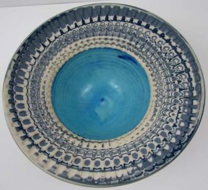
More complex is Robin’s slipware dotted plate. One can see Robin demonstrating the technique on his Youtube video. and in his, Making Marks book. The slips he uses are good from cone 04 to cone 12 “.3 Such work, a study in browns, although technically “functional” stretch the use of the word. Few owners would be willing to use such works, preferring instead to display them. We still carry the reverence porcelain has had for centuries. The well and its walls are a soft gloss overlain by dots of slip within a darker ground. A row of white dots form the “base“ of the design. Rather than covering the whole surface with the dots he has created an asymmetrical arrangement, leaving a third of the well plain. The source of such dot design comes from seeds and flowers in his Metchosin garden.
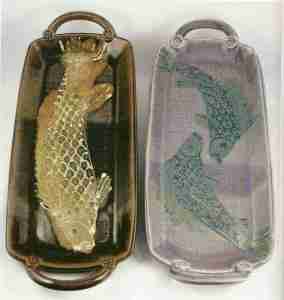
These two press-moulded Salmon Plates demonstrate Hopper’s range of colour and glaze design on a basic form. The salmon are, of course, indicative of Hopper’s interest in nature in his BC surroundings beyond the garden. The two forms, side-by-side although almost the same in shape and size are a study in contrast of colour and content: black and gold, and soft violets with blue-greens. Functional does not mean mechanical repetition.
Agateware and Mocha Diffusion
Agateware
I have separated out Hoppers Agate Ware and Mocha Diffusion works since they not only cut across so many forms but are also two of his most recognized, collected and admired styles. Also, the surfaces and textures are so rich that although the shape might be considered functional, the overall effect of such works is more conducive to a visual and tactile appreciation than merely holding fluids or food.

His Agate Wares add a complexity to Hopper’s processes. The layers of coloured clay, the throwing and the final fluting or marking involve subtle or shallow 3D considerations not seen in “plain” clay. The colour layers, that for a good part of the creating process are harder to observe, and add an additional potentially random or accidental quality to the final form and surface effects. They are the final surface with no further additional decorative slip or glazing required.

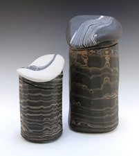
Three coloured fluted agateware bowl. 2003. Agateware is one of Robin’s most widely known and recognizable style of work. Like most of his work they are of a porcelain body of his own recipe. Layers of purer white and stained bodies are interleaved to produce an effect that is variously reminiscent of water, shell patterns or sedimentary layers of sand or rock. Robin wisely does not add any other surface decoration to these already animated and busy surfaces. The colours are limited, restrained, mostly white with blue or grey or brown. These works generally tend to be more intimate in size, more easily picked up and handled. The forms are typical of much of his work: lidded jars, bowls, plates, are thrown on the wheel and then batted, folded or carved. Interestingly, but independently, Alice Mary Hagen had come across Agateware sometime in the early 1930s, probably while she was in England. Upon her return to Nova Scotia she developed the technique. Her style is called “Scotian Pebble Ware.” The effect is quite different from Robin’s, lacking his clarity, cleanness and precision.
This Feather Bowl bowl is an example of a more complex form of Agateware. The form is of two parts, an original porcelain bowl uniformly glazed in blue and an added contrasting rim of Agateware feathered in white, grey and black. The colours and shapes reflect an interest in the ripples at the water’s edge leading to deeper more still ocean depths. Hopper confirms the inspiration for such a bowl, tied, of course, to his observations in nature:
“A chance happening while on a country walk. …. I was walking around a local lagoon, the wind was blowing ripples across the open water, and there were tree branch reflections in the ripples, giving an agitated appearance. I immediately wondered how I might achieve such an image in clay, and the nearest thing that I could think of was fluted agateware,” 9 blockquote>
Hopper also used more sculptural and wider colour effects.
Hopper has been interested in geology since his teen years in England. It was in an Arizona Mining museum he saw drilling core samples and made the connection to agate ware and neriage. He has made these Lidded Jar forms distinctly his with a subtle facetting. Capping, lids, in blue-grey and white neriage, that are at once either a rounded pebble or a glacial flow, complete the lid of the jar form. 6

The Pillar Vase’s two-part contrast in colours and effect is something not often seen in Hopper’s work: grey and cream agate ware is surmounted at the shoulder by a neck and mouth in white porcelain with agate swirls that bleed into the white in a form of blush. Robin describes a further the inspiration for this technique arising from as visit to Israel and viewing a collapsed temple:
“ … fluted and facetted, pinky-grey, marble pillars …lay where they fell 2000 years previously. Those pillars became the idea source for pieces like this. I made up two colored porcelains, one with 3% Copper carbonate and the other with 10% rutile, then layered them with normal white porcelain and threw the lower sections. this part was unglazed. The top section was thrown onto the lower part. It was gas-fired in reduction at cone 10. The white, tin-opacified glaze became red from the swirling copper in the clay. 6
Mocha Diffusion and Mochaware

This Footed Vase form reflects the influence of Hans Coper in its elegant concave curved beaker silhouette shape atop a cylindrical stand. The mocha diffusion technique seen in England from the 1780s was also popular in England in the early 19th century. The dendritic patterns of the mocha diffusion are clearly seen as the addition of drops of acidic fluid are dripped or trailed onto the alkaline slips creating the feathery or moss-like shapes seen on dendritic limestone or agate. Robin uses apple-cider vinegar mixed with colourant to achieve the effect. He finds carbonates or stains work better since they are lighter. This is an example of Hopper looking at the small and intimate in geology. The effect of the process is also similar to the wet-in-wet technique used in watercolour painting when wet pigments are placed directly next to or onto each other. Robin describes his technique:
“The leather hard pot is dipped, brushed or poured with slip. While the surface is still wet, and before it has begun to lose its shine, the acid/color mix is dripped or trailed into it. It is best done using a well-loaded brush held just touching the slip. If the viscosity of the slip, and the acid/color mix is right then the feathering pattern will take place quite naturally, as the acid eats a fern-like pathway through the slip pulling the colorant with it. Traditionally, the surface is coated with a thin coat of clear glaze, or clear, colored glaze, but this might cause the color to bleed out or become absorbed into the glaze, particularly at temperatures above cone 4. I prefer to use the technique on high-fired wares that do not need to be glazed, and have been doing it that way for over 50 years” 6
As mentioned above a feature of Robin’s work is his use of what are basically functional forms developed as sculptural forms. These are often assembled works made from a variety of thrown and cut pieces. Some show the impact of Hans Coper, the British ceramist, who Robin acknowledges as one of his inspirations.

Porcelain with Iron & Manganese Mocha Diffusions With Rutile & White Slips. Unglazed Exterior, Glazed Interior. Gas Fired Reduction. Cone 10. 40.6 x 25.4 cm. Photo: Judi Dyelle
In this Disc Vase a thrown porcelain cylinder foot surmounted by two thrown bowls joined at the rims, in turn topped by a short neck and ridged lip. The whole is in white porcelain, matte and unglazed on the exterior but glazed on the interior. The disc surface is slashed across the general central area with dribbles of rutile and white slips, modified by iron and manganese mocha diffusions. The whole is gas-fired to cone 10 reduction. Such works are usually exhibition pieces, often produced in series for coming exhibits.
Hopper’s Series/Themes
Another path to follow in looking at Robin’s works is to follow themes. Some of these themes are already mentioned in the works above. Most are inspired by various nature or historical or cultural themes or motifs. In catalogues one can find works listed as SouthWest Series, Oriental Series, Night Forest Series, Garden Series, Hummingbird Series, with titles such as Green Garden, Night Garden, Classical, Clematis, Zoomorphic, B’Oribe, Mocha, Mediterranean, Chado.
His many “Series” are where Hopper shows his ease in his many combinations of form, glaze, surface design and technique.
We shall follow up on , four series: Southwest, B’Oribe, Classical, and Nature. There are many intertwining subsets to these series.
Southwest Series
“This series of my work is inspired by pottery of the indigenous people of the American southwest. Their wonderfully graphic work was the first pottery I ever remember seeing in a museum when I was 8 years old. Black, red and white have been my favorite triad of colors for 65 years. I’ve tried every variant of these three colors that I have been able to imagine. 3
Southwest series pieces are purely decorative and not for functional use.”

Footed Parabolic Bottle. SouthWest Series, 1987. This form is a popular and much seen shape in Robin’s work and exhibitions. Against a pure white canvas of porcelain and terra sigillata Robin has loosely brushed on a sumi-e type flower holder in black with a central kanji-type calligraphic swirl in red. The holder supports one sparse reed. The whole rests on a loosely drawn but dense brushwork of a bed of flowers that includes a favoured motif of Robin’s, an eye-like circle of dropped white slip with a central dot of red slip. The shoulder to neck transition has a simple band of black on red. The colours also reflect a desert sky just after sunset. Red , black and white are a longstanding colour favourite of Robin’s from his early years Here we see too Robin’s interest in fusing different cultures, styles and periods.
Robin describes his technique:
“Porcelain sprayed when bone dry with white, Tin-opacified Terra Sigillata and polished to a sheen. Abstract Black/Bronze pigment brushed on – Fired in an electric kiln to cone 9. After high firing the piece is decorated with a brushed and trailed chrome-lead glaze for the best lightly textured orange in the book. Subsequently refired to cone 010. In the process of firing the chromium fumes and bonds with the tin to create a grey haze and thin yellow line around the orange. After firing, the surface is sanded under water with emery cloth or wet and dry sandpaper to achieve an egg-shell smooth finish. Chrome-Red lead glazes are not suitable for inside surfaces of functional pottery.” 6

Tri-foot PlateSouthwest series. The form of this bowl is typical of Robins bowls: a wide flared rim with a deep central depression; the two elements are of contrasting styles. The bowl proper is a deep red set off from the lip by a thin black band. The rim has a dynamic counter-clockwise swirl of leaves and blossoms which are themselves restrained by the reverse design of leaves of rhythmic loops and curves of slip trails. Across all of these shapes Robin trails a red slip over white, as stalks or blossom dots. We can see here Robin’s control of localized chromium red glaze on top of a tin-opacified terra sigillata.

Olla Form,Southwest Series. Vase shapes such as this reflect a more humble and traditional form. They were used for cooking or storage. Its wide convex belly is topped by a conical, slightly convex, cylindrical neck, and minimal lip. The two are perfectly balanced in scale. The design is framed rhythmically, both horizontally and vertically. Leaf forms create small vertical vignettes on the neck. The body swirls with fluid leaf movement around bands of red and black. A pronounced diagonal emphasis of the leaf shapes moves the eye continuously around belly of the pot. The vertical movement of the design is countered by the horizontal banding on the throat, neck, belly and foot. The base is unglazed white porcelain.
B’Oribe Series
The cross cultural theme also can be seen in a variety of approaches Robin uses such as his B’Oribe ware. B’Oribe is part of his broader Oriental Series. Series. Robin describes the origin of the name since he is not trying to make Japanese pots:
“The word B’Oribe is another invention of mine. One of the most beautiful groups of work in Japanese traditional ceramics is called Oribe, … The Japanese wares are randomly decorated with glazes. In between the splash glazes are Iron brushwork patterns, often very complex. I borrowed the concept and I called it B’Oribe or borrowed from Oribe.“ 1
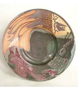
B’OribePlate, 2004. This plate resembles a pastiche of Japanese kimono-like designs scattered across the rim and sliding down into the bowl’s recess. These tighter geometric designs are contrasted with trailing, flowing organic lines and shapes. The orange and grey base colours each occupy about half the surface. The work is one of his most multi-coloured expressions in blues, greys, white red, orange and green. Yet the colours are gently restrained. The elements are familiar but set in a new context. Such works are abstract with just a hint of Hopper’s beloved garden forms.

The Square Lidded Jar’s ceramic surface does not have the open spaciousness of a plate. Here Hopper has used the randomness of the Oribe approach in a restrained monchrome, in white and black fading to brown. To appreciate the overall design one must turn the jar for a 360⁰ view. In this picture the left side is a checkerboard layout, like goban of the game of Go. The right is loose linear curves and a favoured motif of Hopper’s, a tightly fan-brushed pattern reminiscent of agate-ware. The lid, neck and shoulder are a uniform, semi-gloss black field. The monochromatic simplicity binds the randomness of design into a unified whole.

Not obvious from the picture of the Fan Plate is the texture of the plate’s surface. An exhibition, Ceramic Explorations, at the Art Gallery of Greater Victoria and a curator’s request started Hopper on an interesting tactile direction He explains:
“The curator of the exhibition said that the Art Gallery of Greater Victoria had a policy of having occasional tours for the blind. She asked if I would mind if these people touched the work. My take on the subject was to use glazes from super smooth and satin like, to almost rough. It was also another variation on the black, red and white themes that were focus of the new work in this show. On this large plate, the dark bronze glaze is super smooth, the white glaze is almost pebbly, the copper red trailed linear work is a thick raised line of copper red trailed linear work is a thick raised line of a white, tin-opacified glaze that has picked up volatile copper and turned red. The blue-black sponge stamped fans burn their way into the white glaze, leaving a multilevel surface that a sightless person could easily feel. I was amazed when they told me that they could even “feel color” and accurately described the feeling of the piece and its colors. For the rest of my working life as a potter, I always tried to incorporate various textural experiences for those who have tactile abilities beyond my understanding. You never know who may be feeling your work!”
Classical Series
The works of the Classical series are a legacy of Hopper’s travels and many museum visits, throughout the years. From his early childhood on, Hopper has been fascinated by museums and their collections. This series has a look that is more spare in its forms and colour. The lines are generally clean, almost “sharp” looking with a “patinated” surfaces that looks as though they are freshly restored bronze or even alabaster from some archaeological dig.

Axe Jar, Classical Series. 1981. At first glance the overall effect of the work is that it is made of stone. The form is an inverted yellow and blue cone that sweeps out at the base. Foot and lip are defined by thin bands. But what of the thin axe handles splayed like wings on the side and lid? The same axe motif is picked up in the simple sgraffito design on the face of the work. The thin axe-blade handles seem almost purely decorative, too fragile for use. They are an unusual feature of Hopper’s work. Normally his approach is to focus more on surface and design within the overall form. Wisely he has minimized the design this time to focus on the extensions into space.
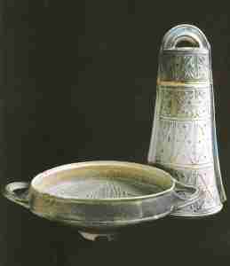
Lidded Bell Jar and Kylix Form. 1985. The look on these two works is more complex: the look is more patinated, cast “bronze” in look. Handles are simple in both but the surface design is more complex, in the bell jar, especially. The stemless kylix on the left is plain except for the slip trailing in the well. The bell jar is a more eclectic mashup with a Greco-Chinese look: slip trailing in compartmented rows consists of “X”-shaped lines and dots. Whatever the source the effect is one of great antiquity.

Phoenix bird bowl. 2005. Hopper describes the source of such works:
“I started making wheel-thrown ceramic sculpture as a student in 1956, after seeing an exhibition of Picasso’s ceramics in London. Later, in my visits to museums I came to realize just how often bird and animal forms were used by many early cultures going back at least 5000 years. Hittite from Israel, Amlash from Northern Persia and Neolithic Chinese objects were a continual source of ideas to explore.” 6
Landscape, Nature, and Garden Series
Nature has always been a key theme in Hopper’s work as decoration and even in form.
Landscapes have always inspired him from his early primary school days in England. As he travelled across Canada he would use his sketch book to capture scenes and ideas. Later the subjects became more intimate and home-garden based.

Metchosin Mists, Landscape Bottle. 1978. The large bottle form is a well-known and popular format of Hopper’s. The smoothly curved surface was in effect a canvas for Hopper. He first created such works in Ontatio and made sketches for future use on his journey across Canada when he moved from Hillsdale to Metchosin. The design is quite constant. The pot itself is a combination of joined slab built and thrown work. The design has a watercolour effect of wet-in-wet, with trees defined by hard edge “squiggles” of pure colour.
The Gardening theme includes series sets such as clematis, hummingbird, and garden, especially the garden as art.
Typically Hopper his right-brain connects the two arts:
“Most people do not know that every aspect of this [ Metchosin] garden is a metaphor for my life. It is also my biggest source of ideas and inspiration.”. 10
“I am a gardener and a potter. … To me pottery and gardening are totally enmeshed. Totally. They are using the same minerals” 12

Ghost Forest #1. “Night Forest Series, Landscape Plate.” 1978.
“Somewhere in the Prairies I came across a ghost forest, where mature trees had been sitting in a swamp and died, leaving stark white skeletons of cypress trees. It was darkening dusk. The trees seemed to have been spotlit by a cool white moon. We were camping nearby and I had time do do some of my cryptic little drawings and glaze and color notes for whenever I had a studio at my disposal. This plate interpretation uses approximately six glazes.” 6
Such landscape plates show Hopper’s painterly background. Much of his work is actually illustrative or at least based on naturalistic subjects. The choice of a night-time theme is interesting and difficult to accomplish. Most artists stay away from portraying that time of day. The use of glaze on ceramic is more daring than an oil or watercolour pigment on canvas or paper work The plate is in greys yellows, blacks and browns. The landscape proper takes up the bottom two thirds of the plate. The upper third has only a full moon against a dark grey sky. The work is interesting in that the subject shows the persistence of memory in Hopper’s use of subjects.

Hummingbird Plate #1, 1987. In looking at Robin’s works one has to be aware of another quality of his process: linguistic creativity, his making up new technical terms for his works and processes. For example “bonefuming” in the Hummingbird plate above is a term created to describe placing calcium materials (bone. shells), sodium (salt) and potassium onto bare bisque clay – not onto glaze – where it will bond with the silica and form a smoky glass. Hopper describes the steps to create this work:
“The bird image is cut out, and placed on top of a splash of bronze glaze and sandblasted after glaze firing. The two circular grey areas are from cross-cut pieces of beef bone placed on the white unglazed clay. The bone fumes as it shrinks and is like a localized area of wood, soda or salt firing. The bone just shrinks slightly and usually just lifts off. There is also some black pigment brushwork. I call this process “Bone-Fuming” Any bones will leave a mark when fired.” 6
Tall Lidded Jar. Clematis Series. 2005. Clematis works are a favoured subset of Hopper’s Garden Series. The effect here is of soft, sensual. The forms and lines move organically across a classic jar form. Hopper describes his colouration technique:
“ There are great subtleties of colouration that come from a very thin coloured glaze over a white micro-crystalline , high alumina matte glaze in conjunction black pigment brushwork and trailed details within a tin opacified glaze.“ 3
Ceramic Substrate.
Much of Robin’s latest ceramic work have been in the form of ceramic substrate paintings, a medium he came across about twenty years ago. He has pioneered the use of this relatively new material and has produced videos on the subject. A large part of this current direction reflects his acknowledging his twenty-five thousand days of producing pottery and the effect it has had on his health. He has gone more directly to earlier painterly roots, painting images on flat rectangular surfaces. Robin has written and spoken about the material in articles, videos and on his blog but here is a brief summary. Ceramic substrate is a space age material developed by NASA and other industries for such things as heat shields and computer cards. Because of high production quality controls much substrate is discarded as seconds, unsuitable, garbage. What does not work for NASA works well for artists and the availability of seconds keeps the cost per unit down. Robin provides detailed instructions on his expllorations and use of the medium on his blog.

Clematis. Glaze painting. The clematis as subject, is a favourite of Hopper’s. Typically Robin he finds great satisfaction in combining a ceramic base with his early roots in painting, and of course his love of the garden. He explains his liking for the medium:
“The substrate sheets accept and withstand various print-making approaches, such as monoprint, linocut, woodcut, screen printing, and decals. The potential range of applications is limited only by the creative mind and technical understanding of the person doing it. If one can imagine all the possibilities of paper, card, or canvas, substrates are just another flat, white surface waiting for the artist’s touch !”7

Homage to Adolph Gottlieb. 2012. This is one of the latest of a series of homages. Hopper has used the iconic Gottlieb design in other glaze painting and on the occasional bottle from at least 1987. The substrate surface is like vellum. Robin draws on it with ceramics pencils or pens, or Conté. The initial image is similar to a pen and ink drawing. He fires the image in place at around cone 6 in his electric kiln. Later, he will use glaze and slip trailing in combination with glazes or terra sigillata in multiple firings to build up the surface further. He uses either oxidation or reduction firings, or a combination of the two. Although much of the imagery of his glaze paintings relates to his garden, plants and landscape, this particular work takes him back to his art roots in an homage to the American Abstract-Expressionist artist, Adolph Gottlieb. Against a plain, white field he places a zen-like spattered, red central orb is suspended within a greyed disc square above a brown spattering of earth. Minimal content, pictographs and brush work make for a deeply meditative object. Hopper describes the inspiration:
“.. one of a series that paid homage to painters of the American Abstract Impressionist movement that included Adolph Gottlieb, Mark Rothko, Barnett Newman, Franz Kline, Robert Motherwell and Jackson Pollock amongst others. My life in the visual arts started as a painter and then morphed into being a ceramic artist, obsessed with the potential of using the ceramic surface as a canvas.” 6
Robin Hopper has inspired many with his never-ending quest for innovation, his passion for sharing his knowledge and expertize, and his often whimsical interest in life, history, culture and nature. On looking at his blog or facebook page it is obvious he is a joker. He always invites us to laugh with him. But one can never doubt the depth of his seriousness and passion for his art. He now continues these in his love for his garden and its inhabitants, creating and sharing its life and beauty.

Major Collections
Collections of Robin Hopper’s work are extensive, public, corporate and private:in North America, England, Germany, Japan, China, Korea, the Middle East, Australia and New Zealand; they include: The Canadian Museum of History,Gatineau; The Art Gallery of Greater Victoria, Victoria BC; The Winnipeg Art Gallery, Winnipeg, MB; the Koffler Gallery, Toronto, ON; the Ontario Crafts Council,toronto, ON; the Art Gallery of Burlington, Burlington, ON; Confederation Centre Art Gallery, Charlottetown, PE; and what were once The Indusmin and Claridge Collections; Queensland Art Gallery, (Australia, The Reading Museum, England; Beijing Academy of Art and Design, China; Ichiin, Korea.3
Video/Podcast Links
In spite of his health Robin is still reaching out to international audiences. Three of the most recent are:
- An NCECA video, Published on Mar 31, 2015, From the 2015 Conference in Providence, Rhode Island. He appeared via broadcast during the clay stories session
- A March 10, 2016, podcast, Die As An Individual: Robin Hopper, Episode 195 By Potters cast by acast. Host Paul Glais. The interview is about 1:17 hours but well worth listening to. The first 14 minutes are general podcast information before the conversation with Robin really begins. Tip: also stay and listen after the conversation supposedly ends. Robin adds more post-interview nuggets.
- One also has to mention Robin’s success as a successful fundraisier via crowdfunding for his DVD on his life and work, “Swansong.” Listed as his “ last project”.” Approximately two hours in length it is a compilation of stories, music and images of a “life well lived!” Typically Robin the project was for two charities: the Jimmy Fund of the Dana Farber Cancer Institute (pediatric cancer) and the BC Arts Council (arts programs for youth).
The amount of broadcast and written media on or by Hopper is extensive. He also served in 1993 as Served as consultant and on-camera host for “Making Marks,” a series of six educational videos on ceramic decoration processes; and in 1993 and as consultant and on-camera host for “Form and Function,” a series of five educational videos based on second book, “Functional Pottery” in 1994.
The listing below is a sampling of titles and clips, many available as videos , video segments and interviews. On Youtube: just type in “Robin Hopper Ceramics” to see and hear the man himself.
- “Making Marks”: a series of six half-hour videos.
- “Form and Function” : a series of five of varied length depending on content.
- – “Beginning to Throw on the Potters’ Wheel” and “Advanced Throwing” programs of approximately 60 minutes each.
- Robin Hopper Mocha Diffusion Youtube
A Sampling of Robin Hopper Writings
Books:
- “Contemporary Focus: Studio Ceramics, Glass and Silver at the Winnipeg Art Gallery.” 1992; expanded to “Focus One: Contemporary Studio Ceramics in the Collection of the Winnipeg Art Gallery.” Winnipeg Art Gallery, Winnipeg, MB. 1991.
- “The Ceramic Spectrum: A Simplified Approach to Glaze and Color Development.” Chilton Book Company, Radnor, PA.1984; Second edition. Krause Publications Inc, lola, WI.2001.
- “Functional Pottery: Form and Aesthetic in Pots of Purpose.” 1986 by Chilton Book Company, Radnor, PA, 1986; Second edition Krause Publications Inc., lola, WI. 2001.
- “Clay and Glazes for the Potter.” Co-authored/co-edited a revised and expanded new edition of Daniel Rhodes’ major educational text; Krause Publications, lola, WI 2000.
- “Stayin’ Alive: Survival Tactics for the Visual Artist.” Krause Publications Inc., lola, WI 2003.
- “Making Marks: Discovering the Ceramic Surface.” Krause Publications Inc., lola, WI. 2004..
- “Robin Hopper Ceramics: A Lifetime of Works, Ideas and Teachings.” Krause Publications Inc., lola, WI. 2006.
- “A Potter’s Garden – An Artist’s Approach to Creative Garden-Making”. Ebook.
There are numerous articles on or by Robin Hopper from 1968 to 2003: Ceramics Monthly, Australian Potter, Beautiful BC, Western Living, Studio Potter, Canada Crafts, Ontario Crafts, Ceramic Review, Craft Horizons, Tactile.
Endnotes and Bibliography
- Email correspondence with Robin Hopper, June11, 2013ff.
- Robin Hopper’s website
- Robin Hopper. Ceramics: A lifetime of Works, Ideas and Teaching. Krause Publications.2006. Iola Wisconsin.
- Greater Lansing Potters Guild, Michigan, Workshop, October 2006.
- Robin Skelton. Introduction. Explorations Within A Landscape: New Porcelain By Robin Hopper. Pub. Robin Hopper , Victoria BC. 1978.
- Robin Hopper Facebook page
- Robin Hopper Blog
- 8.Robin Hopper. Transcript of an Interview with Ann Mortimer and John Chalke for the project. November 1978.
- Robin Hopper. Making Marks: Discovering the Ceramic Surface. Krause Publications Inc., lola, WI. 2004..
- The Experimental Nonlinear Physics Group, Dept. of Physics, University of Toronto,
- Robin Hopper. The Ceramic Spectrum: A Simplified Approach to Glaze and Color Development.” Chilton Book Company, Radnor, PA.1984; Second edition. Krause Publications Inc, lola, WI.2001.
- Steggles, Mary Ann. Robin Hopper. Ceramics Art & Perception. Mar 1, 2015
- Robin Hopper. Swansong
- Bill Terry, Rosemary Bates. Beauty by Design: Inspired Gardening in the Pacific Northwest. TouchWood Editions.2013.
- Robert Amos. An artist, facing cancer, reflects on what inspired life’s work . December 12, 2015 03:24 AM
Congratulations if you have read all of this material on Robin Hopper.

Here is one more picture treat that is classic Hopper humour. Smile, laugh, enjoy.
© 2016 studioceramicscanada.com

Hi Robin
It has always been a great experience to visit with you and Judi and to frequently once again to examine my collection of your work. I thank you for introducing me to MISSA so many years ago when I took your Glaze Workshop and introducing me to your philosophy of ” Try it and see” I share it with my students regularly!
See you both in July.
Hugs, Al
LikeLike
Big hugs to you and Judi. Enid.
LikeLike
Thanks, Enid. Such comments show other major artists’ affection as well as respect for Robin.
LikeLike